AE
The simplest solution would be for each channel to be represented by a colour. So on the cross promotional menus, a red box with no text means BBC1, teal for 2, black for 4, pink i for iPlayer, and a red circle for Red Button. 
But seriously, I think the solution used at present was a best effort. A best effort that is the most accurate in terms of visual accessibility.
Since nations started rebranding trails, it has at least enabled the accuracy of saying "it says 'BBC ONE Wales' etc. on screen, it'll be on your very own BBC One Wales channel. It says just 'BBC One', it might not be on at that time, or day, or even that channel". That trail might run on the News Channel, BBC FOUR or outside staffed hours in a nation when network continuity occasionally airs.
Factor in also the whole BBC TWO HD situation, where "TWO" can't accurately reflect the channel showing live sport in a nation for example, because if you pick the wrong one, you might find you'll get a completely different schedule.
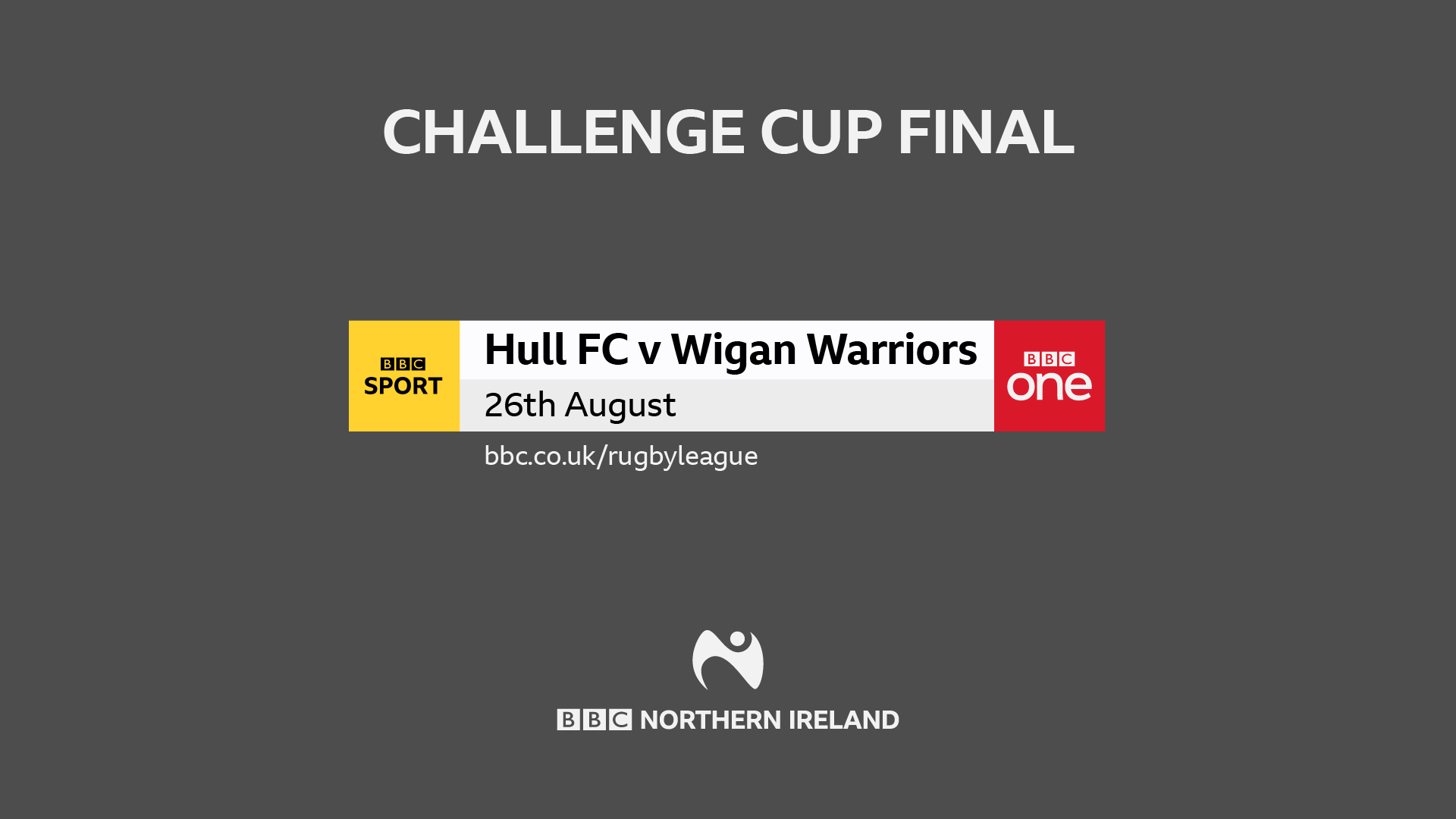
Reducing 'Northern Ireland' to a pedantically inconsistent "NI" seems to be an unfortunate result of the size that the graphic is going to be displayed at in some circumstances, some of which look very small on screen.
But seriously, I think the solution used at present was a best effort. A best effort that is the most accurate in terms of visual accessibility.
Since nations started rebranding trails, it has at least enabled the accuracy of saying "it says 'BBC ONE Wales' etc. on screen, it'll be on your very own BBC One Wales channel. It says just 'BBC One', it might not be on at that time, or day, or even that channel". That trail might run on the News Channel, BBC FOUR or outside staffed hours in a nation when network continuity occasionally airs.
Factor in also the whole BBC TWO HD situation, where "TWO" can't accurately reflect the channel showing live sport in a nation for example, because if you pick the wrong one, you might find you'll get a completely different schedule.
Reducing 'Northern Ireland' to a pedantically inconsistent "NI" seems to be an unfortunate result of the size that the graphic is going to be displayed at in some circumstances, some of which look very small on screen.