JO
Hate to break to you, but
Vertical boxes, boxes not evenly spaced out, font size of the text outside the blocks is smaller than within, drop shadow present, and it's filled with a graphic pattern instead of being plain black or white. So yeah, quite a few!
Hate to break to you, but
JB
Sounds like a Paul Akinbola idea.
This is a BBC Three show but couldn't really find a better place to put it.
How many 1997 brand guidelines would you say this graphic from RuPaul's Drag Race UK breaks?
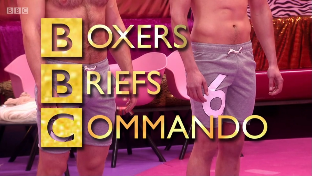
How many 1997 brand guidelines would you say this graphic from RuPaul's Drag Race UK breaks?
Sounds like a Paul Akinbola idea.
IS
Looks too good to be a one-off CIN special.
Not only does it jot have 'Oneness' on it but the camera's moving, not static.
Not only does it jot have 'Oneness' on it but the camera's moving, not static.
LY
This is how they should have done the Oneness idents in the first place. Panning shot of the group in action, with music.
This is how they should have done the Oneness idents in the first place. Panning shot of the group in action, with music.
:-(
A former member
Half decent is fairly accurate. Half.