MA
I guess it is useful for commuters, people travelling to different parts of the country.
Thanks to Sat Navs etc now, some people do have a staggering lack of geographic sense. A colleague of mine
was convinced that Surrey has a coast (and he lives in Guildford !) and had absolutely no idea where Newcastle upon Tyne was (other than it was 'up north') He drives all over the UK, but has NEVER looked at a map.
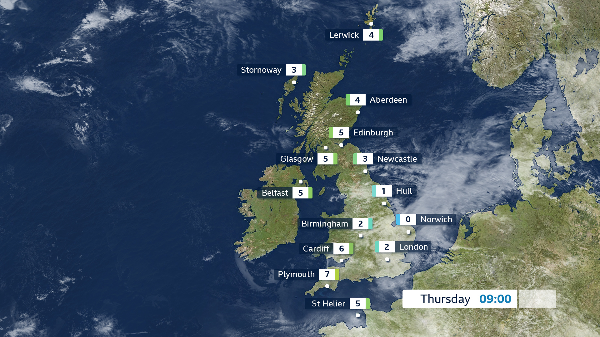
Why do UK weather forecasts have place names on the maps all the time? Like I'm a bit concerned you dont know the location of the town or location your visiting? Adds clutter for no reason. If you're going for zooms and flyovers then add them but they don't need to be in the full screen version of that map.
I guess it is useful for commuters, people travelling to different parts of the country.
Thanks to Sat Navs etc now, some people do have a staggering lack of geographic sense. A colleague of mine
was convinced that Surrey has a coast (and he lives in Guildford !) and had absolutely no idea where Newcastle upon Tyne was (other than it was 'up north') He drives all over the UK, but has NEVER looked at a map.