JO
Been meaning to post that the standard of unique trail designs has greatly improved recently, with some genuinely lovely graphic design capability on display.
However, from a brand management perspective it's business as usual - that cyan box with heavy "TWO" is one that has cropped up intermittently since the botched 2008 refresh. If anyone deserves credit it's Wales for at least plonking on the current logo.
However, from a brand management perspective it's business as usual - that cyan box with heavy "TWO" is one that has cropped up intermittently since the botched 2008 refresh. If anyone deserves credit it's Wales for at least plonking on the current logo.
DP
D.Page
Has BBC Creative turned a leaf?
Fun and jokes aside, Network has finally outperformed the Nations with this promo.
To be totally fair, it's a non standard logo design and the Nations will probably have had no choice but to improvise, as Network doesn't, as a rule, pass these kinds of non standard design elements on to the Nations. I may be wrong, but that is my understanding.
MM
Network version: very washed out looking colour - and not in keeping with the strength of any of the colours used during this trail. It spoils an otherwise quite refreshing trail.
NI version: not great - but roughly in keeping with the white BBC Music logo that appears at the start of the trail. A darker colour for the 'TWO' might've worked a little better.
Wales version: looks the least offensive. The teal logo box ties in better with the darker colours on that endboard.
Scottish version: I doubt you'll find a BBC Two Scotland version - they don't bother rebadging Network trails.
But as I believe someone else has pointed out, I don't believe the Nations have a lot of time to play about with these things.
Interesting inconsistency in the design of the respective logos across BBC2 for the
St Peppers Musical Revolution
trail (haven't seen Scotland's trail yet).
It's very clear the Nations have superimposed their logo and ensured Network's very light blue logo has been completely covered by enlarging their one slightly. Northern Ireland has partially retained the colouring as per Network's. Wales hasn't even attempted to adopt the colour scheme.
It's very clear the Nations have superimposed their logo and ensured Network's very light blue logo has been completely covered by enlarging their one slightly. Northern Ireland has partially retained the colouring as per Network's. Wales hasn't even attempted to adopt the colour scheme.
Network version: very washed out looking colour - and not in keeping with the strength of any of the colours used during this trail. It spoils an otherwise quite refreshing trail.
NI version: not great - but roughly in keeping with the white BBC Music logo that appears at the start of the trail. A darker colour for the 'TWO' might've worked a little better.
Wales version: looks the least offensive. The teal logo box ties in better with the darker colours on that endboard.
Scottish version: I doubt you'll find a BBC Two Scotland version - they don't bother rebadging Network trails.
But as I believe someone else has pointed out, I don't believe the Nations have a lot of time to play about with these things.
MM
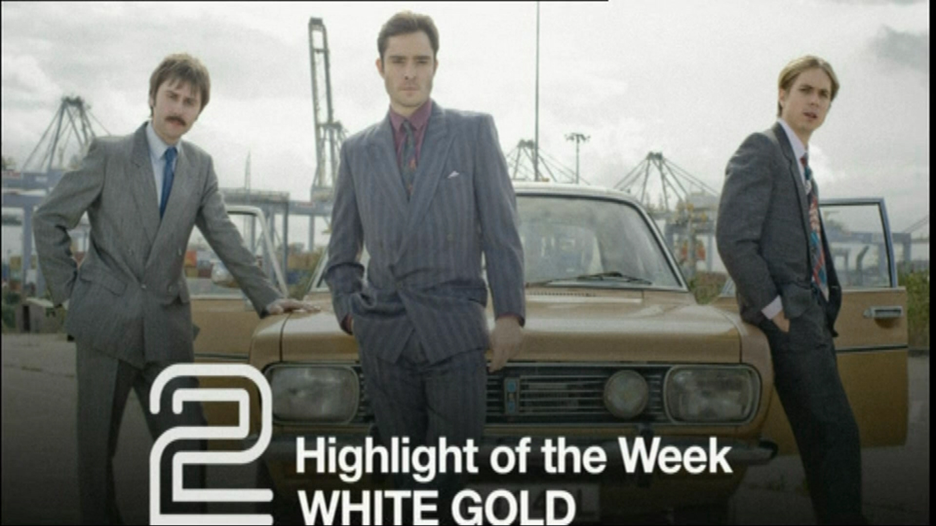
The poorly reproduced '2' remains with us. At least Northern Ireland used a font which was of the era (albeit it was the font used for the 'Northern Ireland' text on the 1981 - 1985 BBC One symbol - and was not used on BBC Two NI trails or branding during that period, to my knowledge). However, our Scottish friends seem to have thought it a good idea to use BBC Two's current channel font, Avenir (if I'm not mistaken), for their 'SCOTLAND' text here. If it is indeed Avenir - well, that font was released in 1988.
This is for you 623058 (look away now, MMcG198  )
)
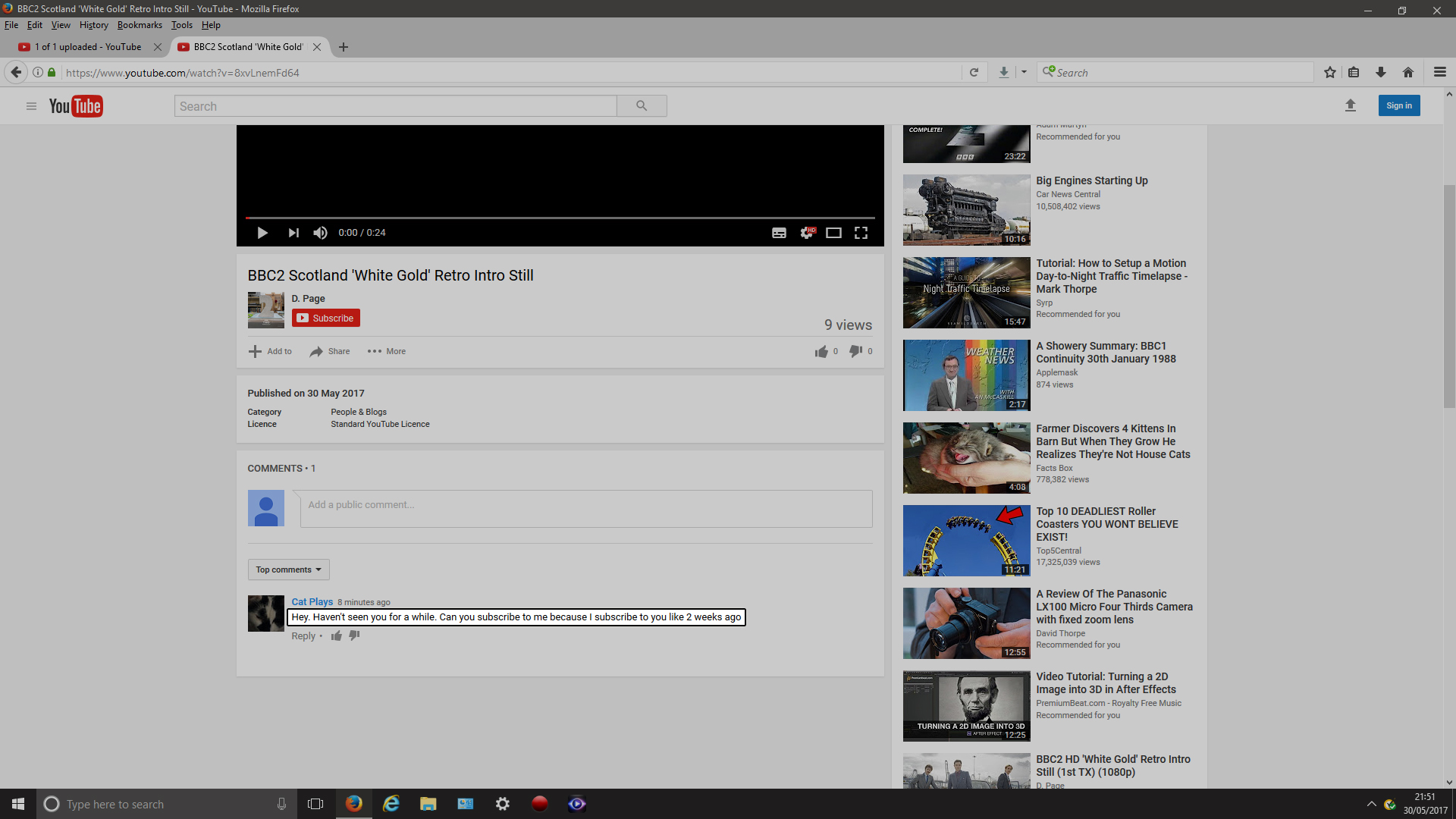
https://www.youtube.com/watch?v=8xvLnemFd64
Wales' intro still seems to be as Network's.
https://www.youtube.com/watch?v=8xvLnemFd64
Wales' intro still seems to be as Network's.
The poorly reproduced '2' remains with us. At least Northern Ireland used a font which was of the era (albeit it was the font used for the 'Northern Ireland' text on the 1981 - 1985 BBC One symbol - and was not used on BBC Two NI trails or branding during that period, to my knowledge). However, our Scottish friends seem to have thought it a good idea to use BBC Two's current channel font, Avenir (if I'm not mistaken), for their 'SCOTLAND' text here. If it is indeed Avenir - well, that font was released in 1988.
Last edited by MMcG198 on 31 May 2017 7:17pm
:-(
A former member
Cheers D.Page. Somehow I doubt Glasgow made this, I think it was sent to them from the network.
:-(
A former member
Here is that beetles promo as broadcast in Scotland plus a NICE Scottish local promo
MM
Credit where credit's due - that 'The Town That Thread Built' trail is quite good. And nice to see the 'Scotland' text back in Avenir, rather than Gill Sans.
Here is that beetles promo as broadcast in Scotland plus a NICE Scottish local promo
https://www.youtube.com/watch?v=1wmnJ8S4ebM
https://www.youtube.com/watch?v=1wmnJ8S4ebM
Credit where credit's due - that 'The Town That Thread Built' trail is quite good. And nice to see the 'Scotland' text back in Avenir, rather than Gill Sans.
:-(
A former member
Someone will be happy... No slide..


