FA
I have been working on a rebrand for ITV’s This Morning programme for the past month or so.
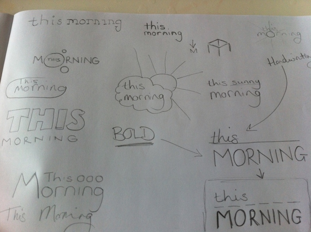
For the design process I thought about what this morning is and how it fits in with viewer’s lifestyles. I came back with the idea that ‘this morning’ can fit into many people’s lives through it’s different segments and that it works well because every day is different and the contents of each edition are varied.
With this in mind I began to look at a logo design taking past logos into consideration too.
I looked at current trends in design and colour to how these could be influence the design.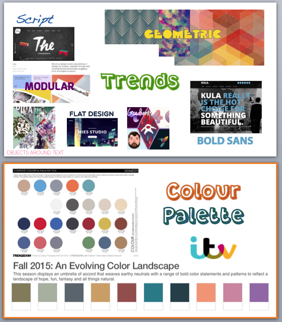
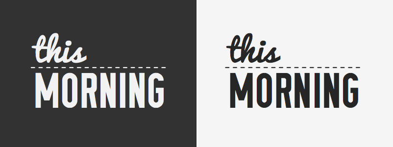
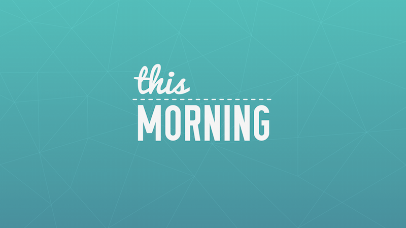
I settled on a logo using mixed fonts to represent the varied contents that could work well. Using a handwriting font to show the soft and friendly side of the programme and a capitalised sans font to represent the serious undertone that the programme can have whilst drawing a likeness to newspaper headlines.
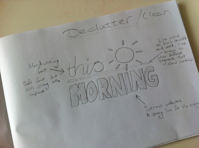
I added a line as a separator between the two styles and decided to break it up as a dotted line with the shortened lines representing the different segments that make up each edition.
I trialed many geometric patterns, but settled on a relatively simple design of thin lines to enhance a plain background, but not to detract from the logo. I wanted to make the design cleaner than the previous look. Adding an aqua colour gradient over these allows a subtle difference but keeps the image clean.
Moving on to programme graphics.
I looked at ways that the menu/recap could be displayed.
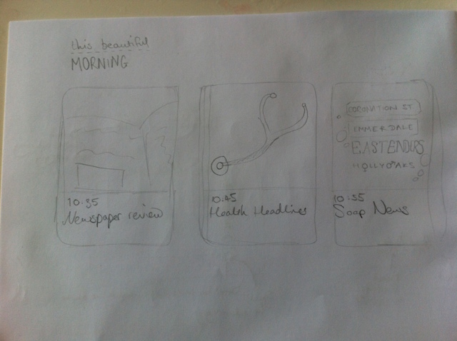
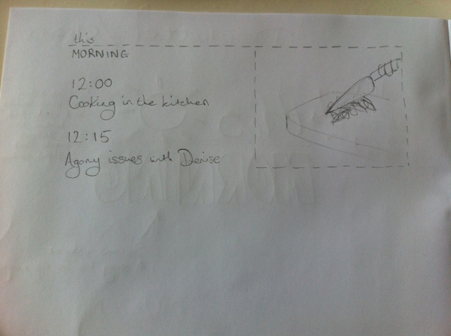
The design that I preferred uses the aqua background with a system extending the dotted line to create a box for images to display in.
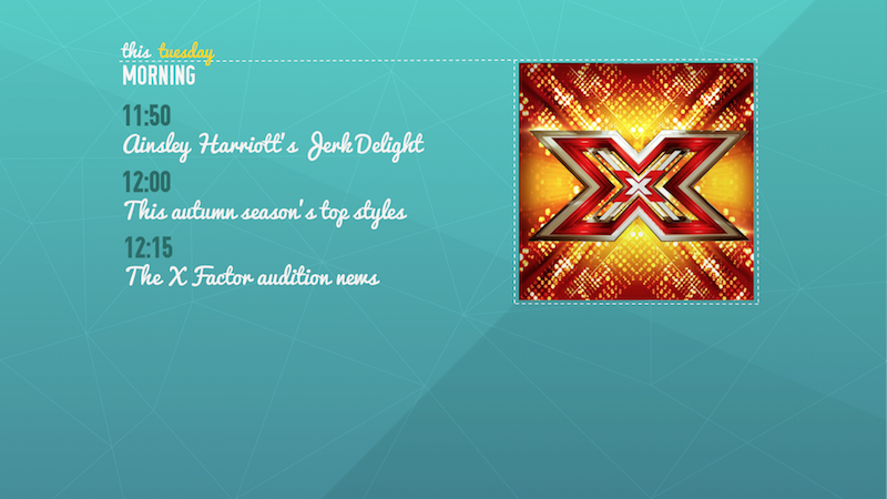
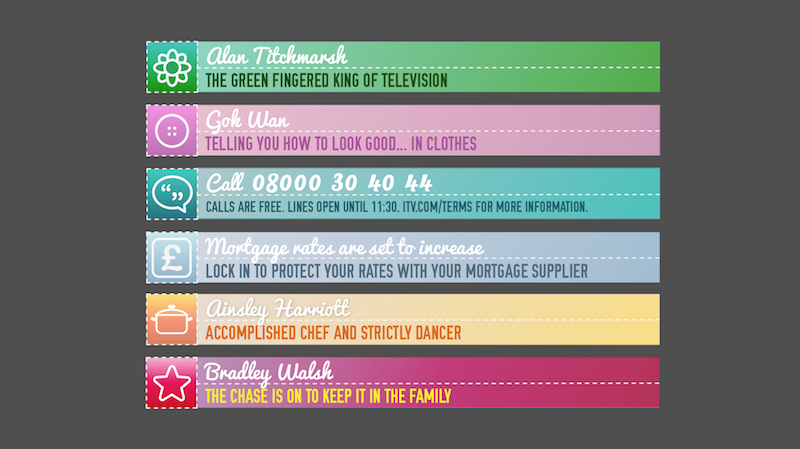
Looking at the name captions I looked at simple logo and line, adding a gradient and then at using the symbols similar to the current straps.
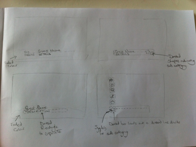
In the end I went with the symbol box and bar that could connect to the recap/menu and have used similar colouring to the current segment bespoke straps to keep familiarity.
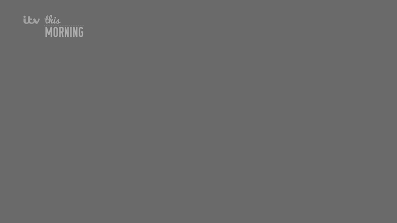
The DOG/Bug/On screen logo would appear to the right of the itv on screen over any pre recorded films/packages.
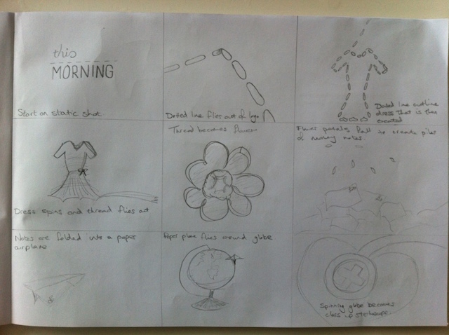
I’ve looked into ideas for titles and done rough storyboards into these.
The first uses the dotted line transforming into various forms to show how the different segments are linked together.
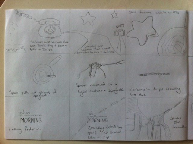
The second uses an idea similar to current but as an overview of a long dining table with tablets, photos, catalogues, magazines, cookbooks, first aid kits, newspaper, etc. laid out like a busy house could look and showing the different segments in the programme ending with a pull up from the table focusing on the TV with the logo appearing.

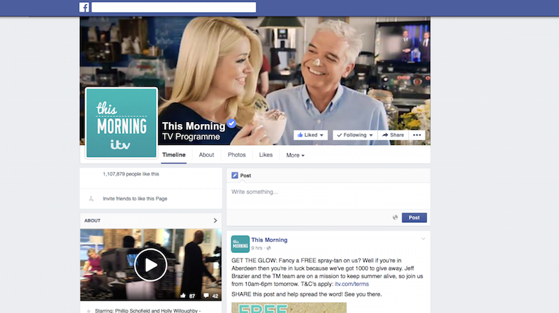
Finally I’ve looked at social media and how that change with a rebrand.
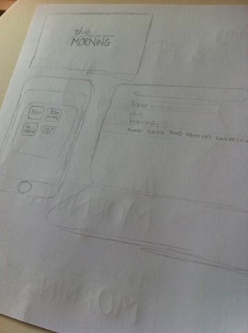
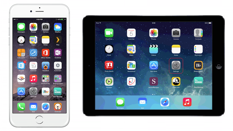
The images of iphone & iPad show the icon that could represent a This Morning app and how it would appear.
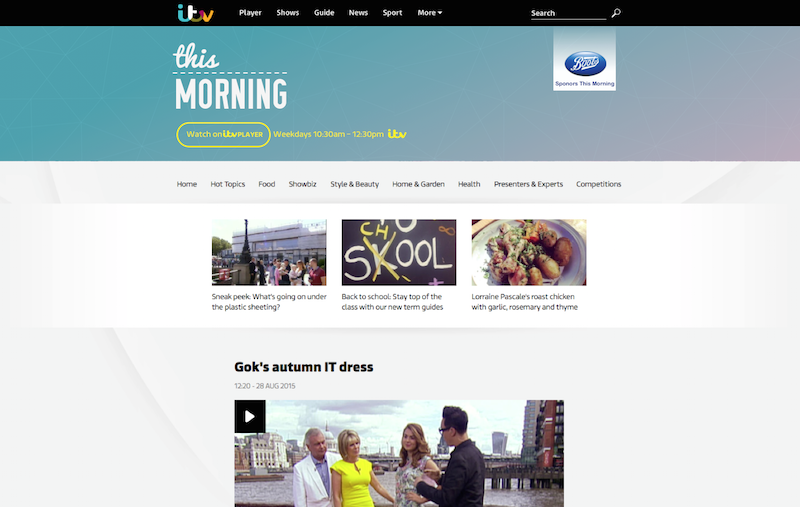
The website bar would change to reflect the change but would ultimately remain the bespoke ITV layout.
Twitter & Facebook would have new logos and photos added to their respected sites/apps to fully repositioned the brand.
Thank you for reading. As always your comments are welcome.
For the design process I thought about what this morning is and how it fits in with viewer’s lifestyles. I came back with the idea that ‘this morning’ can fit into many people’s lives through it’s different segments and that it works well because every day is different and the contents of each edition are varied.
With this in mind I began to look at a logo design taking past logos into consideration too.

I looked at current trends in design and colour to how these could be influence the design.

I settled on a logo using mixed fonts to represent the varied contents that could work well. Using a handwriting font to show the soft and friendly side of the programme and a capitalised sans font to represent the serious undertone that the programme can have whilst drawing a likeness to newspaper headlines.

I added a line as a separator between the two styles and decided to break it up as a dotted line with the shortened lines representing the different segments that make up each edition.

I trialed many geometric patterns, but settled on a relatively simple design of thin lines to enhance a plain background, but not to detract from the logo. I wanted to make the design cleaner than the previous look. Adding an aqua colour gradient over these allows a subtle difference but keeps the image clean.

Moving on to programme graphics.
I looked at ways that the menu/recap could be displayed.


The design that I preferred uses the aqua background with a system extending the dotted line to create a box for images to display in.

Looking at the name captions I looked at simple logo and line, adding a gradient and then at using the symbols similar to the current straps.

In the end I went with the symbol box and bar that could connect to the recap/menu and have used similar colouring to the current segment bespoke straps to keep familiarity.

The DOG/Bug/On screen logo would appear to the right of the itv on screen over any pre recorded films/packages.

I’ve looked into ideas for titles and done rough storyboards into these.
The first uses the dotted line transforming into various forms to show how the different segments are linked together.


The second uses an idea similar to current but as an overview of a long dining table with tablets, photos, catalogues, magazines, cookbooks, first aid kits, newspaper, etc. laid out like a busy house could look and showing the different segments in the programme ending with a pull up from the table focusing on the TV with the logo appearing.

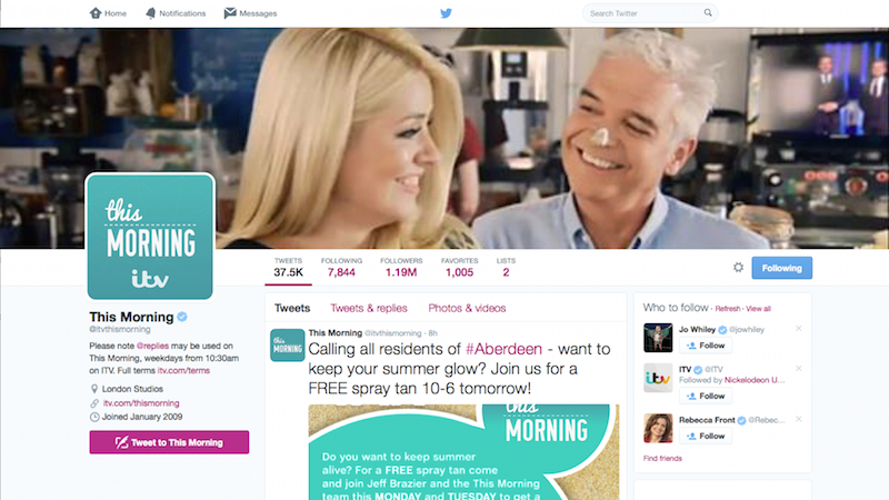
Finally I’ve looked at social media and how that change with a rebrand.

The images of iphone & iPad show the icon that could represent a This Morning app and how it would appear.
The website bar would change to reflect the change but would ultimately remain the bespoke ITV layout.

Twitter & Facebook would have new logos and photos added to their respected sites/apps to fully repositioned the brand.


Thank you for reading. As always your comments are welcome.
Last edited by fanoftv on 31 August 2015 1:08am
