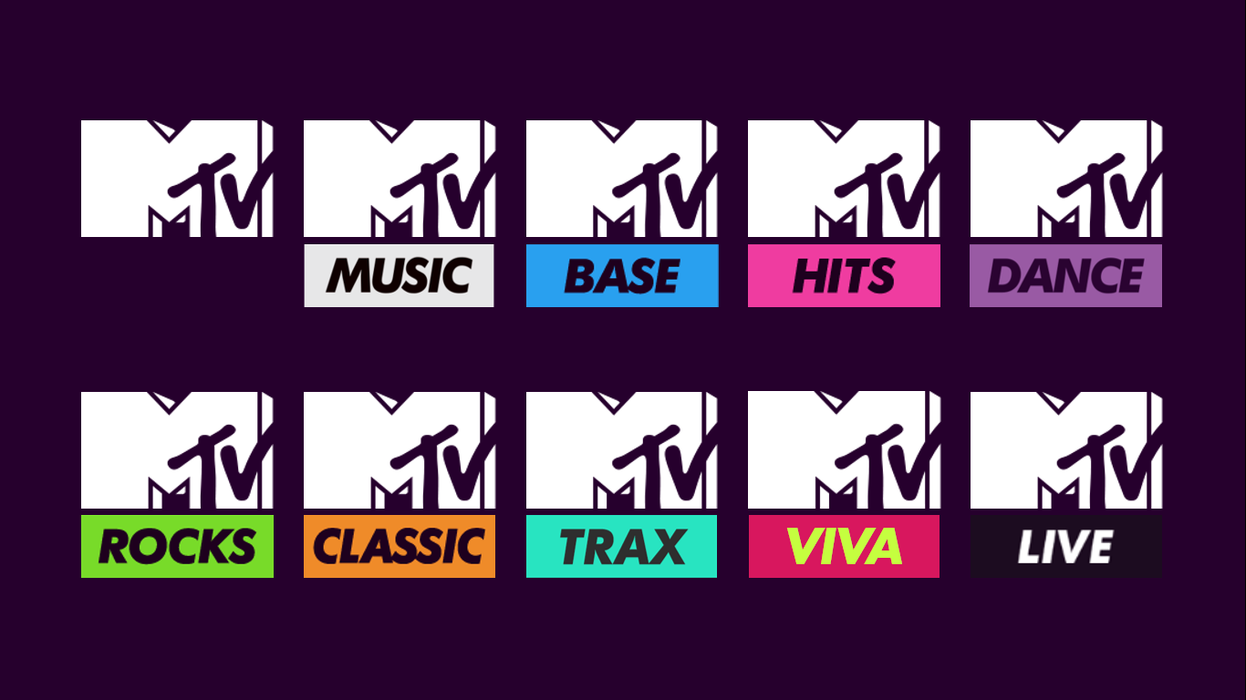
The Gallery

Viacom Channels Brand Refresh

MTV & Comedy Central (Includes 'The TV Forum Mixtape') (January 2016)

This site closed in March 2021 and is now a read-only archive
PA
PATV Scunthorpe
Bail posted:
Is there any point to this?


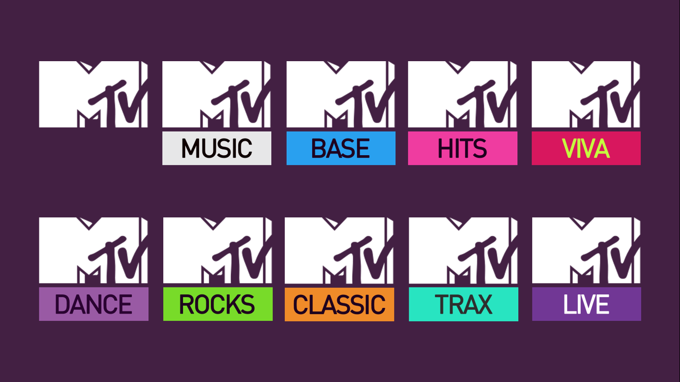
As you might be able to see there isn't actually a mock here yet, but there will be in time.

But for now, I want to ask if you could leave a response with your favourite song as with this information will help me with my mock.


I just want to say thank you to everyone who has left a reply as I have already started to use this information to help me with my mock
CO
Colorband
So what is it?

9 days later

PA
PATV Scunthorpe
Hi, this is the mock of which I asked for your favourite songs, I thought it would be a nice way to incorporate something that each individual member would like. (And if you don't like the graphics then you've at least got a song that you like)

If I any songs that are wrong then I apologise as quite a lot of the song ps I had never heard of before, so hopefully I have got them right.

PATV Scunthorpe, DavidWhitfield & Tantusar
MatthewFirth & tmorgan96
AddictedToTVPres & AgainWTheNorth
Neil Jones & UBox
AxG & coreyhughes
Multi & Anyone Who Didn't Vote

I'm in the process of making V2 which I'm probably going to use the current Futura Bold Italics font and quite possibly a different layout.

EDIT: Here are some early developments of this mock (these include new features and chromakeying)


https://vid.me/8X0m

Last edited by PATV Scunthorpe on 7 February 2016 12:12pm - 3 times in total
DW
DavidWhitfield
I really like these. I think the way the MTV logo, the explanatory programme text, the little genre box and the duration bar fit together on screen looks really smart, and I really like that the bar gets progressively further to the right as the song plays, giving you an idea how much longer it will be until the next track.

I really like the way the 'NOW' graphic animates, and the use of Gotham in this context, as well as the wide range of colours you have selected to denote each genre.

I personally very much appreciate, also, the fact you asked for members' song choices. It shows that you went the extra mile to provide a mock members would find pleasing.

Great job on the whole. A lot of work went into this.
JD
JDN
Nice that they've let you use the music videos for your mocks.
PF
PFML84
I like the graphics, simple and to the point, but can't forgive the use of Gotham! I'm sick of seeing it everywhere.

Also, not sure about the separate bar for showing how long the song has left. Perhaps that could be incorporated into the logo in some way instead? I'm also not a fan of text beside the logo. Too much clutter on the screens is a big problem with music channels. Better to make it as plain as possible I think.
PA
PATV Scunthorpe
pad-e posted:

Also, not sure about the separate bar for showing how long the song has left. Perhaps that could be incorporated into the logo in some way instead? I'm also not a fan of text beside the logo. Too much clutter on the screens is a big problem with music channels. Better to make it as plain as possible I think.

I thought of making the progress bar in the logo I'll do than next time (the progress bar was featured in the 2009 and 2011 rebrands and the 2009 version was almost like mine (the 2011 was quite thin))
As I said I'm workin with the current Futura Bold Italics as well I think I'll do a couple of different song display styles and let you choose

2009: *
If playing music videos the white section of the dog acted as the progress bar slowly wiping a bar in from the side

2011: *
Last edited by PATV Scunthorpe on 8 February 2016 4:51pm - 2 times in total
PA
PATV Scunthorpe
Here is another idea for graphics featuring Futura Bold Italics this time (this is the last one i'll make as a video, I made it just to also show off how the MTV logo could act as the progress bar.)
Last edited by PATV Scunthorpe on 9 February 2016 5:05pm
BR
Brekkie
Really nice effort - retains the information music channels generally insist on but in a much more subtle way.
PA
PATV Scunthorpe
Really nice effort - retains the information music channels generally insist on but in a much more subtle way.

As you may see in the little thumbnail, I'm also going to "rebrand" VH1 and Viva, VH1 becoming MTV Trax and Viva becoming MTV Viva

*
JamesTV and DavidWhitfield gave kudos
PA
PATV Scunthorpe
Ok, I lied I made another video as I feel a screen cap doesn't really put forward the same effect. But a couple of things I have already noticed (after I rendered the video) are that the song titles and album text are 1 pixel too high, you can just see them over the now box. I have also noticed that the MTV logo progress bar is out of line (I must have accidentally moved the logo on the PowerPoint) and that the MTV progress bar doesn't fade off at the end. But either way the animations have turned out well. I think this looks rather like the current graphics but gives it a nice 2016 refresh.

Just one more thing, I'm not going to bother to try and get rid of any expletives that may be in the songs as its would waste my time and the odd swear he and there won't matter, and it's not as if people haven't responded with them before. Smile

10 days later

PA
PATV Scunthorpe
MTV 2016 Brand Refresh

The main ideas for this were based off of videos showcasing the previous two refresh's


The Previous Rebrands/Refresh's
So, I started off with a screen grab off of one of the videos above (then added my idea to the bottom after creation)
*

Exploring Typefaces
I then started to explore typefaces, all of the typefaces on the image I tried to use as a main typeface, but I found that FF Din was the best and I wanted to ignore using Futura as the main typeface as it is currently being used.
*

Channel Logos
I basically took the logos from a couple of posts back and adapted them with FF Din.
*

Channel Layout
I then started to see how the channel was going to look on screen, taking inspiration from the videos at the top of this post, I created a template from which the text and boxes would be placed. The layout and look is more influenced by the 2011 Brand Refresh but retains some features of the 2013 Brand Refresh
*

Then the lines can be taken away
*

Examples of Channel Layout

Here are the animations of the programme text and the song text (one with and one without the countdown number)

EDIT: Just noticed that some of the bars can be seen underneath, these have only appeared after the export from PowerPoint and didn't show up in either edit mode or slide show mode

EDIT 2: Fixed on next page


This isn't the full project, but it's the main aspects of the project.
Hopefully you can suggest the ways in which the mock is good and how I could improve. Smile
Last edited by PATV Scunthorpe on 20 February 2016 1:01pm - 2 times in total

Newer posts