IN
I think the font is quite similar with "Bahnschrift Bold" one, and all caps.
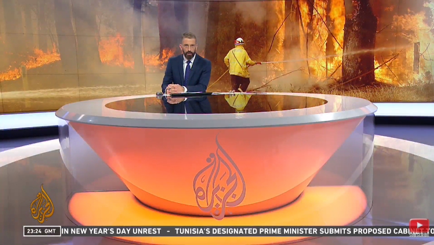
Not really seeing a lot of change. The videowall looks a little different, maybe a bit longer, but not that noticeable really.
The music has evolved, and is a bit stronger than the original.
The lower thirds are definitely longer, 16:9 friendly rather than 4:3 friendly.
The graphics seem to be an evolution of the originals.
The one ident we've seen so far somewhat reminded me of BBC2's idents.
It seems that they have decided to add a standup position, and that actually seems to work.
The desk looks bigger, but not that significantly different. Still circular, and still using orange lighting. In fact orange still remains as a signature colour.
Is it me, or are the lower thirds Arial Rounded?
I think the font is quite similar with "Bahnschrift Bold" one, and all caps.
NY
I believe the fonts are from the DIN family
Not really seeing a lot of change. The videowall looks a little different, maybe a bit longer, but not that noticeable really.
The music has evolved, and is a bit stronger than the original.
The lower thirds are definitely longer, 16:9 friendly rather than 4:3 friendly.
The graphics seem to be an evolution of the originals.
The one ident we've seen so far somewhat reminded me of BBC2's idents.
It seems that they have decided to add a standup position, and that actually seems to work.
The desk looks bigger, but not that significantly different. Still circular, and still using orange lighting. In fact orange still remains as a signature colour.
Is it me, or are the lower thirds Arial Rounded?
The music has evolved, and is a bit stronger than the original.
The lower thirds are definitely longer, 16:9 friendly rather than 4:3 friendly.
The graphics seem to be an evolution of the originals.
The one ident we've seen so far somewhat reminded me of BBC2's idents.
It seems that they have decided to add a standup position, and that actually seems to work.
The desk looks bigger, but not that significantly different. Still circular, and still using orange lighting. In fact orange still remains as a signature colour.
Is it me, or are the lower thirds Arial Rounded?
I believe the fonts are from the DIN family
CH
That was exactly the first thing I said to myself. The use of the font DIN dates the whole look as if it’s all from circa 2012.
So far, the fact that it’s not too much of a radical departure from the previous look is probably a good move, but then it begs the question why they touched a single thing in the first place. I usually don’t say that, but the outgoing look aged so well.
My favorite thing that’s different might be the picture-in-picture effect for guests - that’s cool.
It's all very nice but would make sense as an evolution if it came 6 years into the launch. 13 years after, it just feels the same.
That was exactly the first thing I said to myself. The use of the font DIN dates the whole look as if it’s all from circa 2012.
So far, the fact that it’s not too much of a radical departure from the previous look is probably a good move, but then it begs the question why they touched a single thing in the first place. I usually don’t say that, but the outgoing look aged so well.
My favorite thing that’s different might be the picture-in-picture effect for guests - that’s cool.