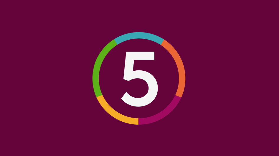
I have tried my original idea but now have used the 1997 Channel 5 logo and made the circle a whole rather than with spaces separating each colour. I also like the rough edges look the original C5 logo had.
Again, cheap and nasty, this is just to give you an idea of what I mean.
Yes, I think that looks a lot better than the rounded one. I am not a fan of the current chunky 5 used on screen. Have you thought about making the circle smaller and not having spaces between each colour? I also think swapping the green and purple segments around would look better. I don't think orange and purple beside each other looks right. I don't know why, it just doesn't!
Are you working on end boards, animations, menus etc as well for this mock? Would be great to see what you can come up with. I think you have the logo pretty well sorted.
I may adjust the blue as it blends too much with the green.
I must admit that I'm not the biggest fan of this new font and ring that I am going down as I feel like I'm now just recreating a 90's brand. We'll see how it goes next.
I really like the thicker design (the latest one) although I also like the idea you have with the designs being more embedded in the background as shown in your first post on this page.
I can't say for sure but you'll know, are all your colours given equal segments? I wouldn't love worry too much about have the colours in the correct order, I would have a standard logo that is used for branding like on buildings and would allow the on-screen graphics the flexibility to change the order - the wood group rebrand is what I am thinking of.