The Gallery

TLC Rebrand

Larger than life. Which, of course, means large text. (December 2018)

This site closed in March 2021 and is now a read-only archive
WH
what
Hello everyone.
It was around six months ago that I stumbled across TLC for the first time. My first impression of it was that it felt cheap, in more than one way. And no, it wasn’t the stars of the network, attention-grabbing though they are. Nor was it all those wedding dresses.

Overwhelmingly, it was the presentation. Poor colour matches, invisible text, bland fonts. It looked like something a child would make. Except with a font that doesn’t come preinstalled with PowerPoint.

So I decided to have a go at tidying it up. After months of sketching and mockups, this is what I came up with.

*
This is the logo. Based on the old, which was first used in the early 90s, when the channel was known as The Learning Channel.

*
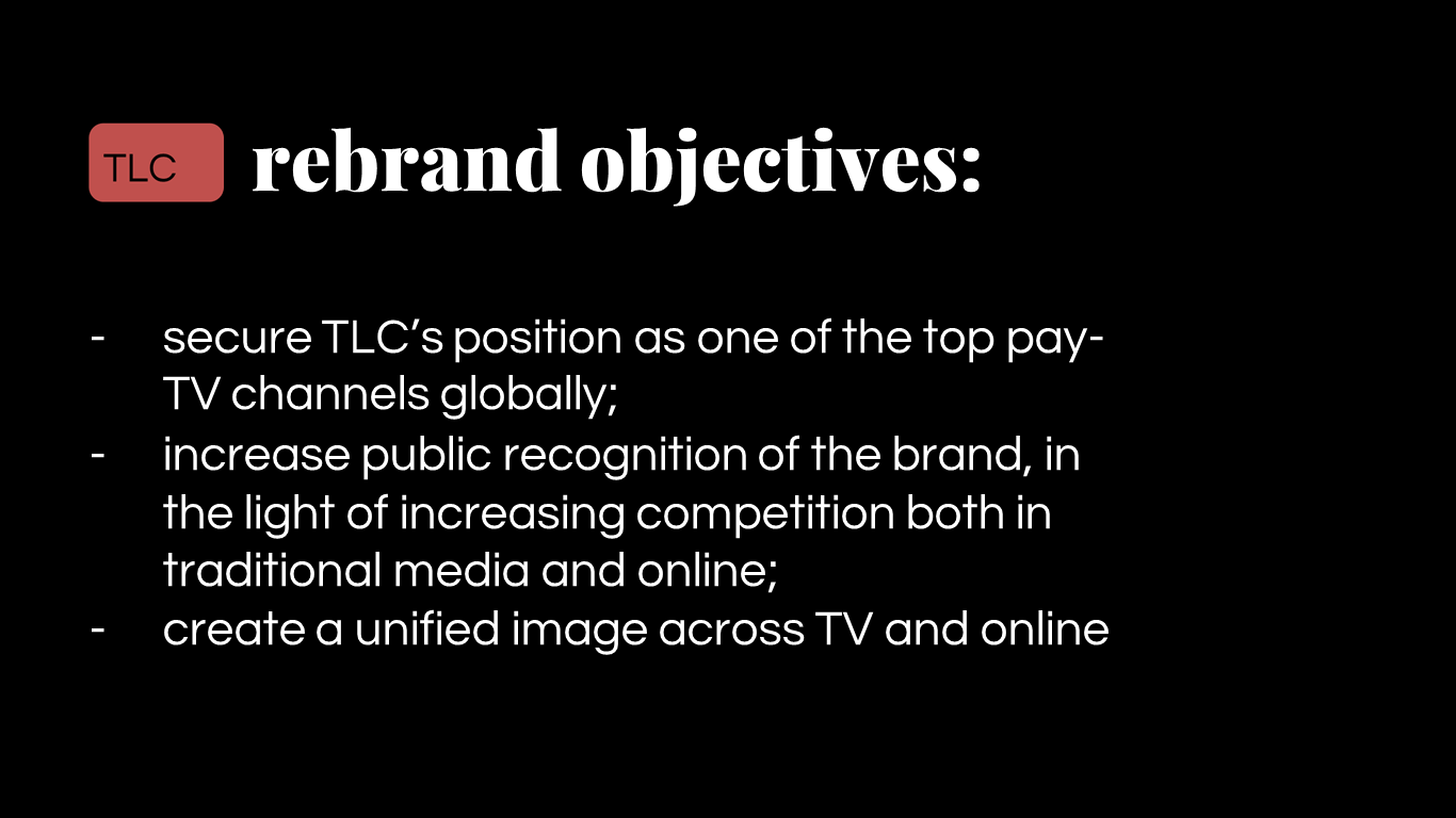
With every rebrand, you need to have reasons. Made-up, marketing speak type reasons, but reasons all the same.

*
*
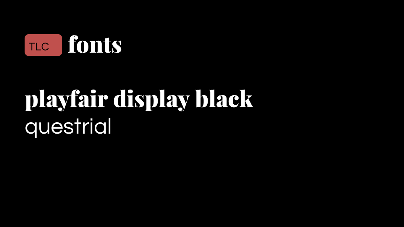
As a wise man once said, typography makes all the difference. This pairing worked surprisingly well together, and no, they weren’t preinstalled.
*
*
*
*

*

That’s it from me.
Hope you like it!
Last edited by what on 1 January 2019 3:11pm - 3 times in total
NJ
Neil Jones Founding member
Its a bit uninspiring really, a thin TLC off-center in a pink box when everything else on the screen is twice the size in the first place.

It should probably speak volumes when the "rebrand objectives" thing is far more attention grabbing than the tiny little pink box you've put next to it.
Ittr, lukeshep and BBI45 gave kudos
WH
what
Its a bit uninspiring really, a thin TLC off-center in a pink box when everything else on the screen is twice the size in the first place.

It should probably speak volumes when the "rebrand objectives" thing is far more attention grabbing than the tiny little pink box you've put next to it.

Thanks for the feedback!
I’ll see what I can do to make it stand out a bit more.
DB
dbl
Sorry, but this isn't at all great. It's very uninspiring and isn't an improvement on TLC's current logo or OSP. It looks like it was chucked together with a lot of alignment issues.
orange, Ittr and lukeshep gave kudos
JO
Joe
I don’t mind the logo, typography or colour choices, but don’t really like where you’ve taken it.

I would suggest that the success of this would rely on an underlying grid or layout system, and in how it animates.

If you can develop it with these in mind, I’d be interested in seeing more.
WH
what
Thanks for the feedback everyone!

Neil Jones - I will try and have a look at the logo.

dbl - To each their own. I’m all ears if you have suggestions on how to improve. One thing you did mention were the alignment issues, which are a problem I need to tackle.

Joe - This was developed with the intention of animating, and I will take some time to experiment with it.

I should be back with an update soon. The logo in particular I want to finalise before I look at anything else.
AG
AxG
Just to add my thoughts to this, but maybe choose a red, green and blue that's not on the top default colour menu on the Office suite.

Also try using a ligature and 'é' for '90 Day Fiancé', making it look neater.
*
WH
what
AxG posted:
Just to add my thoughts to this, but maybe choose a red, green and blue that's not on the top default colour menu on the Office suite.

Also try using a ligature and 'é' for '90 Day Fiancé', making it look neater.
*

ligatures are only supported in Word, and they seem unwilling to change that.
WH
what
OK, so I've made a few changes. The main one you'll notice is that I've changed the fonts and swapped them around. There is now a wider and less restrictive colour palette. And the logo has been revised.

*
*
*
*
*
*

Hope you like the changes!
OR
orange
I was going to say that I like what you’re trying to do with the logo but Cubano as a font doesn't work here at all… please play with the spacing and kerning because it doesn’t look right. Looking now at your promoboards, those two fonts do not go great together and as a result it looks garish. All caps and all lowercase smashed up together is looking very cheap - something you set out to fix, but you’ve made it worse. Keep trying though. What programs are you using? If it’s the office programs - nip that in the bud now, because then you’re using a keynote software to do design work... That’s like trying to use a piano to write word documents, it’s not going to work if you want decent results!
Last edited by orange on 1 January 2019 9:42pm - 2 times in total
WH
what
_Tom_ posted:
I was going to say that I like what you’re trying to do with the logo but Cubano as a font doesn't work here at all… please play with the spacing and kerning because it doesn’t look right. Looking now at your promoboards, those two fonts do not go great together and as a result it looks garish. All caps and all lowercase smashed up together is looking very cheap - something you set out to fix, but you’ve made it worse. Keep trying though. What programs are you using? If it’s the office programs - nip that in the bud now, because then you’re using a keynote software to do design work... That’s like trying to use a piano to write word documents, it’s not going to work if you want decent results!

1) the font is Barlow Black, not Cubano.
2) what software would you recommend?
OR
orange
Cubano or not - it’s ugly. I think you’re only starting out so perhaps use the free software GIMP and see where you go from there. Graphic designers tend to use the Adobe creative suite, you can try a free trial of that if you want to get stuck into some proper software. To have the full version however it’s quite pricey, although when I was younger there were ways you could get it free which is what everyone usually did, I’m not endorsing that though. Wink
DeMarkay and lukeshep gave kudos

Newer posts