AJ
<< Jump to 1st Update >>
<< Jump to 2nd Update >>
<< Jump to 3rd Update >>
I was going to embark on a Good Morning Britain mock, but seeing as the site is full of those at the moment, I didn't really want to add to that! So...
Bid relaunched last week as "Shop at Bid" with a graphic set which looks like it has been designed by a five year old. I mean, seriously, what IS that logo all about?! It belongs in the crap logos drawer in Room 101.
So, the aim here was to be more of an evolution of the previous graphics set rather than a wholesale relaunch like they have done...
Logos

I wanted to nod back to the past history of the channels with a flash of the previous colours, whilst going with something not a million miles from the previous logo. These channels have been around for over a decade, and the colours are well associated with the channels. Seems silly to break away completely (although I do understand that they have probably done so because what the channels are now is a world apart from what they were.
Screen Furniture
Again, nothing too radical - more of a refinement of what they have now got - polished up a bit, and used something different to Tahoma (it looks like that's what they're using now).
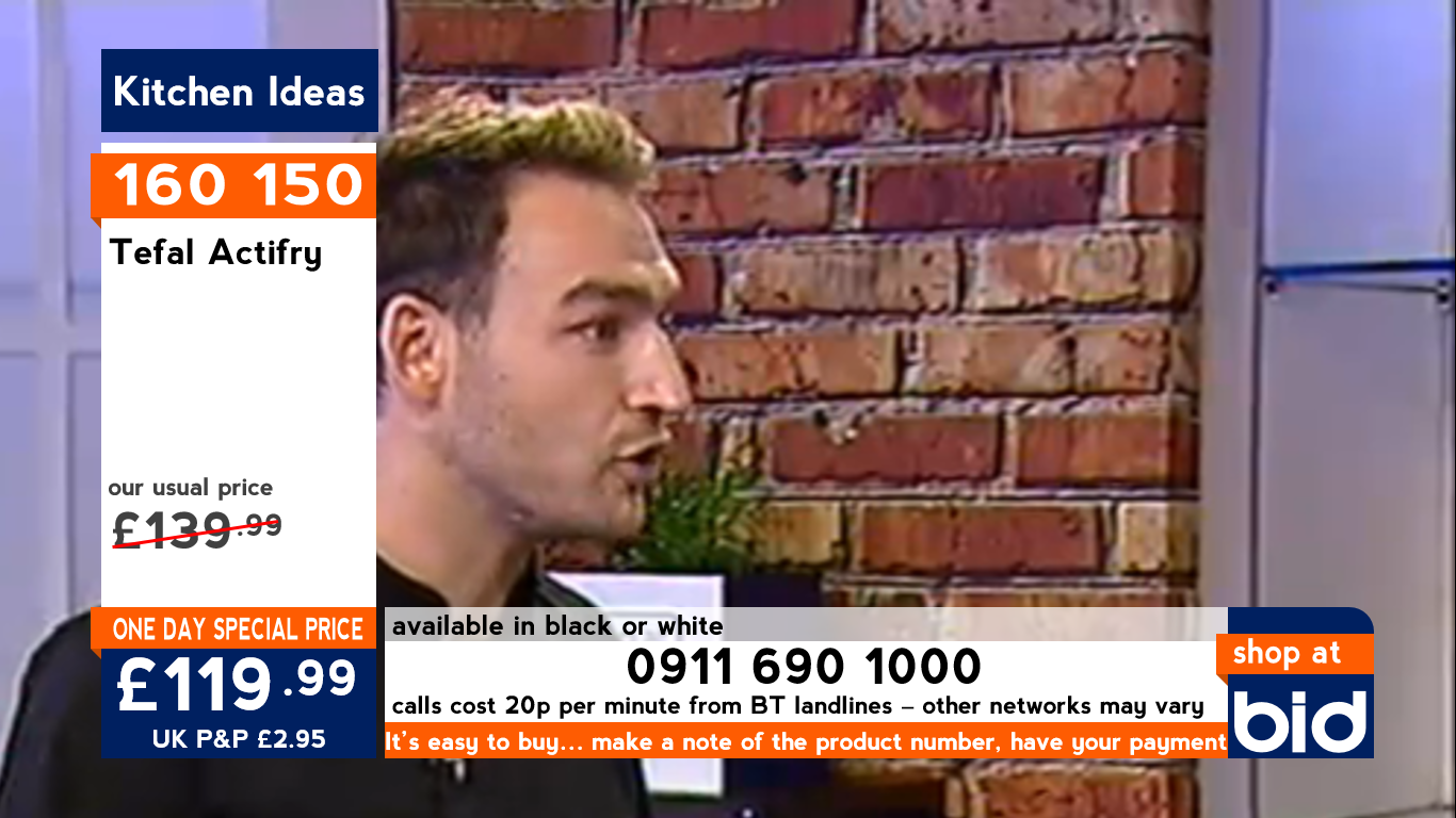
This one shows the One Day Special graphics for Shop at Bid. Something which is glaringly missing from the current graphics is the usual price. If it's a special price, then you need to show why - even if it is only 20 quid. Again, the flash of orange just nods to the past history of the channel, and the navy blue moves it on just a bit.

Much the same for Best of Bid. It was Price Drop (which I gather will be going at the end of the Spring Clearance fire sale event), so the colour here is purple - just nodding back to what the channel was. These graphics show what the channel would look like for day to day products (i.e. not specials).
Like I said, nothing radical - just a polish of what they have now. Something a bit more consistent across both channels whilst not throwing all of the previous brand away.
<< Jump to 2nd Update >>
<< Jump to 3rd Update >>
I was going to embark on a Good Morning Britain mock, but seeing as the site is full of those at the moment, I didn't really want to add to that! So...
Bid relaunched last week as "Shop at Bid" with a graphic set which looks like it has been designed by a five year old. I mean, seriously, what IS that logo all about?! It belongs in the crap logos drawer in Room 101.
So, the aim here was to be more of an evolution of the previous graphics set rather than a wholesale relaunch like they have done...
Logos
I wanted to nod back to the past history of the channels with a flash of the previous colours, whilst going with something not a million miles from the previous logo. These channels have been around for over a decade, and the colours are well associated with the channels. Seems silly to break away completely (although I do understand that they have probably done so because what the channels are now is a world apart from what they were.
Screen Furniture
Again, nothing too radical - more of a refinement of what they have now got - polished up a bit, and used something different to Tahoma (it looks like that's what they're using now).
This one shows the One Day Special graphics for Shop at Bid. Something which is glaringly missing from the current graphics is the usual price. If it's a special price, then you need to show why - even if it is only 20 quid. Again, the flash of orange just nods to the past history of the channel, and the navy blue moves it on just a bit.
Much the same for Best of Bid. It was Price Drop (which I gather will be going at the end of the Spring Clearance fire sale event), so the colour here is purple - just nodding back to what the channel was. These graphics show what the channel would look like for day to day products (i.e. not specials).
Like I said, nothing radical - just a polish of what they have now. Something a bit more consistent across both channels whilst not throwing all of the previous brand away.
Last edited by AJ on 6 April 2014 7:25pm - 3 times in total


