CR
So, we all know that UTV have old and some-what dated branding. Whilst they tried to make it feel fresh by making elements of it 3D earlier this year, it is, in effect, the same look that they launched in 2003. Constant shots of the countryside, accompanied by things like 'U Study', don't help, in my opinion.
In my mock, I've tried to modernize UTV, with a new, simple logo, and, hopefully, a nice graphics package.
So, first, the logo:
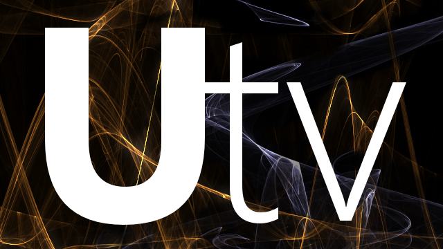
Apologies for the background - it was against my better judgement. Varying weights make the most of this.

The DOG is very small and hard to see... A good thing!
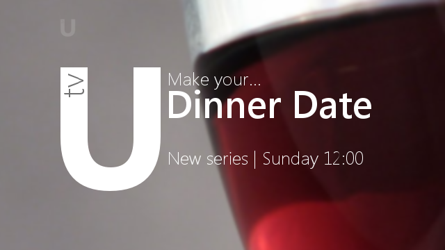
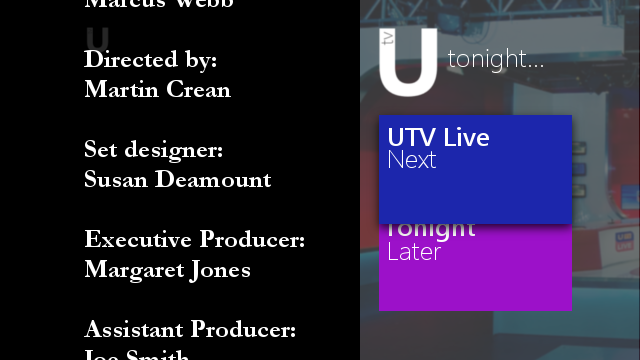
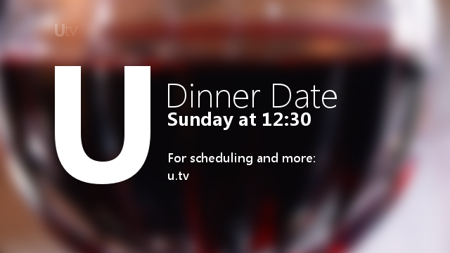
Second, some promo endboards. I'll add more elements of the package in later, but for now:
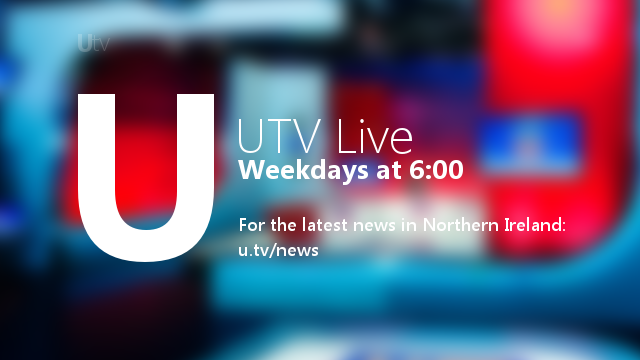
- The UTV Live studio is the blurred image behind this. A relevant, blurred image would be behind the endboard.
_____________________
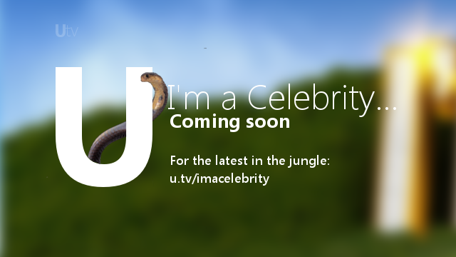
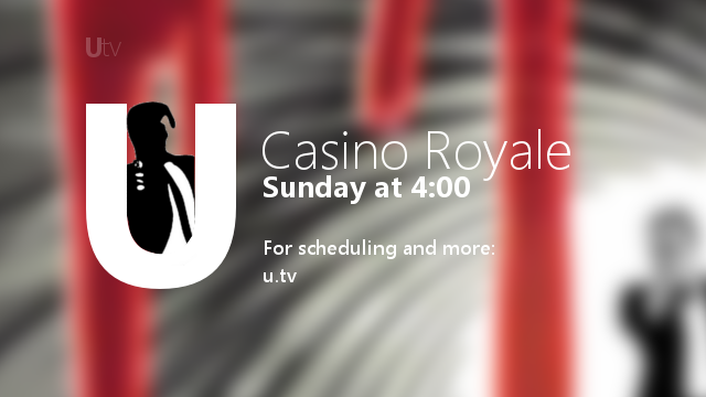
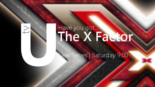
The second variation includes something from the programme interact with the UTV logo, along with the programme related image. So, in the above, there's a Snake, loosely related to I'm a Celebrity, and the James Bond silhouette.
That's it so far! I look forward to your comments, and hope to expand on this soon. I've aimed to make everything readable and simple, yet without looking all that bad.
In my mock, I've tried to modernize UTV, with a new, simple logo, and, hopefully, a nice graphics package.
So, first, the logo:
Apologies for the background - it was against my better judgement. Varying weights make the most of this.
The DOG is very small and hard to see... A good thing!
Second, some promo endboards. I'll add more elements of the package in later, but for now:
- The UTV Live studio is the blurred image behind this. A relevant, blurred image would be behind the endboard.
_____________________
The second variation includes something from the programme interact with the UTV logo, along with the programme related image. So, in the above, there's a Snake, loosely related to I'm a Celebrity, and the James Bond silhouette.
That's it so far! I look forward to your comments, and hope to expand on this soon. I've aimed to make everything readable and simple, yet without looking all that bad.
Last edited by Critique on 10 July 2011 5:37pm - 3 times in total