The Gallery

price drop - updated

Studio Recreation (February 2012)

This site closed in March 2021 and is now a read-only archive
JA
james
PLEASE NOTE : THE IMAGES BELOW ARE 100% UNOFFICIAL AND ARE NOT CONNECTED TO price drop / bid / speed auction OR bid shopping IN ANY WAY.

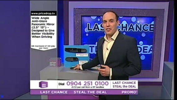
I have been working on and off for a short while now recreating the current price drop studio which will be scrapped at the end of this month. Trying to get the set as accurate as possible I have included things like the projector cube joins and the out of sync brightness settings.

Below on the image everything was created from scratch including the price drop logo and even the coming up graphic.

*

*

*

*

*

*

*

*

I know this mock won't be everyone's taste as some people can't stand anything shopping tv related, but if you can - enjoy! Smile
Last edited by james on 10 February 2012 10:22pm - 2 times in total
CR
Critique
Ah, so this is another of this endangered species that is a good SketchUp mock, eh? Wink

A very nice effort James! You've paid attention to detail, for a start, and leading on from that, you have spent more than five minutes on it... Await TVMockery14 and Raheem11 to say they don't like it, though.

Nice touches with the brightness issues on the screens, etc.
DF
DrewF
Nice effort!

I think it would look nicer with some texturing - such as the lighting around the edge of the larger screens, and perhaps a reflection in the flooring (best way to do that is to copy the entire studio, flip it upside down, attach it to the underneath of your studio and make the floor very slightly transparent) but overall, I like Wink
AG
AxG
Complete with badly calibrated screens as well. Laughing
BA
baa
Eh, I don't like it. The subject matter is as anally retentive as any Daybreak mock could hope to be and its still not great no matter how much effort you put into making screens be totally accurate. Nice touch yes but eh, it's a set mock, set mocks seem to be determined to be terrible no matter who is making them.
BA
bilky asko
DrewF posted:
[...]and perhaps a reflection in the flooring (best way to do that is to copy the entire studio, flip it upside down, attach it to the underneath of your studio and make the floor very slightly transparent) but overall, I like Wink


Whatever you do, don't listen to this suggestion.
SR
SomeRandomStuff
I'm not a fan of these Sketchup mocks.

However, looking at this, It seems to be VERY close to the dimensions of the actual set. An Impressive recreation IMHO.

Where the "Daybreak"s of the world would have just slapped any old crap together, this is on the way to being superb.

James, have you any plans to render these in a higher quality? These would look even more impressive if the surfaces had texture.
DF
DrewF
DrewF posted:
[...]and perhaps a reflection in the flooring (best way to do that is to copy the entire studio, flip it upside down, attach it to the underneath of your studio and make the floor very slightly transparent) but overall, I like Wink


Whatever you do, don't listen to this suggestion.


What would you suggest? Looks fine, and it's as close as you will get without a proper render.
VM
VMPhil
Isn't it amazing not just what technology can do, but what people can do with that technology.

Meanwhile, however...
RO
rob Founding member
What a welcome change from the crap filling this board. As always, well done James.
Last edited by rob on 5 February 2012 7:38pm
SK
Sky786
Ah, so this is another of this endangered species that is a good SketchUp mock, eh? Wink

A very nice effort James! You've paid attention to detail, for a start, and leading on from that, you have spent more than five minutes on it... Await TVMockery14 and Raheem11 to say they don't like it, though.

Nice touches with the brightness issues on the screens, etc.


I think you'll find, I have never said to anyones mocks that I dislike them.

Raheem786
BA
bilky asko
DrewF posted:
DrewF posted:
[...]and perhaps a reflection in the flooring (best way to do that is to copy the entire studio, flip it upside down, attach it to the underneath of your studio and make the floor very slightly transparent) but overall, I like Wink


Whatever you do, don't listen to this suggestion.


What would you suggest? Looks fine, and it's as close as you will get without a proper render.


I'd suggest leaving it alone as the price drop studio floor is painted and reflects very little. Also, it means future edits will have to be duplicated in the reflection. Thirdly, it would doubtless look awful.

EDIT: Here's a shot of the studio itself:

*
Last edited by bilky asko on 5 February 2012 11:59pm

Newer posts