LU
Ok, so this is my first mock on the forum. I quite like BBC Sport's current branding, and definitely believe that it could be the basis of a consistent BBC rebrand. I have used the Titillium font, as I do not have a copy of BBC Reith. I'm happy so far with my design, and constructive criticism is welcome.
The logos:
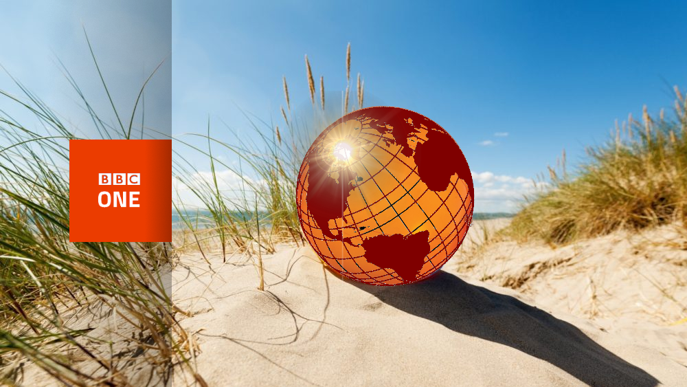
As for BBC One, my idea is that you could have a beach ball globe, or a globe football being kicked around a pitch.
BBC One Regional Ident:

BBC Two would keep the current idents, just with the new logo placed to the side.
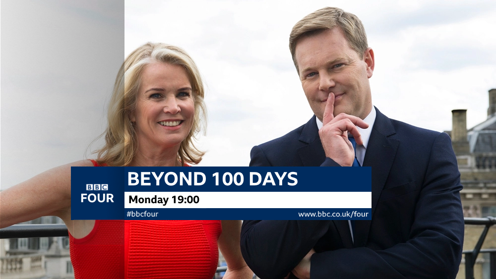
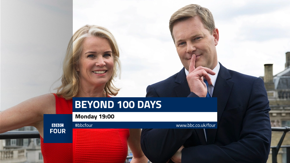
My idea for BBC Four would be time-lapse shots of different locations, with one half of the shot being day, the other being night.
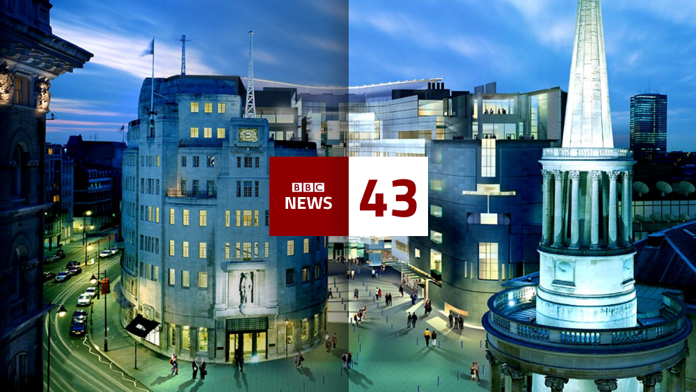
BBC News would use shots of current news stories (à la Channel 4 News), finishing with a shot of Broadcasting House.
The news at 1, 6, and 10 would finish on a shot like this:
The news countdown would be a time-lapse shot of Broadcastring House, with the logo and countdown numbers over it.
Endboards:
Menus:
Let me know what you think!
The logos:
As for BBC One, my idea is that you could have a beach ball globe, or a globe football being kicked around a pitch.
BBC One Regional Ident:
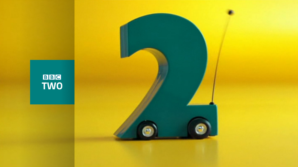
BBC Two would keep the current idents, just with the new logo placed to the side.
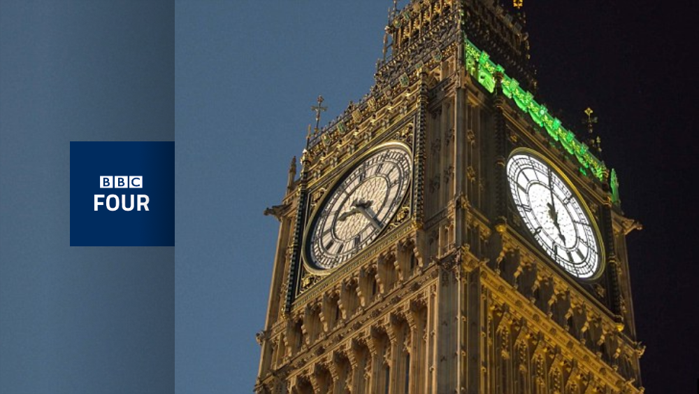
My idea for BBC Four would be time-lapse shots of different locations, with one half of the shot being day, the other being night.
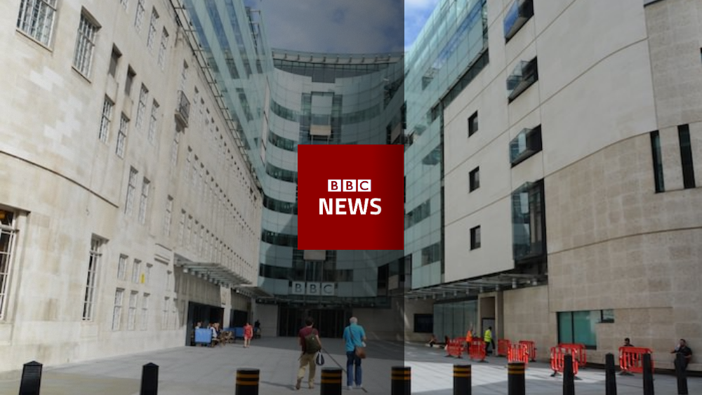
BBC News would use shots of current news stories (à la Channel 4 News), finishing with a shot of Broadcasting House.
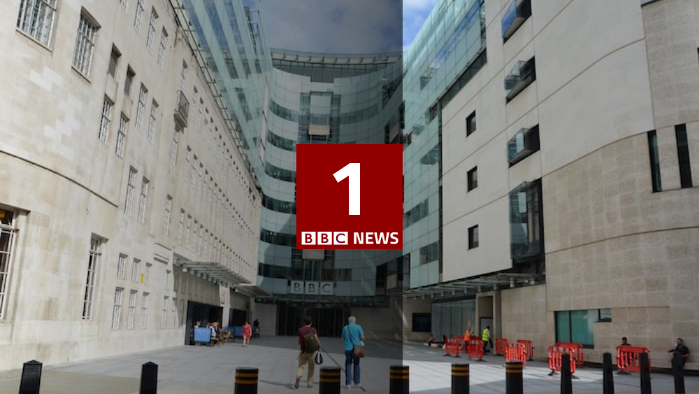
The news at 1, 6, and 10 would finish on a shot like this:
The news countdown would be a time-lapse shot of Broadcastring House, with the logo and countdown numbers over it.
Endboards:
Menus:
Let me know what you think!