Who knows how long this has been in my system waiting to be done. Just finished it today. The problems where the size and position of the UK map, my source video being stretched, colour and specular of the globe, and the rings. Well it's all done now.
Big hand to Lambie-Nairn for making the BBC memorable with its graphics
Last edited by Jimmyson on 19 November 2011 6:15am
Excellent - usually clips of these things are 4:3 and very poor quality, so it's nice to see a recreation of it so sharp and to see the detail in it. Well done!
All these years and I've never noticed the slanted UK map underneath the globe.
Excellent recreation, although I agree the 'C' isn't the right thickness, and I think the oscillating words faded a bit more to the left and right of the screen (the first line at least) looking from that screenshot above.
Thanks for the wonderful feedback. I have made some slight improvements to the video, but now that the thin "C" has been brought to my attention, I will have to use another SVG graphic to replace my so called "Placecard"
I had started this some 8 months ago, (or longer), but dropped it because I thought that a rough copy was my better version.
I do wish their was a script for the Oscillating words, that would so make our work easier. The words were done as a single comp, then multiplied and offset in time and position.
Now that I am planning to recreate the title sequence, it will take some time, but I have a start. (Can someone give advise of the rotating, axis-spinning and stretching of the oval in the titles?) 0:23
Uploaded by: jamej
And as a side-note the track used on the clip was actually the "News Summary Close" not "Open". Now theres something that must be tracked down.
Um, make the cream background and oval on one comp, set the oval to silhouette alpha and als the shadow layer to the same, then put this into another comp with the red background/globe devices...
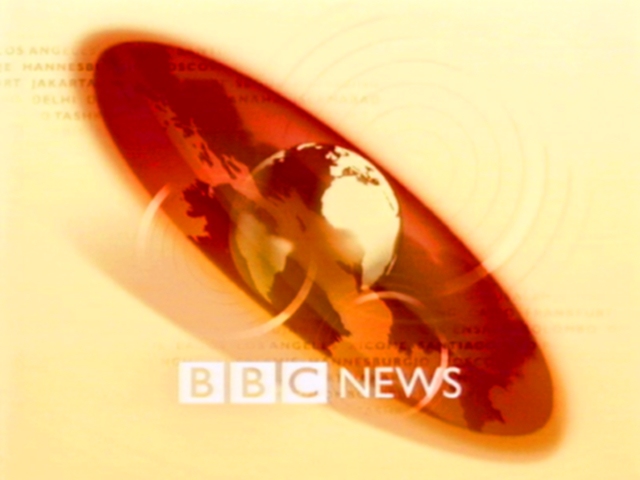
Awesome effort so far. Just one tiny bit of feedback - instead of actual place names, it looks like you've got 'BBC NATIONAL NEWS' text scrolling across every line; on the real title sequence, these were of course actual place names as you can see here:
If you're a real stickler for detail, locations such as Johannesburg, Jakarta, Los Angeles, Delhi, Tashkent, Santiago, Moscow and Panama are visible (to varying degrees) in this particular slide.
Aside from that, it's really impressive so far. Keep up the good work.