UPDATE V1.1
Right then, I'm back with an update for this mock. If you don't want to see a mock for an original idea then simply don't look at it.
It's been a while since I last added to this so I thought I would show you some things I've been working on (some changes based on previous feedback), before I post a larger update sometime in the next month or so.
1)
I've sorted the logo, it now looks less "cut out"

and I've also created logos for the 3 main elements of the show (Sport, Technology & Showbiz).
 2)
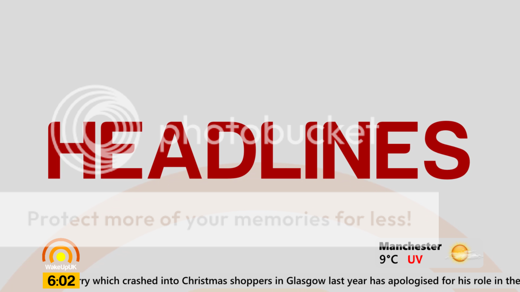
2)
I've now moved the graphics in front of the transitions however it looks slightly strange in my opinion because the ticker and weather bug has the same colour background, if you have any suggestions on colour changes for the transitions then please give me them. I have tried white ticker but I'm not 100% sure.
With the new logos I've made transitions to match:
Sport
:
Showbiz
:
Technology
:
3)
I'm currently playing around with how I can improve the end of the opener and have been playing around with how I can vary the straps. I remembered seeing AUS Channel 7's The Morning Show and took some inspiration from that. Also made the straps slightly wider. Here's an image of the straps:

The idea is that the colours at the right will change depending on what the topic is, for example the sport will have the 3 green colours of the sport logo (see spoiler):
As always please leave some constructive criticism for me and I'll try and sort it for the full update.


