PA
Hi,
Since my last try at a BBC News mock ( http://www.tvforum.co.uk/thegallery/bbc-news-recreation-mock-40943/ )
I've been working on and off since the last mock. It's not completely finished but I feel I have a lot which I can show you.
The one thing I tried since people do suggest it, is I had a go at using After Effects (but I'm not going to use it again as: 1) it was the trial and its now over 2) I personally didn't like it).
So here are my BBC News titles (they might be simple, but it was the first thing I produced in After Effects so I'm happy with it.) I've gone with red, white and blue for the Union Jack colours (this is only for the news channel, world news still uses red)
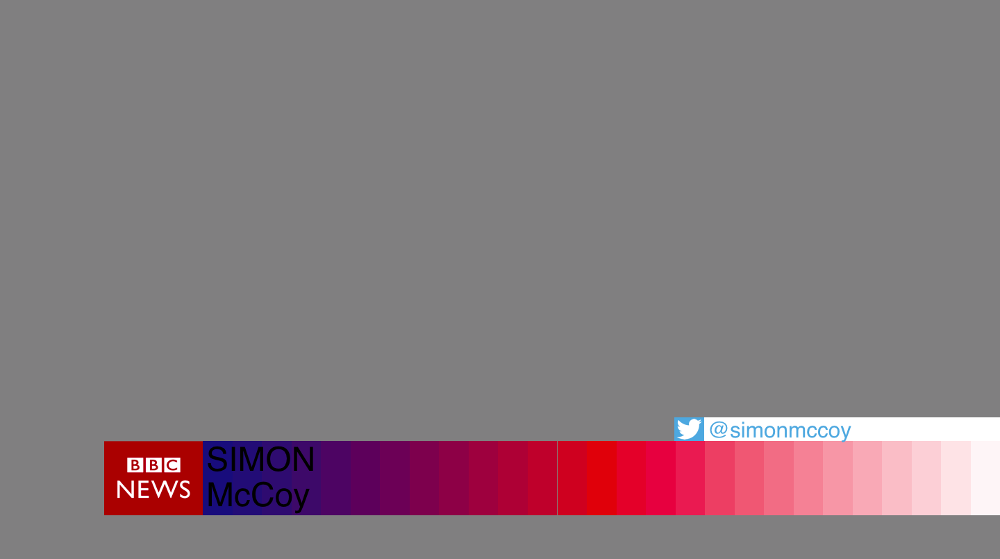
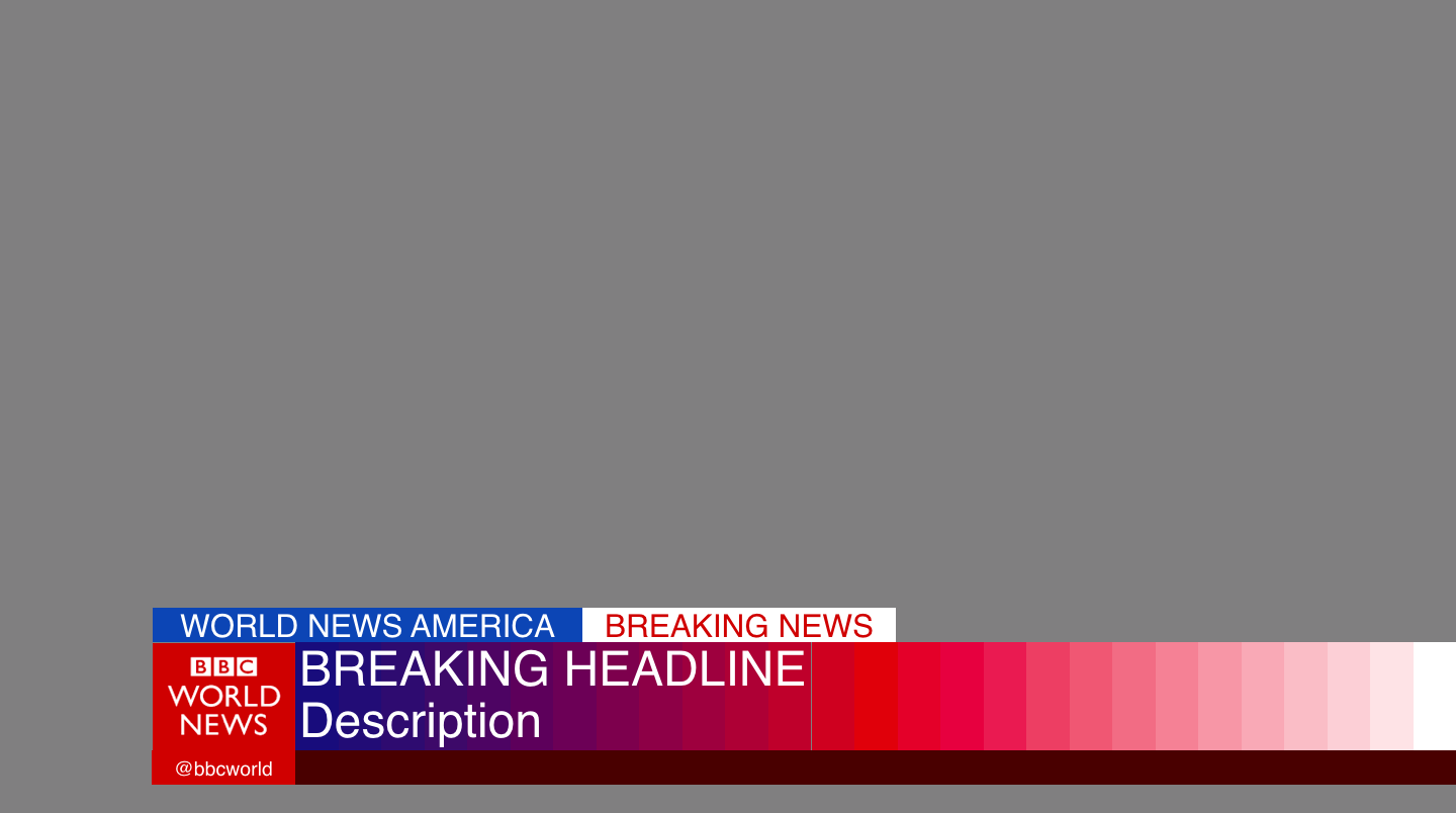
Then onto graphics, it follows on from my last mock (the one which you were a bit mad at me for not apparently not saying it was 'a recreation of the BBC News 24 1999 graphics.) I've shown them with Breakfast (I'm doing what others have done and getting rid of the 'BBC' part, also the presenters also say 'Welcome to Breakfast' and not 'BBC Breakfast'). These are the 'main' graphics but some more will be seen later.
I've changed the countdown slightly, gone are the reporters. I decided I wanted the countdown to revolve around the programming the News channel shows, so most of the programmes are shown and inbetween are shots of London (makes sense, Broadcasting House)
And an example of programming titles (like the breakfast titles), all programming has the same style titlecard. I want to give a bit of continuity to the programming.
So I've used the example of The Film Review, which I've remade the titles for, they are a bit simple but I like it.
I also want to let you have an explore of my mock and how the graphics work if you are interested.
Also you may have noticed that I recreated/added to the Breakfast studio, this is not a studio mock, but I just wanted to have a try at a studio (it was made in Blender). But if you want comment on the studio I am happy for you to do so.
Also, if you need proof that I started this after my last BBC News mock, I have provided some updates to DavidWhitfield, so have can verify that I did start it afterwards. (Just for the ones who may not believe me.)
Since my last try at a BBC News mock ( http://www.tvforum.co.uk/thegallery/bbc-news-recreation-mock-40943/ )
I've been working on and off since the last mock. It's not completely finished but I feel I have a lot which I can show you.
The one thing I tried since people do suggest it, is I had a go at using After Effects (but I'm not going to use it again as: 1) it was the trial and its now over 2) I personally didn't like it).
So here are my BBC News titles (they might be simple, but it was the first thing I produced in After Effects so I'm happy with it.) I've gone with red, white and blue for the Union Jack colours (this is only for the news channel, world news still uses red)
Then onto graphics, it follows on from my last mock (the one which you were a bit mad at me for not apparently not saying it was 'a recreation of the BBC News 24 1999 graphics.) I've shown them with Breakfast (I'm doing what others have done and getting rid of the 'BBC' part, also the presenters also say 'Welcome to Breakfast' and not 'BBC Breakfast'). These are the 'main' graphics but some more will be seen later.
I've changed the countdown slightly, gone are the reporters. I decided I wanted the countdown to revolve around the programming the News channel shows, so most of the programmes are shown and inbetween are shots of London (makes sense, Broadcasting House)
And an example of programming titles (like the breakfast titles), all programming has the same style titlecard. I want to give a bit of continuity to the programming.
So I've used the example of The Film Review, which I've remade the titles for, they are a bit simple but I like it.
I also want to let you have an explore of my mock and how the graphics work if you are interested.
Also you may have noticed that I recreated/added to the Breakfast studio, this is not a studio mock, but I just wanted to have a try at a studio (it was made in Blender). But if you want comment on the studio I am happy for you to do so.
Also, if you need proof that I started this after my last BBC News mock, I have provided some updates to DavidWhitfield, so have can verify that I did start it afterwards. (Just for the ones who may not believe me.)
Last edited by PATV Scunthorpe on 21 November 2015 12:32pm - 2 times in total