PA
So with the new News at Ten launching with Tom Bradby, ITV reverting to 'ITV Lunchtime News' and 'ITV Evening News' monikers and them creating Twitter accounts for the individual bulletins, I guess I was inspired to think about how the branding could work with this.
These are just some very initial ideas.
Final titles concept (previous updates below)
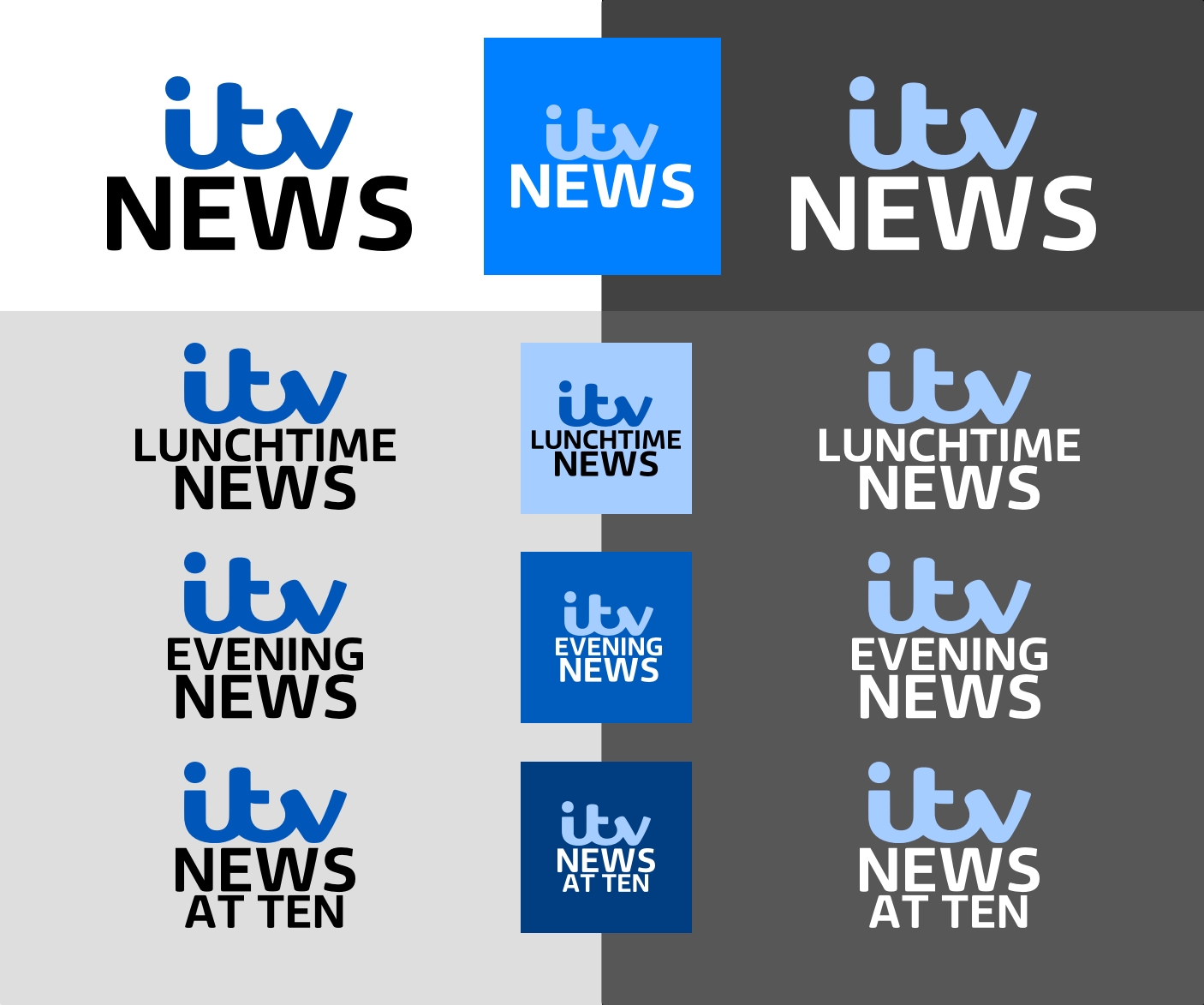
I've changed the ITV logo from being stacked and two-tone in colour to one block colour and one line.
I have made the titles larger and fixed the spacing between the two lines.
Colour wise, I have made some small tweaks to all three.
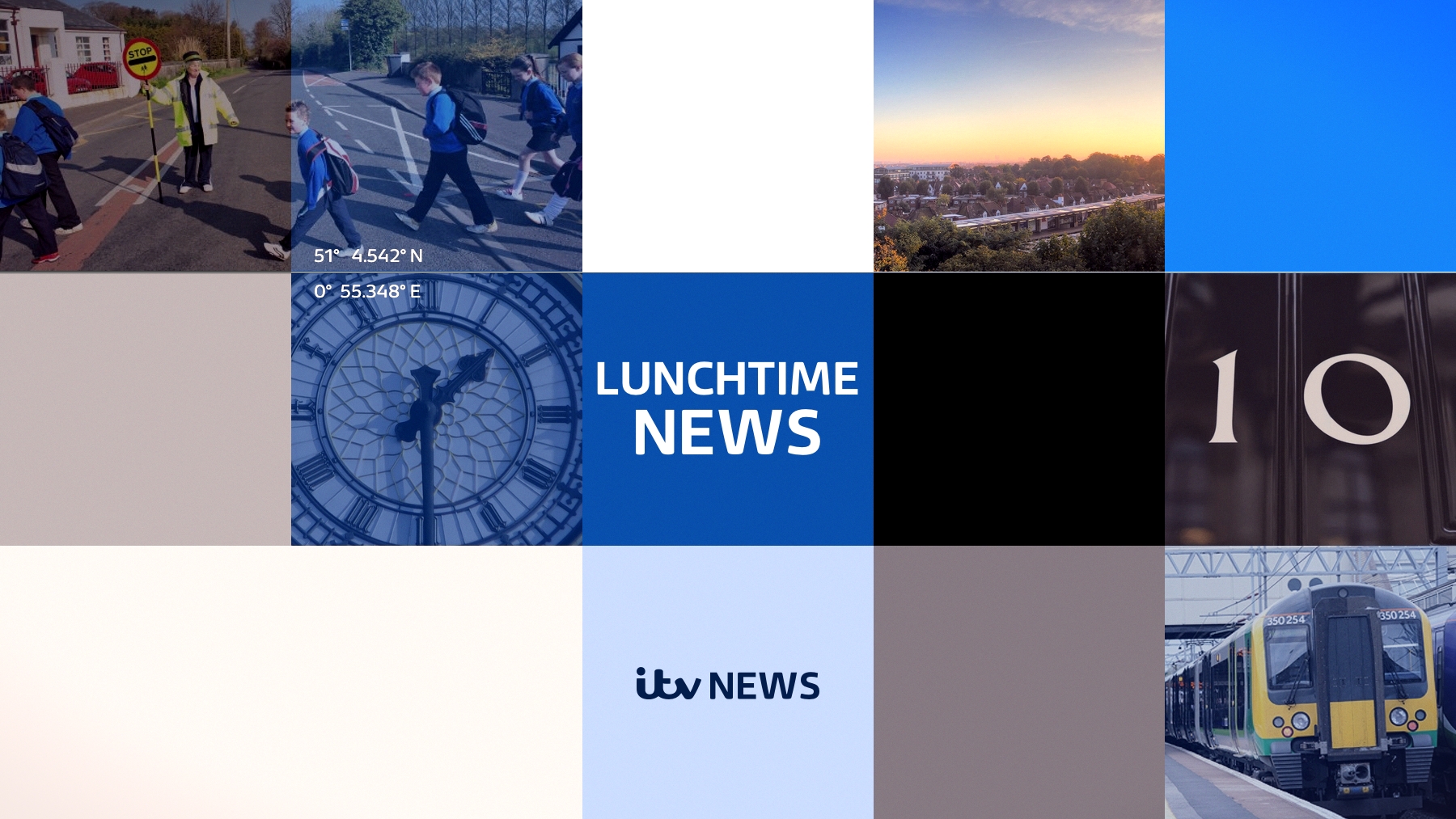
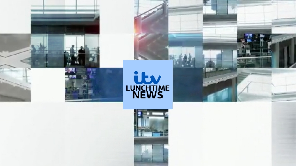
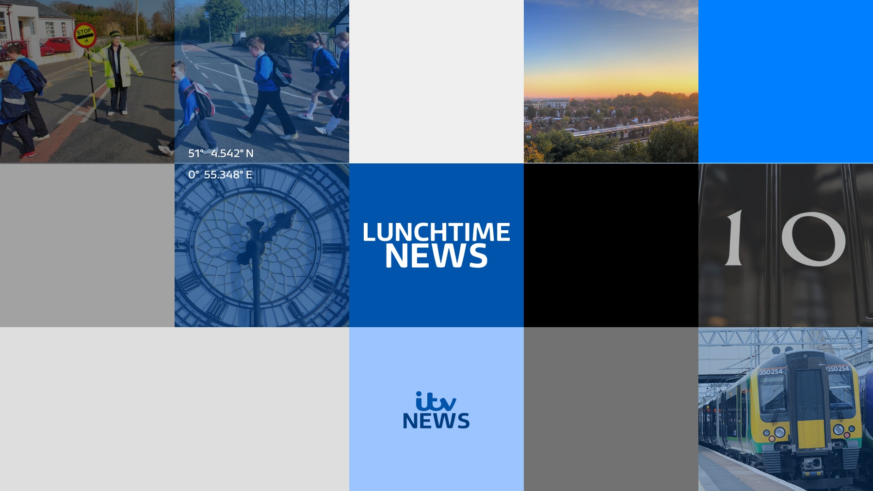
Lunchtime News
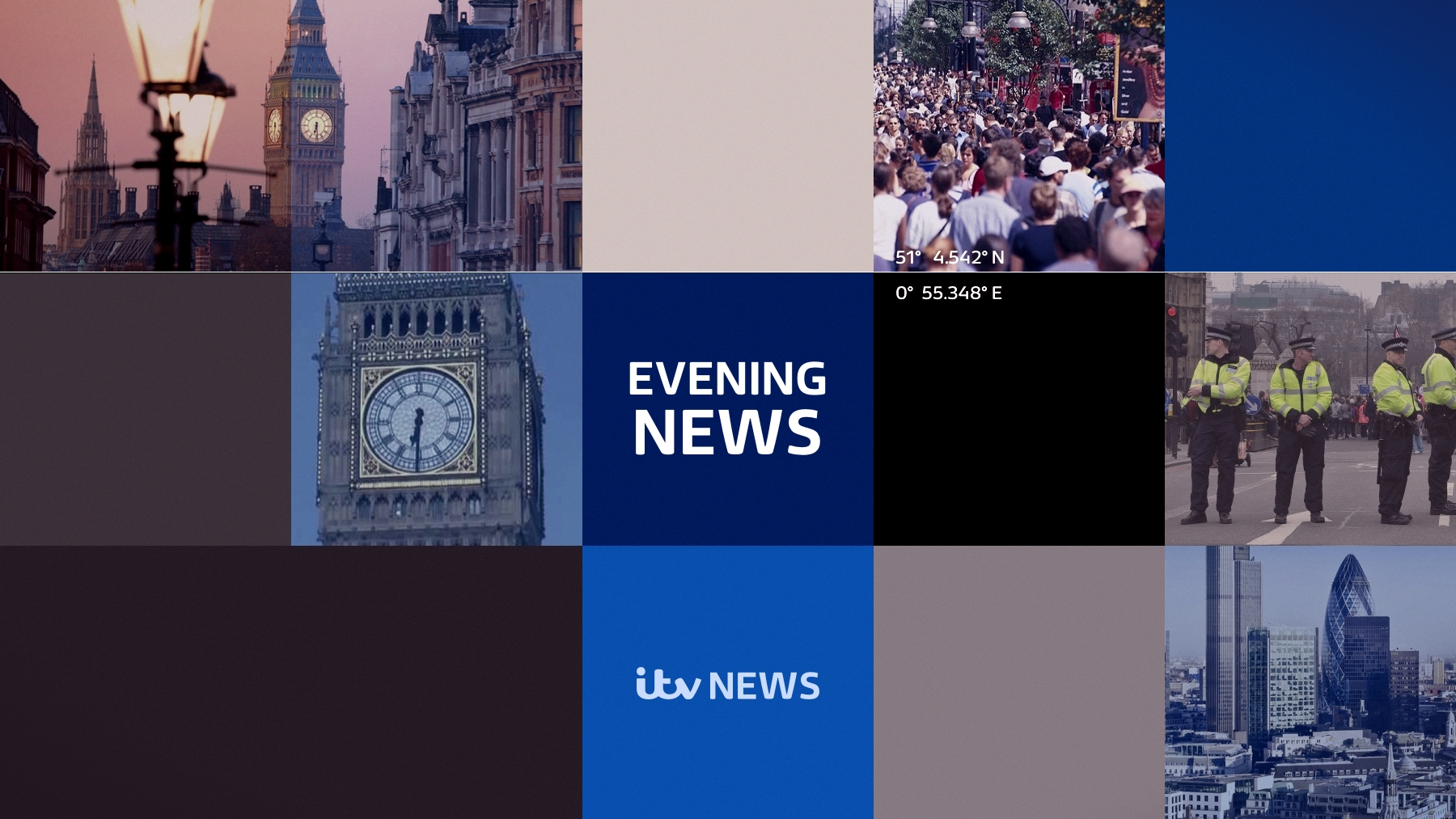
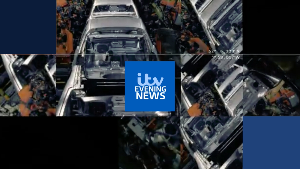
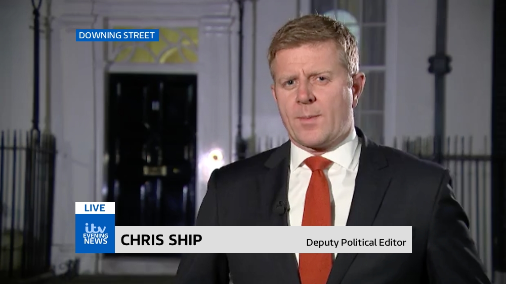
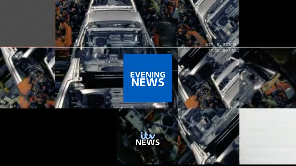
Evening News
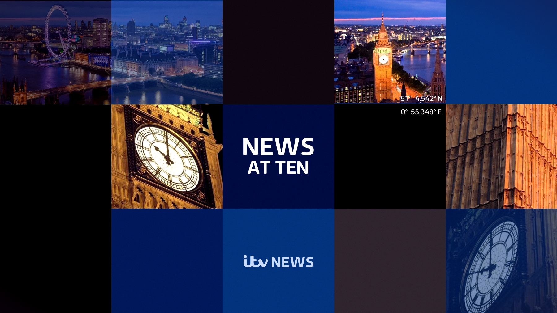
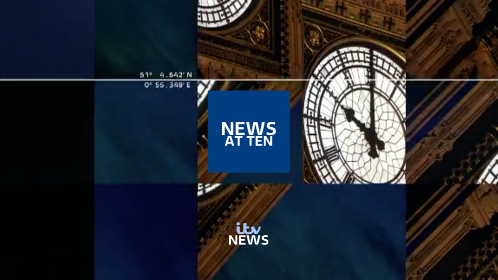
News at Ten
Aston wise they would use the ITV News logo rather than the programme title as I initially experimented; however these would change through the day. I may do these final strap designs.
In terms of the titles, I should think this will be the last time I tweak these as I am now happy with them. Appreciate all the feedback and hope people feel I've developed them sufficiently, even if they're not to everyone's tastes! It's been fun mocking again, if a bit of a daunting experience at times.
—
I'd like ITV to adopt a blue scheme over the teal colour at the moment, and have different shades of blue for the three bulletins as the time of day changes. The top logo would be used for weekend/out of slot bulletins.
I like the current set so would probably just recolour it slightly to suit the different time of day and be more blue-y than teal. I'd consider a London backdrop for News at Ten only.
Anyway, broad strokes - my reputation with mocks has never been glorious so I apologise if these offend anyone! I'm considering taking them further and looking at some on-screen graphics for a refresh of those too (straps and maybe titles).
Feedback welcomed.
—
Initial Ideas
How I would like the graphics to look.
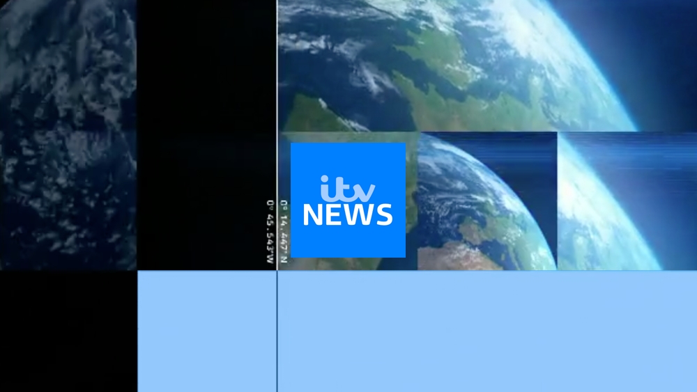
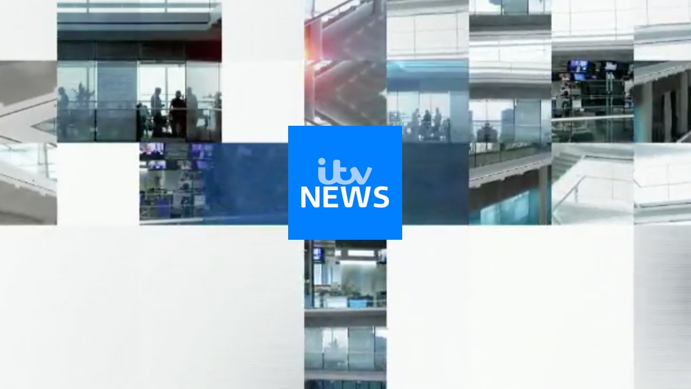
ITV News (generic, weekends etc)

Lunchtime News
Evening News
News at Ten
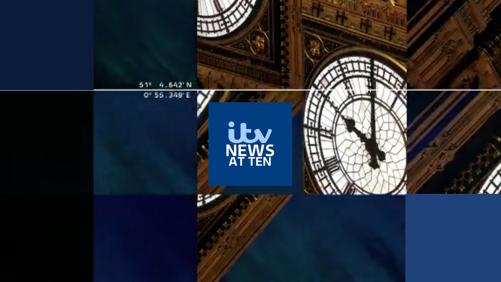

Keeping the same opening titles style as now with the squares, each bulletin getting 'darker' through the day in colour/shade as seen in the opening titles, logo and on-screen graphics.
—
Update 2
In response to feedback about logos using title along with "ITV", an alternative which would involve programme names in their own box and the "ITV News" logo at the bottom:


—
Update 3
Thanks for all the comments and votes, good and bad. Here are my newest ideas for the titles for the bulletins, based on feedback received:
Lunchtime News
Evening News

News at Ten

So I've abandoned the logo including the edition name, opting for unified "ITV News" logos in the bottom third of the screen and the bulletin name in the centre.
I've also changed the colours a bit, particularly looking at the Lunchtime News so it's less garish. All the while keeping the distinctive darkening in colour through the day. I've tried to make all three titles unified but different to suit the time of day.
These are just some very initial ideas.
Final titles concept (previous updates below)
I've changed the ITV logo from being stacked and two-tone in colour to one block colour and one line.
I have made the titles larger and fixed the spacing between the two lines.
Colour wise, I have made some small tweaks to all three.
Lunchtime News
Evening News
News at Ten
Aston wise they would use the ITV News logo rather than the programme title as I initially experimented; however these would change through the day. I may do these final strap designs.
In terms of the titles, I should think this will be the last time I tweak these as I am now happy with them. Appreciate all the feedback and hope people feel I've developed them sufficiently, even if they're not to everyone's tastes! It's been fun mocking again, if a bit of a daunting experience at times.
—
I'd like ITV to adopt a blue scheme over the teal colour at the moment, and have different shades of blue for the three bulletins as the time of day changes. The top logo would be used for weekend/out of slot bulletins.
I like the current set so would probably just recolour it slightly to suit the different time of day and be more blue-y than teal. I'd consider a London backdrop for News at Ten only.
Anyway, broad strokes - my reputation with mocks has never been glorious so I apologise if these offend anyone!
I'm considering taking them further and looking at some on-screen graphics for a refresh of those too (straps and maybe titles).
Feedback welcomed.
—
Initial Ideas
How I would like the graphics to look.
ITV News (generic, weekends etc)
Lunchtime News
Evening News
News at Ten
Keeping the same opening titles style as now with the squares, each bulletin getting 'darker' through the day in colour/shade as seen in the opening titles, logo and on-screen graphics.
—
Update 2
In response to feedback about logos using title along with "ITV", an alternative which would involve programme names in their own box and the "ITV News" logo at the bottom:
—
Update 3
Thanks for all the comments and votes, good and bad. Here are my newest ideas for the titles for the bulletins, based on feedback received:
Lunchtime News
Evening News
News at Ten
So I've abandoned the logo including the edition name, opting for unified "ITV News" logos in the bottom third of the screen and the bulletin name in the centre.
I've also changed the colours a bit, particularly looking at the Lunchtime News so it's less garish. All the while keeping the distinctive darkening in colour through the day. I've tried to make all three titles unified but different to suit the time of day.
Last edited by pad on 23 October 2015 10:11pm - 11 times in total

