KT
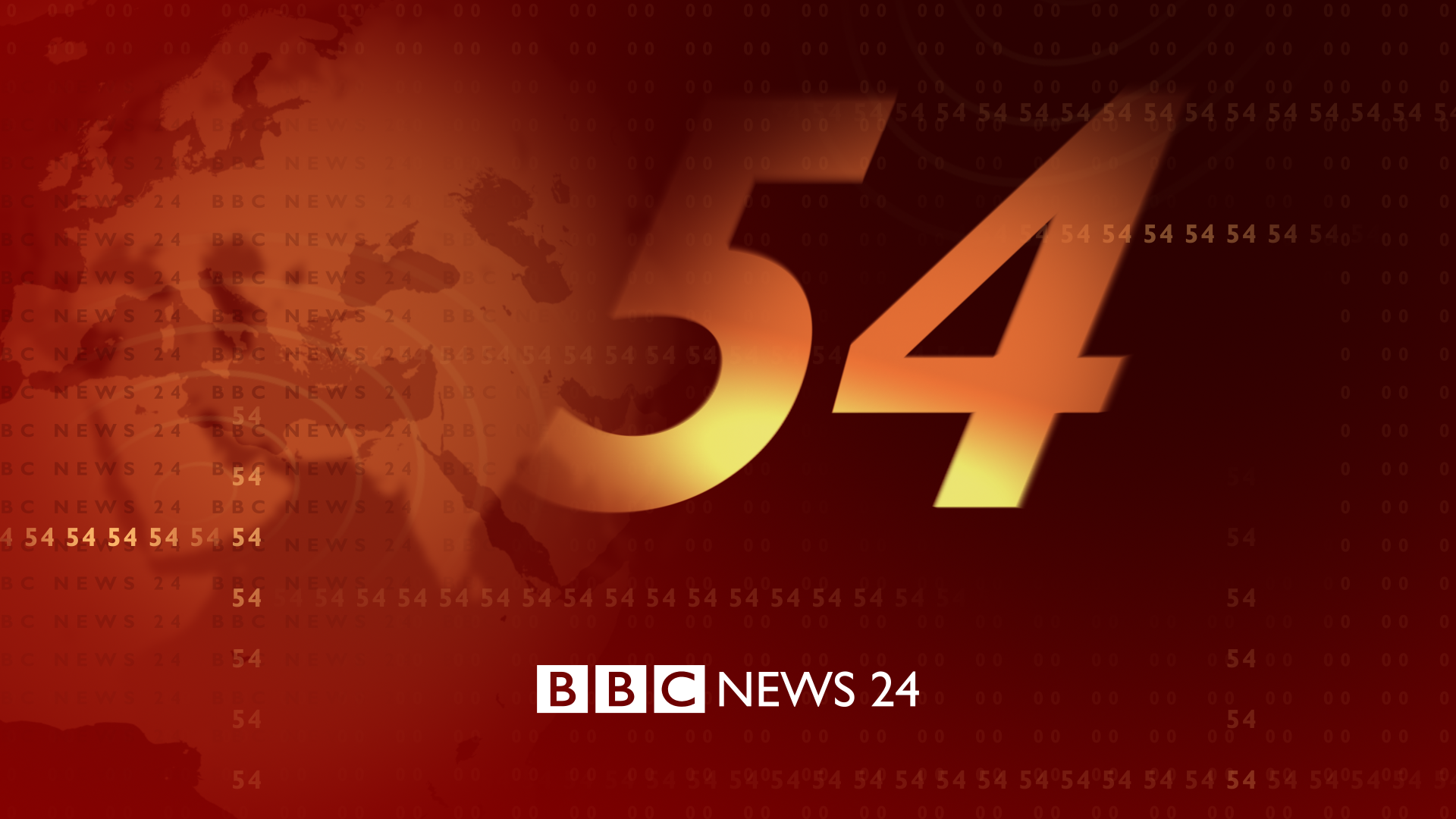
Yep! It's because at that time, BBC World was still stuck with the flags look. BBC World only got the 'red and cream' look later in 2000 (so the titles didn't even exist/weren't used at this point), whereas BBC News 24 and the national news got the look in 1999. When BBC News 24's overnight broadcast was simulcast on BBC World the generic BBC News titles were used - that's what we see in the clip 
Lambie-Nairn also seemed to get much better at refining this look as it developed...
Lambie-Nairn also seemed to get much better at refining this look as it developed...
MD
I wonder how much was Lambie-Nairn and how much was the internal designers. The titles remained for some time untouched (other than music) and with BBC World it was only really the countdown that changed until the "horrible" orange swirls came in.
Yep! It's because at that time, BBC World was still stuck with the flags look. BBC World only got the 'red and cream' look later in 2000 (so the titles didn't even exist/weren't used at this point), whereas BBC News 24 and the national news got the look in 1999. When BBC News 24's overnight broadcast was simulcast on BBC World the generic BBC News titles were used - that's what we see in the clip 
Lambie-Nairn also seemed to get much better at refining this look as it developed...
Lambie-Nairn also seemed to get much better at refining this look as it developed...
I wonder how much was Lambie-Nairn and how much was the internal designers. The titles remained for some time untouched (other than music) and with BBC World it was only really the countdown that changed until the "horrible" orange swirls came in.
KT
I think the internal designers were a little lost themselves at the start, I didn't think they realised that red was going to end up the prominent colour. Remember the original national news studio? All cream walls, red carpet?? (Who thought that would look good as a set? It looked like a snazzy reception with a window).
I even remember World's set when it launched, it had a blue wall to the right of the gallery, luckily it was mostly hidden by that column behind the desk, then finally they realised they needed more red - adding the red wall panels in 2001, then the two red pillars in front of the gallery a bit after that. Best set in my eyes, always hated N8's symmetry and emptiness at the time.
But even the quality and detail of the titles changed significantly, the national titles from 1999 were much simpler and somewhat more jerky than even News 24's, let alone World's package.
MD
I wonder if work had started with BBC World and BBC News 24 at the same time as the branding changed for domestic news in 1999. I would have to imagine it was part of the plan from day one, although the graphics for News 24 and World were more sophisticated than the domestic news - but I think that had as much to do with the fact those channels had much more capable graphics systems, than those of the National and Regional news teams.
I think the internal designers were a little lost themselves at the start, I didn't think they realised that red was going to end up the prominent colour. Remember the original national news studio? All cream walls, red carpet?? (Who thought that would look good as a set? It looked like a snazzy reception with a window).
I even remember World's set when it launched, it had a blue wall to the right of the gallery, luckily it was mostly hidden by that column behind the desk, then finally they realised they needed more red - adding the red wall panels in 2001, then the two red pillars in front of the gallery a bit after that. Best set in my eyes, always hated N8's symmetry and emptiness at the time.
But even the quality and detail of the titles changed significantly, the national titles from 1999 were much simpler and somewhat more jerky than even News 24's, let alone World's package.
I even remember World's set when it launched, it had a blue wall to the right of the gallery, luckily it was mostly hidden by that column behind the desk, then finally they realised they needed more red - adding the red wall panels in 2001, then the two red pillars in front of the gallery a bit after that. Best set in my eyes, always hated N8's symmetry and emptiness at the time.
But even the quality and detail of the titles changed significantly, the national titles from 1999 were much simpler and somewhat more jerky than even News 24's, let alone World's package.
I wonder if work had started with BBC World and BBC News 24 at the same time as the branding changed for domestic news in 1999. I would have to imagine it was part of the plan from day one, although the graphics for News 24 and World were more sophisticated than the domestic news - but I think that had as much to do with the fact those channels had much more capable graphics systems, than those of the National and Regional news teams.
KT
Cheers
@mdtauk, yeah of course in terms of on-screen graphics etc. Though I see no reason for the titles to be intentionally less sophisticated, if it's just being played off a server or other media? I think it probably came down to the refinement of an initial concept. The regional titles were great (minus Newyddion - don't know what happened there) BBC News 24, BBC World, BBC Breakfast's opening idents were on par. But even the 2002 BBC World countdown that you mentioned - something about it never sat with me, it was too black the large dark decoders seemed stretched...
Anyway, I've changed the details we were talking about, just wanted to post before I render the whole sequence. We good to go?
