HJ
No knowing how this is going to go down, but I'd love some feedback from this studio mock! I have spent a lot of time on this mock, and made major changes since I last posted any images.
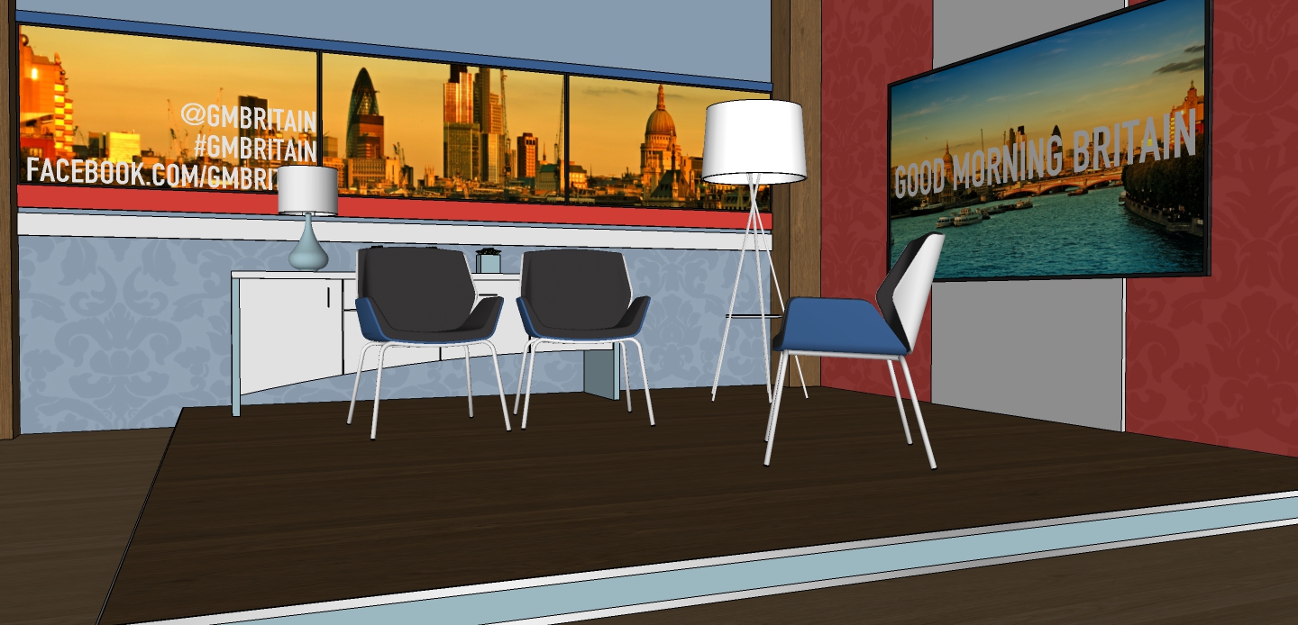
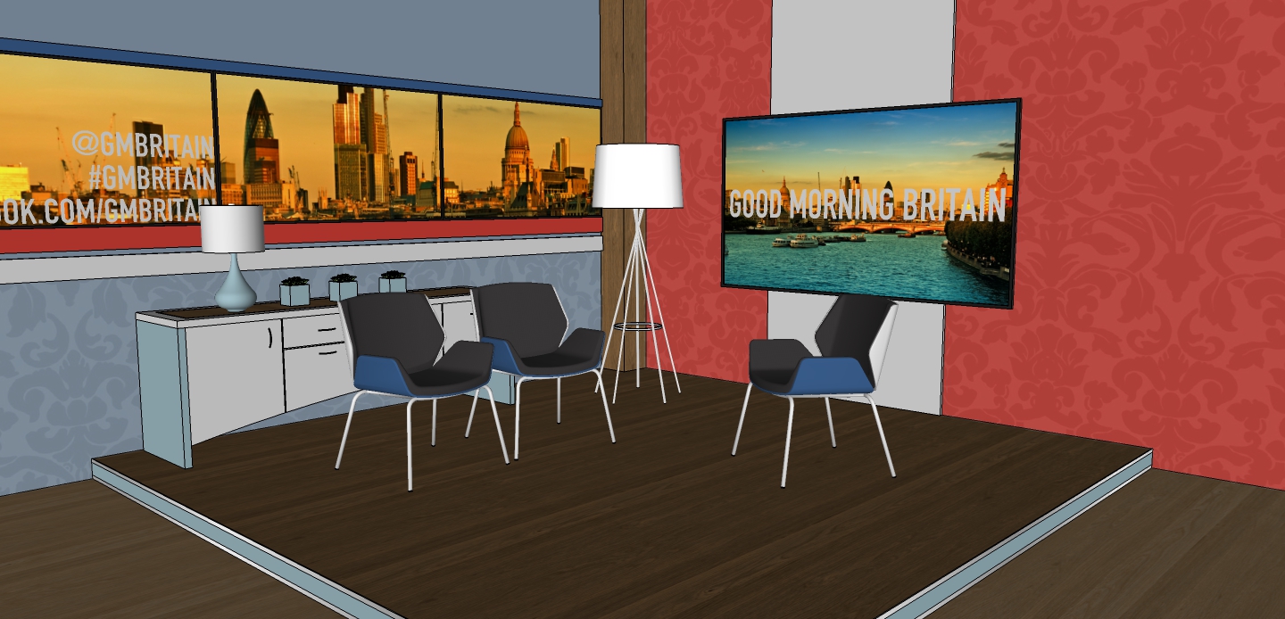
Media/ Small interview area. The chairs (and sideboard) could be removed to make it better for social media.
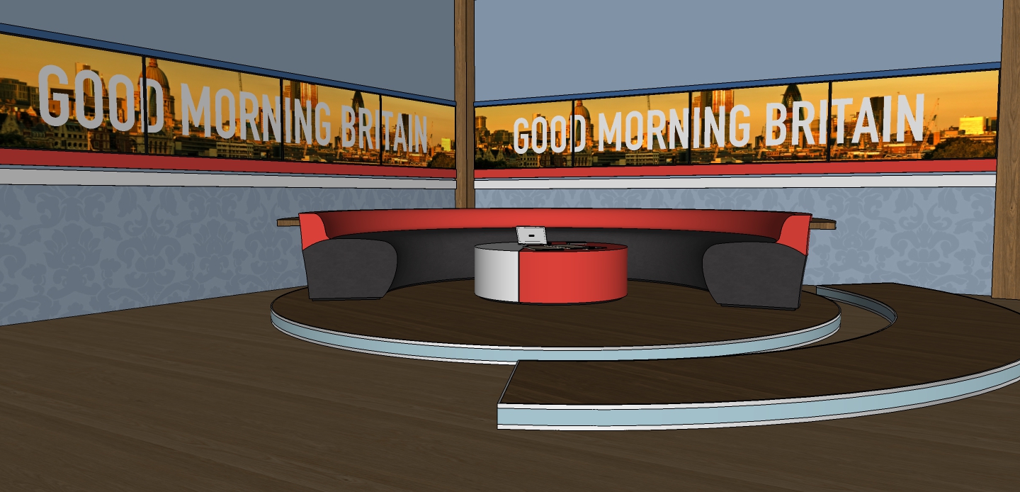
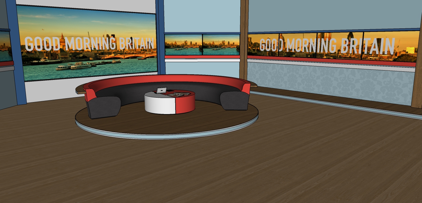
2. Sofa area, whilst not the main presentation part of the studio, the Sofas could be used for the final part of the show, or for interviews with guests. The surround could be used after adverts of the end of any full screen graphic, where the studio hasn't been on screen.
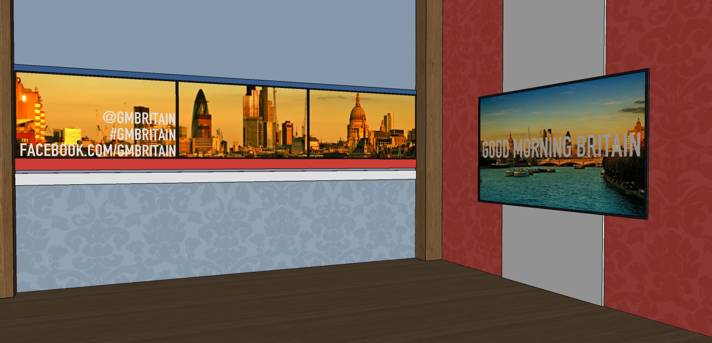
3. The largest screen on set, mainly used when there is someone out of the studio, being interviewed by one of the presenters. The riser allows for close up presentation, like weather, however that would usually happen on screen opposite!.
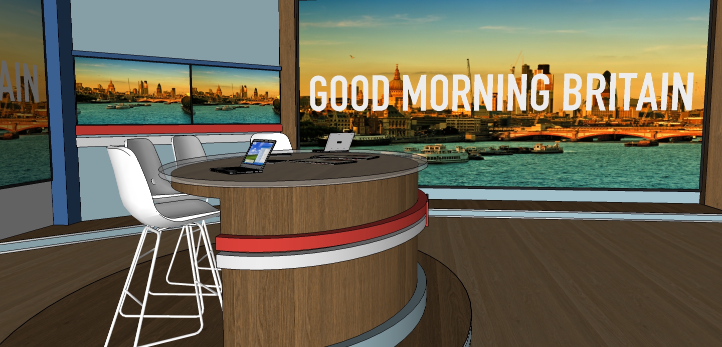
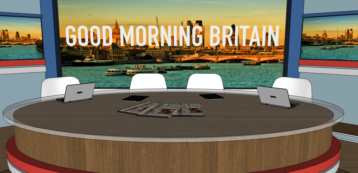
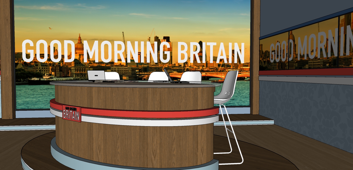
4. The desk area would be used as a default presentation section. the screens behind would show relevant information during the programme, whilst the double small screens in the background can be used for sport/ news updates by Charlotte and Sean who'd sit on the left and right respectively.
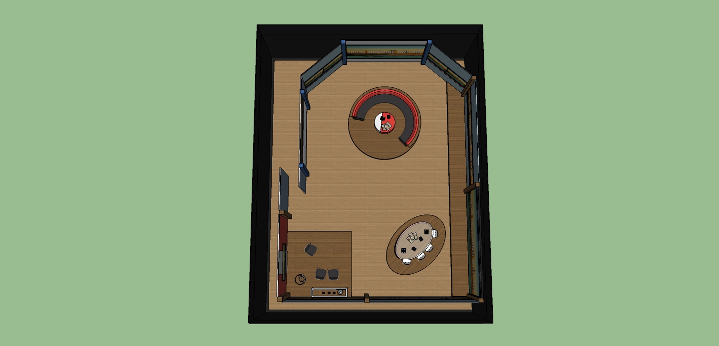
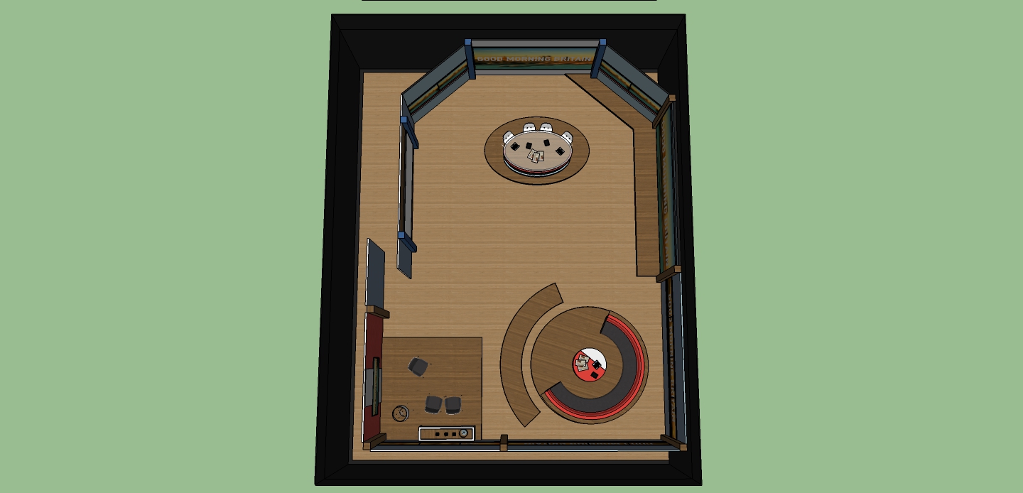
5. Finally, a complete view of the studio. (all measurements, including hight, are real for ITV's London Studios, Studio 5: where GMB will be broadcast)
I would also like to publicly thanks DanielK for the support and advice whilst I've produced this studio. I have some pictures of developments previous of this final design so let me know if you'd like to see them.
Feedback would as ever be gratefully received.
EDIT Okay, so I've made some minor changes to this studio design, as seen above in (1).
Media/ Small interview area. The chairs (and sideboard) could be removed to make it better for social media.

2. Sofa area, whilst not the main presentation part of the studio, the Sofas could be used for the final part of the show, or for interviews with guests. The surround could be used after adverts of the end of any full screen graphic, where the studio hasn't been on screen.
3. The largest screen on set, mainly used when there is someone out of the studio, being interviewed by one of the presenters. The riser allows for close up presentation, like weather, however that would usually happen on screen opposite!.
4. The desk area would be used as a default presentation section. the screens behind would show relevant information during the programme, whilst the double small screens in the background can be used for sport/ news updates by Charlotte and Sean who'd sit on the left and right respectively.
5. Finally, a complete view of the studio. (all measurements, including hight, are real for ITV's London Studios, Studio 5: where GMB will be broadcast)
I would also like to publicly thanks DanielK for the support and advice whilst I've produced this studio. I have some pictures of developments previous of this final design so let me know if you'd like to see them.
Feedback would as ever be gratefully received.
EDIT Okay, so I've made some minor changes to this studio design, as seen above in (1).
Last edited by HJL on 22 April 2014 2:16pm - 19 times in total
%202.jpg)

.jpg)