 I shall choose a different font.


GE
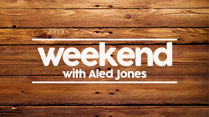
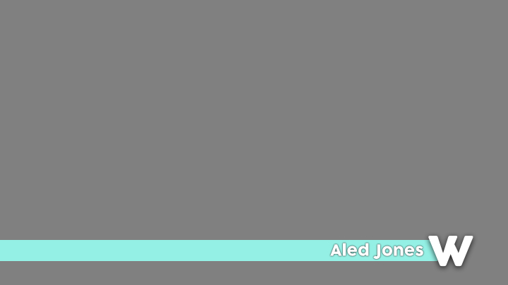
Two things that still need working on IMO: the font and the 'coming up' slide. As for the font, try a simpler one, such as Gotham or Montserrat. I don't like the coming up slide at all. The wood doesn't work if I'm honest. Maybe try to create a coming up slide that could work alongside a video of a presenter talking (i.e. a graphic that isn't full screen)
I like the direction this mock is going in though.
I like the direction this mock is going in though.
AS
Ok thanks for the feedback. With regards to the font, I don't like the first one that I used. The second font I am using for all other text - Nexa - is very similar to Gotham and Montserrat so I will probably use that. Hopefully I can update this tomorrow but I can't today. I have tried out lots of alternatives before I started this mock - one of which included a coming up bit alongside a dodgy cutout of Aled. The design is pretty bad but it was an idea. I can work from that if you like, it create a new coming up slide? The only thing is, I really like the wood.
AS
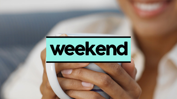
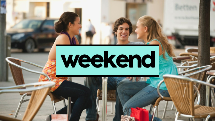
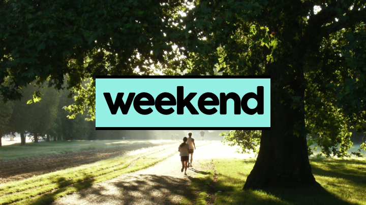
Fourth Update
Please tell me what you think of this new update - I have taken ideas from the actual graphics and my own.
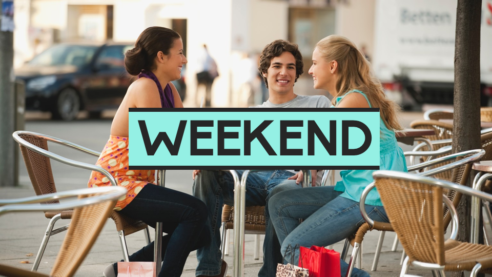
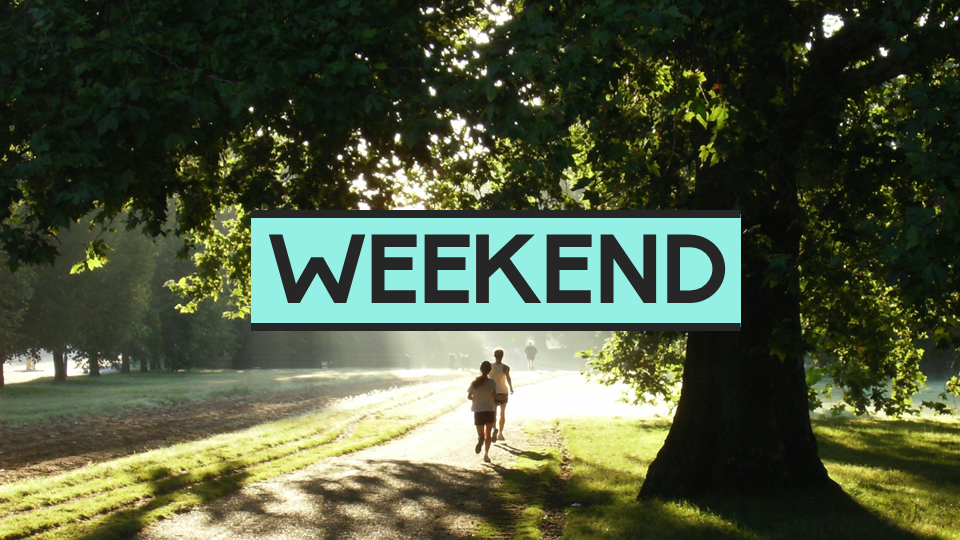
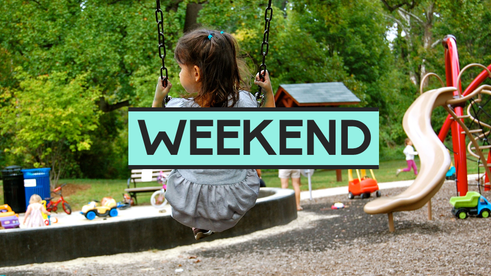
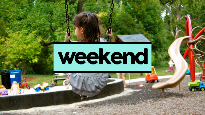
Title card - which would follow the idea of the titles that already exist - but instead of each letter being in the same scene, they would be all around different weekendish scenes (also, the letters would be my font)
Strap
Talking in the air

Revised break stings (slightly different to the title card I know, but I like my original design with the light blue. - I have been playing around with translucency in these as a potential design - tell me if you would like to see that - I have also considered using the wood instead of the blue for these which would fit in more with the title card but doesn't look that good yet -

I think these compliment the set well.
New font too.
Please tell me if you think that a totally different approach is needed. It is something I have considered.
Comments please
More updates to come...
I look forward to improving this mock.
Please tell me what you think of this new update - I have taken ideas from the actual graphics and my own.
Title card - which would follow the idea of the titles that already exist - but instead of each letter being in the same scene, they would be all around different weekendish scenes (also, the letters would be my font)
Strap
Talking in the air
Revised break stings (slightly different to the title card I know, but I like my original design with the light blue. - I have been playing around with translucency in these as a potential design - tell me if you would like to see that - I have also considered using the wood instead of the blue for these which would fit in more with the title card but doesn't look that good yet -
I think these compliment the set well.
New font too.
Please tell me if you think that a totally different approach is needed. It is something I have considered.
Comments please
More updates to come...
I look forward to improving this mock.
Last edited by ASO on 11 May 2014 7:50pm
AS
Keeping the blue with it too? I wanted that but thw white did not stand out enough... I don't really want to get rid of that lovely blue. I shall play around with it. Thanks for the feedback as always Henry.
Really like this, but would prefer the break bumpers to be white rather than black! IMO.
Keeping the blue with it too? I wanted that but thw white did not stand out enough... I don't really want to get rid of that lovely blue. I shall play around with it. Thanks for the feedback as always Henry.