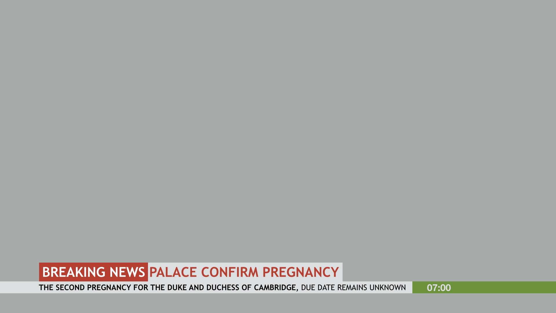
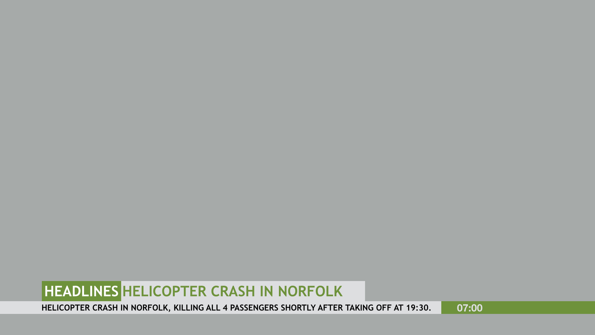
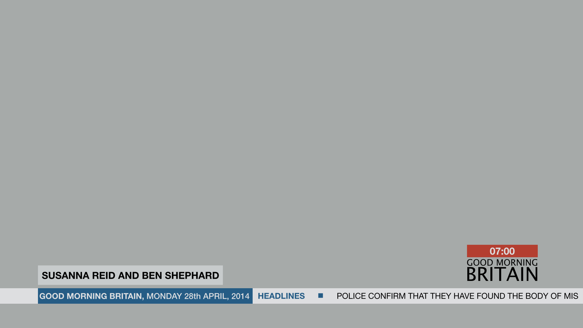
The Gallery

GMB Studio Mock

GOOD MORNING BRITAIN, Studio and Graphics (March 2014)

This site closed in March 2021 and is now a read-only archive
GM
gmb2014

Can I clarify, do you prefer the actual clock or the whole graphic of the clock and graphic, with the clock on top and the red used?
Also what is an end board. I know this looks so bad , but can you confirm it so I know what hasn't impressed you!

Cheers
(p.s. I have changed the distance between the two rows of "Good Morning" and "Britain" since uploading these pictures)

Can I ask why you posted it if you knew it looked 'so bad'?
HJ
HJL

Can I clarify, do you prefer the actual clock or the whole graphic of the clock and graphic, with the clock on top and the red used?
Also what is an end board. I know this looks so bad , but can you confirm it so I know what hasn't impressed you!

Cheers
(p.s. I have changed the distance between the two rows of "Good Morning" and "Britain" since uploading these pictures)

Can I ask why you posted it if you knew it looked 'so bad'?


I meant it looked bad asking, however if you don't ask, you'll never find out and I really wanted to know what he meant.
GM
gmb2014

Can I clarify, do you prefer the actual clock or the whole graphic of the clock and graphic, with the clock on top and the red used?
Also what is an end board. I know this looks so bad , but can you confirm it so I know what hasn't impressed you!

Cheers
(p.s. I have changed the distance between the two rows of "Good Morning" and "Britain" since uploading these pictures)

Can I ask why you posted it if you knew it looked 'so bad'?


I meant it looked bad asking, however if you don't ask, you'll never find out and I really wanted to know what he meant.


Ah right, sorry. I kind of misunderstood why you said it Embarassed
Last edited by gmb2014 on 11 March 2014 8:52pm
HJ
HJL
I have decided that this is the end for this current mock. There is no point giving me any more feedback based on the most recent designs. I will continue working on some ideas for Good Morning Britain graphics and studio design, but these will remain private for a while whilst I try to collaborate some alternative ideas, as its obvious people are becoming annoyed by my constant posting. Thank you everyone who has given me feedback, you have helped me a lot, and I'm sure my future mocks will be made better by this.

Thanks again.

(p.s. out of interest how long do I remain a "New Member" for??)
GM
gmb2014
(p.s. out of interest how long do I remain a "New Member" for??)

I was a new member for about 2 months
HJ
HJL
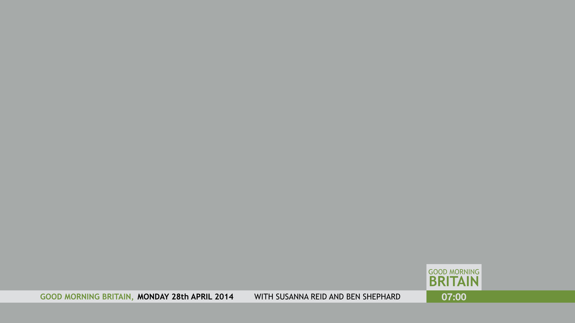
I've made seven different mocks in the last few days and this is my favourite. I hope you all like it, and some feedback would be great!! I have been doing a bit of work on the studio too although its a long way off completion because I want it to be perfect before showing you.
*
The "Good morning Britain" will fade with the other information on screen.
*
*
*
*
*

The news ticker has gone, and instead the clock will be the only constant on screen.
Thanks again in advance for any feedback. Very Happy
Last edited by HJL on 15 March 2014 11:48am
GM
gmb2014
It's going backwards now. Green. Seriously?
HJ
HJL
It's going backwards now. Green. Seriously?


Why not green? They need to change it so it's different from Daybreak and from Breakfast, and that means that Reds and purples are both kind of out of the question. Along with a warmer studio, I reckon green could work, at least through the spring and summer when they launch the new series. These graphics could easily change to be more appropriate for winter.

Now please explain why green is such a bad idea.

and there is no way you can say its gone backwards from this,
*

Alternatively, would you rather see more along these lines,
*
Last edited by HJL on 15 March 2014 12:22pm
GM
gmb2014

and there is no way you can say its gone backwards from this,
*

I like that version, but hey, what do I know? Wink
HJ
HJL
I like that first version, but hey, what do I know? Wink

I was told by numerous members, that they were terrible, lacked creativity and the colours were awful. I had to go back to the start and recreate them. I wanted to make something different and I totally understand if they've gone backwards in your opinion. It's blooming difficult to please everyone, and I just thought this new mock was 100X better. I'm sorry if that's offended you but everyone has an opinion, and I'm just trying to please as many people as possible. Laughing
GM
gmb2014
I like that first version, but hey, what do I know? Wink

I was told by numerous members, that they were terrible, lacked creativity and the colours were awful. I had to go back to the start and recreate them. I wanted to make something different and I totally understand if they've gone backwards in your opinion. It's blooming difficult to please everyone, and I just thought this new mock was 100X better. I'm sorry if that's offended you but everyone has an opinion, and I'm just trying to please as many people as possible. Laughing

I didn't mean to come across as offended, I was just saying that I prefered that version.
Embarassed
AS
ASO
Its just grey and boring.

Newer posts