BA
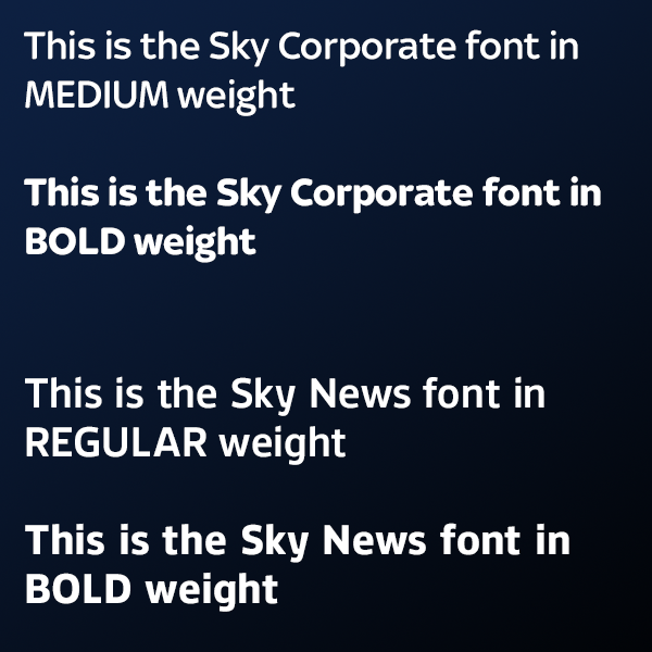
That'll be your eyes. Because the "C" in the headlines in the first two images is curved, it looks misaligned to the letters below; this is accentuated by the size difference. If it were a design of something with static text, then a cheat in the alignment to make it look correct to the eye would be the best solution. However, a news channel's graphics aren't usually kerned, so such visual oddities occur.
http://weatherfieldgazette.co.uk/norris/font.png
A lovely mock! Would love to see further versions of this, just one thing, the title text, to me, doesnt look lined up with the caption text below it, is this deliberate?
That'll be your eyes. Because the "C" in the headlines in the first two images is curved, it looks misaligned to the letters below; this is accentuated by the size difference. If it were a design of something with static text, then a cheat in the alignment to make it look correct to the eye would be the best solution. However, a news channel's graphics aren't usually kerned, so such visual oddities occur.
http://weatherfieldgazette.co.uk/norris/font.png
