MP
So the BBC UK Channels has been using the same logos for a few years now and I thought it was time for a change.
(IDENTS WILL COME SOON) Logos and menus are already made.

So I decided to go back to logo basics with the BBC logos but use different fonts for each channel but this is not going to be a repeat of the 90's BBC logo disaster.
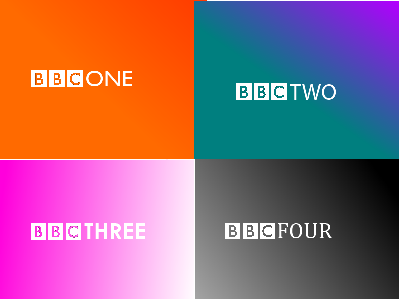
This is the non-gradient version of the logos:

Here are the explanations of the new BBC TV logos:
BBC One:

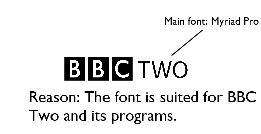
BBC Two:
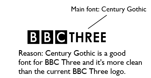
BBC Three:
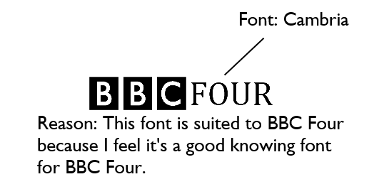
BBC Four:

So creating a menu requires (well for me anyway) taking a visit to the BBC website for guides. So, here they are! What I did was I used the font from the BBC TV fonts (e.g One, Two, Three, Four).
BBC One:

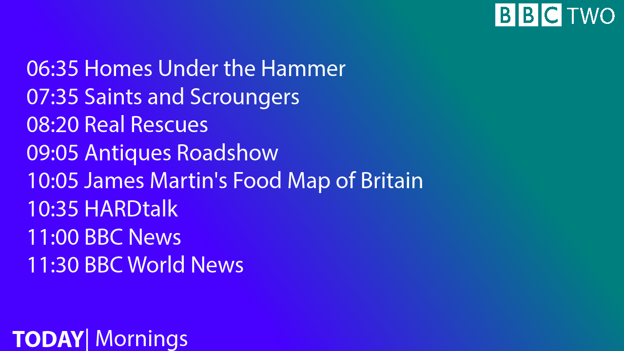
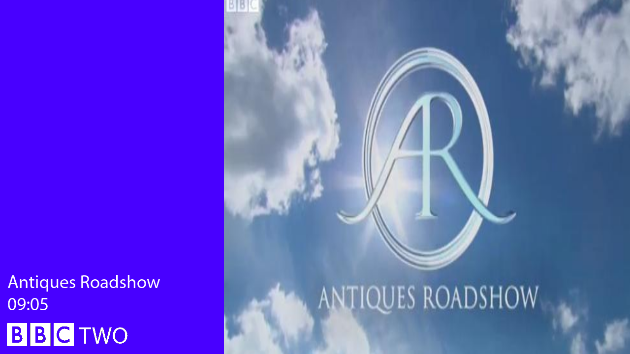
BBC Two:
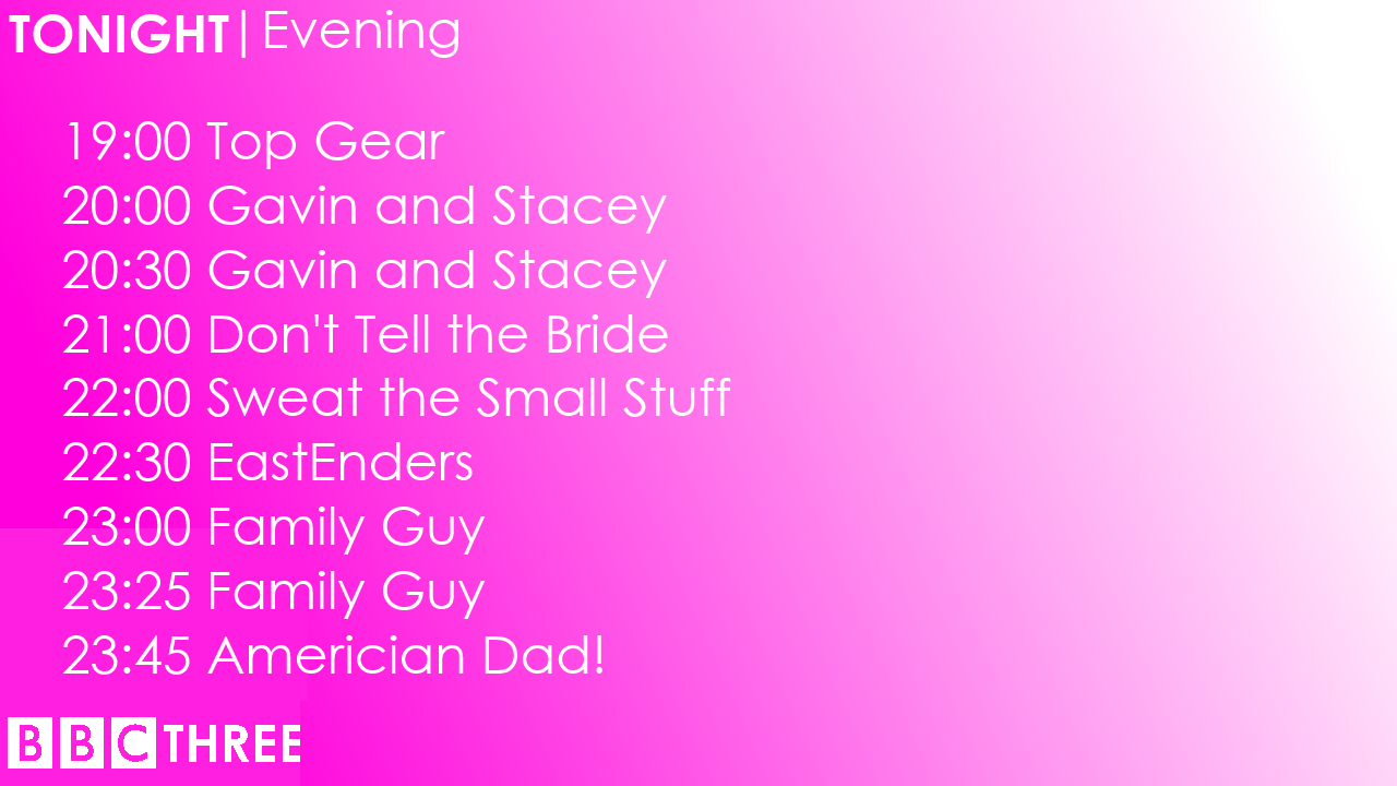
BBC Three:
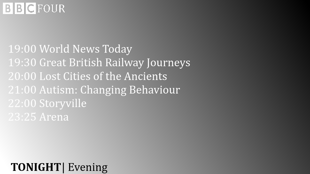
BBC Four:

These are the things which pop up at the end of a show promo
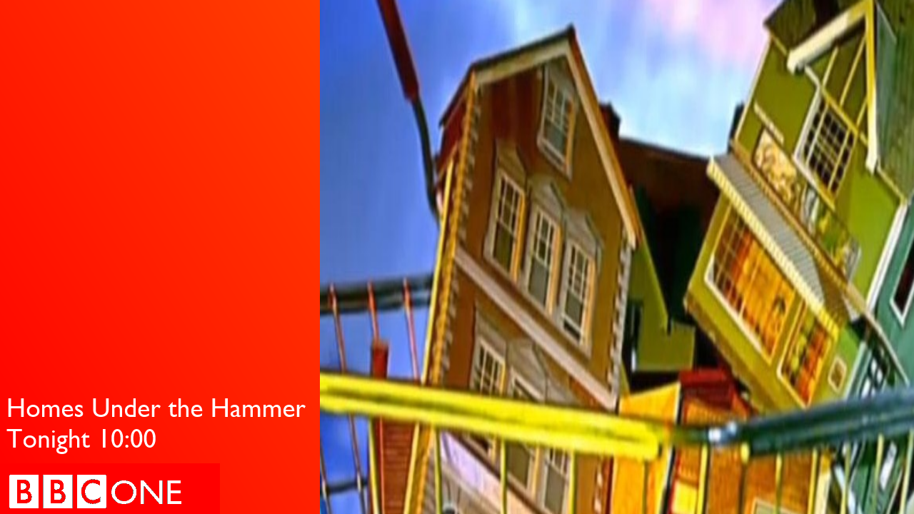
BBC One:
BBC Two:
BBC Three:

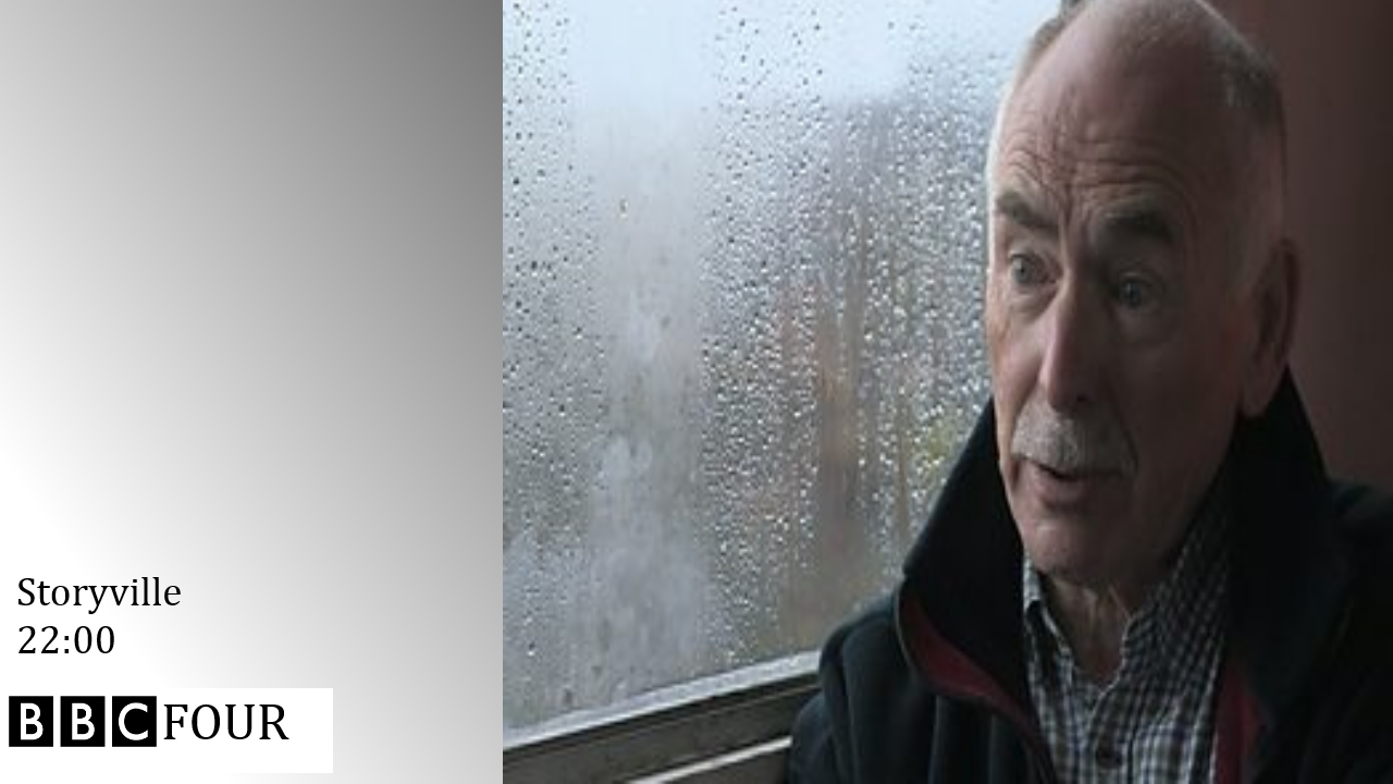
BBC Four:
This project is not finished but I wanted to see how I was doing. Fake junction and idents will come soon!
Thanks for viewing!
-mikey88772
(IDENTS WILL COME SOON) Logos and menus are already made.
So I decided to go back to logo basics with the BBC logos but use different fonts for each channel but this is not going to be a repeat of the 90's BBC logo disaster.
This is the non-gradient version of the logos:
Here are the explanations of the new BBC TV logos:
BBC One:
BBC Two:
BBC Three:
BBC Four:
So creating a menu requires (well for me anyway) taking a visit to the BBC website for guides. So, here they are! What I did was I used the font from the BBC TV fonts (e.g One, Two, Three, Four).
BBC One:
BBC Two:
BBC Three:
BBC Four:
These are the things which pop up at the end of a show promo
BBC One:
BBC Two:
BBC Three:
BBC Four:
This project is not finished but I wanted to see how I was doing. Fake junction and idents will come soon!
Thanks for viewing!
-mikey88772
