JO
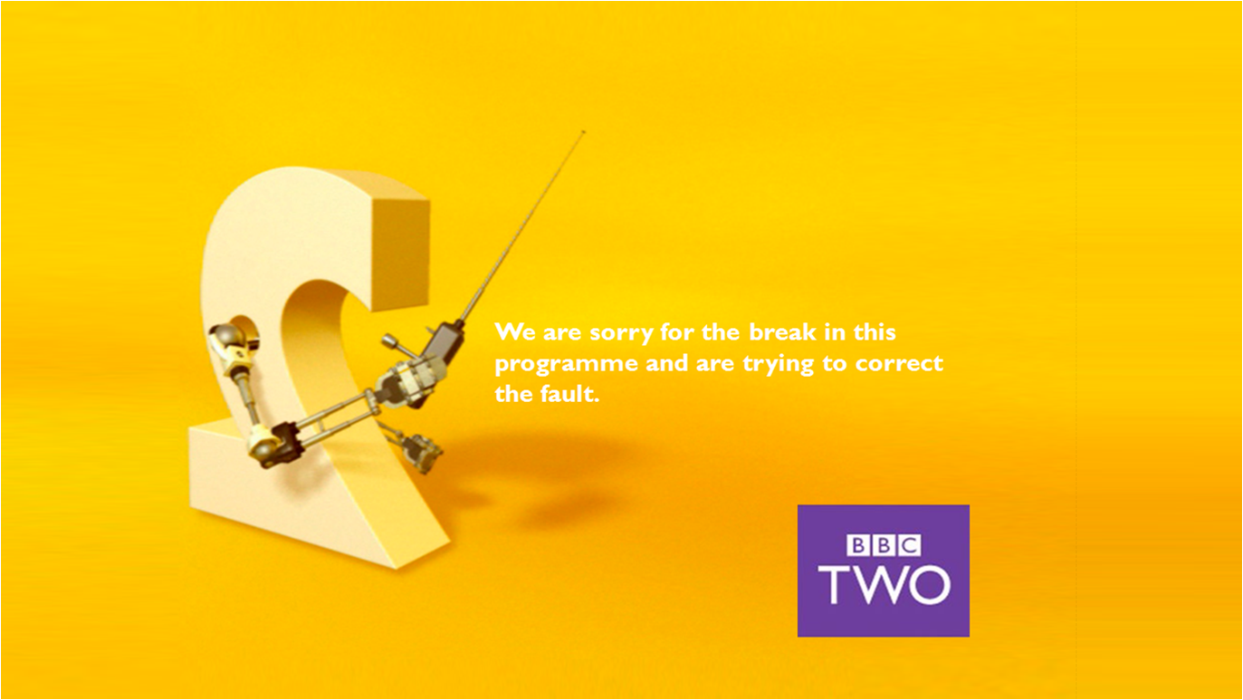
Obviously, the background is nabbed from the ident. That's fine, you're attempting to improve a former presentation package whilst ensuring it remains in-keeping with the then existing style, I get that.
Let's see then. Well for a start there are too many 'we's, too many sentences and a confused distribution of full stops. 'We are sorry for the break in this programme and are working to correct the fault' - nothing unnecessary, flows off the tongue.
The text should be all bold and in white, as with the real style and because the black clashes badly. The box is misized and in the wrong position (this is 2001-7 era Two, such things did still matter then).
Nowt wrong with this type of mock at all , so long as it betters or offers a new take on the existing style. This mock, unfortunately, achieves neither. Closer attention to detail required.