The Gallery

London 2012 OBS graphics

Making the OBS graphics better! (August 2012)

This site closed in March 2021 and is now a read-only archive
DW
DanielWood
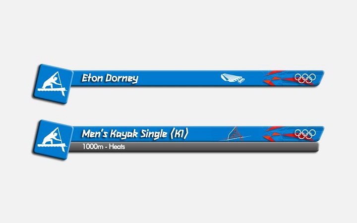
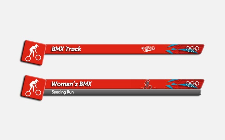
Here are my "attempts" at making the Olympic Broadcasting Services (OBS) graphics much better. I've tried to make them look more colourful but also add some of the branding in. They're close to the game's graphics but have more colour about them. Obviously, they won't be as good as dosxuk's!

I may do more of these but only if I get a good response!

Everything you see was created in Photoshop CS3 (apart from the graphics such as pictograms and venues pictures which were created by LOCOG and are from the London 2012 website).

*

*

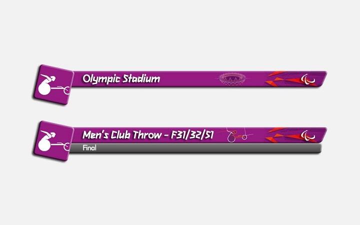
And a Paralympic variant:

*

Sorry for the large-ish files!
RO
rob Founding member
The event titles shouldn't be in bold, they don't look right for some reason.

These are good though, so keep going.
DW
DanielWood
rob posted:
The event titles shouldn't be in bold, they don't look right for some reason.

These are good though, so keep going.


Are these any better?

*
SR
SomeRandomStuff
These are a crappy ripoff of dosxuk's version.

Come up with your own design and don't just copy those of another member.

1*/5
MW
Mike W
These are a crappy ripoff of dosxuk's version.

Come up with your own design and don't just copy those of another member.

1*/5


Couldn't have put it better myself.
:-(
A former member
These are a crappy ripoff of dosxuk's version.
Come up with your own design and don't just copy those of another member.
1*/5

Somewhat harsh. Yes, they are no doubt inspired by dosxuk's design, but at least they are technically well executed. I don't see anybody complaining that Martin's mocks are crappy rip-offs of the BBC's graphics - especially when they're near perfect.
MW
Mike W
These are a crappy ripoff of dosxuk's version.
Come up with your own design and don't just copy those of another member.
1*/5

Somewhat harsh. Yes, they are no doubt inspired by dosxuk's design, but at least they are technically well executed. I don't see anybody complaining that Martin's mocks are crappy rip-offs of the BBC's graphics - especially when they're near perfect.


Well the difference is Martin's aren't crappy rip-offs, they're excellent rip-offs and most importantly they don't take the creative ideas from another member!
ET
ETP1 Forever
These are a crappy ripoff of dosxuk's version.
Come up with your own design and don't just copy those of another member.
1*/5

Somewhat harsh. Yes, they are no doubt inspired by dosxuk's design, but at least they are technically well executed. I don't see anybody complaining that Martin's mocks are crappy rip-offs of the BBC's graphics - especially when they're near perfect.


Well the difference is Martin's aren't crappy rip-offs, they're excellent rip-offs and most importantly they don't take the creative ideas from another member!


Jesus christ...
JA
james.914
xwing posted:
These are a crappy ripoff of dosxuk's version.
Come up with your own design and don't just copy those of another member.
1*/5

Somewhat harsh. Yes, they are no doubt inspired by dosxuk's design, but at least they are technically well executed. I don't see anybody complaining that Martin's mocks are crappy rip-offs of the BBC's graphics - especially when they're near perfect.


Well the difference is Martin's aren't crappy rip-offs, they're excellent rip-offs and most importantly they don't take the creative ideas from another member!


Jesus christ...


These are well executed, if copies of somebody elses work. Copying is the greatest form of flattery.

I can't believe how bitchy a bunch of grown men are. Grow up and get lives. This is pathetic. It has happened on a majority of threads recently. People have attempted to show off their work and a group of old members gang up and attack others. One day you old folk will die and we'll complete this sort of work. Help people improve, not lose all faith that what they are doing is at all worth their while.
SR
SomeRandomStuff
xwing posted:
These are a crappy ripoff of dosxuk's version.
Come up with your own design and don't just copy those of another member.
1*/5

Somewhat harsh. Yes, they are no doubt inspired by dosxuk's design, but at least they are technically well executed. I don't see anybody complaining that Martin's mocks are crappy rip-offs of the BBC's graphics - especially when they're near perfect.


Well the difference is Martin's aren't crappy rip-offs, they're excellent rip-offs and most importantly they don't take the creative ideas from another member!


Jesus christ...


These are well executed, if copies of somebody elses work. Copying is the greatest form of flattery.

I can't believe how bitchy a bunch of grown men are. Grow up and get lives. This is pathetic. It has happened on a majority of threads recently. People have attempted to show off their work and a group of old members gang up and attack others. One day you old folk will die and we'll complete this sort of work. Help people improve, not lose all faith that what they are doing is at all worth their while.


::facepalm::
JA
james.914
xwing posted:
These are a crappy ripoff of dosxuk's version.
Come up with your own design and don't just copy those of another member.
1*/5

Somewhat harsh. Yes, they are no doubt inspired by dosxuk's design, but at least they are technically well executed. I don't see anybody complaining that Martin's mocks are crappy rip-offs of the BBC's graphics - especially when they're near perfect.


Well the difference is Martin's aren't crappy rip-offs, they're excellent rip-offs and most importantly they don't take the creative ideas from another member!


Jesus christ...


These are well executed, if copies of somebody elses work. Copying is the greatest form of flattery.

I can't believe how bitchy a bunch of grown men are. Grow up and get lives. This is pathetic. It has happened on a majority of threads recently. People have attempted to show off their work and a group of old members gang up and attack others. One day you old folk will die and we'll complete this sort of work. Help people improve, not lose all faith that what they are doing is at all worth their while.


::facepalm::


thank you for just totally proving my point. shame really, I had a lot of respect after looking at a couple of your mocks. shame you're a totally idiot.
ET
ETP1 Forever
These are actually very nice mocks. Not as good as dosxuk's version, but it is something you could expect to see on screen without looking away in disgust, and a lot more neater than what we currently have on screen.

I really don't understand why some members come to really quick conclusions on this mock. The only error I realised was the initial font he used on the first set, which might have been unreadable on smaller sets. Otherwise, I think what we have here is a clean, friendly but not too bland set of graphics, something a few other members on here could learn from.

These are a crappy ripoff of dosxuk's version.

Come up with your own design and don't just copy those of another member.

1*/5


Confused
http://www.tvforum.co.uk/thegallery/gmt-george-alagiah-32695/
Last edited by ETP1 Forever on 6 August 2012 11:44pm

Newer posts