The Gallery

GMTV 2012

What if GMTV continued? A 2012 refresh? (March 2012)

This site closed in March 2021 and is now a read-only archive
DK
DanielK
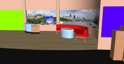
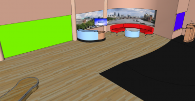
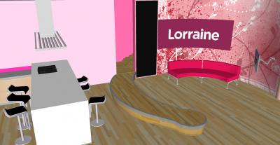
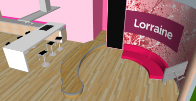
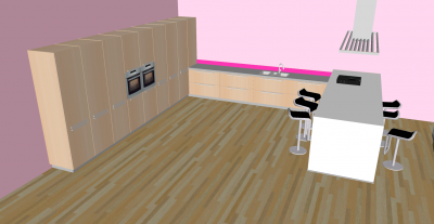
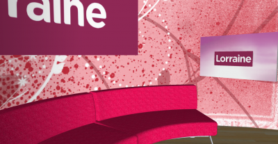
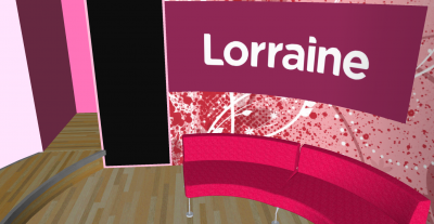
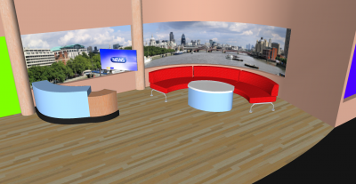
If GMTV continued, I'd hope it would have looked like this! I would revert to opening the show like this: rather than this: obviously music and graphics are the same but it would be set up like the first clip.

Although Lorraine has still split for her on show, it's the same studio etc

Channel Open
*

After Titles open with V/O
*

Into and Out of Breaks
*
*

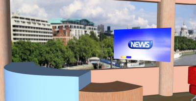
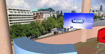
News Desk
*
*

Weather and Virtual Wall
*

Full GMTV Set
*

Lorraine Walk On
*
*

Lorraine Into and Out of Break
*

Kitchen
*

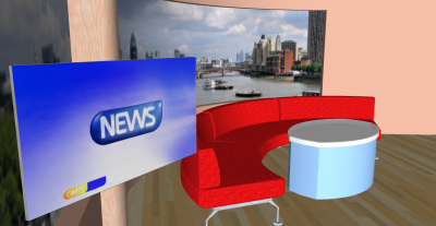
Presenter Couch and Monitor
*

Full Soft Area
*
Last edited by DanielK on 22 March 2012 9:27pm - 2 times in total
DF
DrewF
Another mock that's been slapped together in about a week or even much less. It's not that dissimilar to the 2009 GMTV studio but it's a lot lot worse looking, particularly as it is built in Sketchup with no texturing or renders. Very little thought put into the design. 1/5.

And please reduce your image sizes - they're even too big for a 1920x1080 screen!
DK
DanielK
Okay! reduced them to thumbnails just there?
JA
james
It's horrid.

*

Please reduce the image size to 1 pixel by 1 pixel just to make it easier to load on our screens (and it also will help to save our eyes in the process).
AG
AxG
IMO it's boring. I'm getting sick of seeing a curved sofa, curved wall, images of London, salmon walls? etc. they all seem the same layout. Also the Lorraine splashed paint on the wall, the penis shaped catwork.
03
030293
"If GMTV continued, I'd hope it would have looked like this!"


I'd hope it doesn't look like that. Seriously, what do you want from us?
MW
Mike W
AxG posted:
IMO it's boring. I'm getting sick of seeing a curved sofa, curved wall, images of London, salmon walls? etc. they all seem the same layout. Also the Lorraine splashed paint on the wall, the penis shaped catwork.


'Penis shaped catwalk' Laughing

But yes, my cat has better design skills and Dan, I'm not going to bother with improvement advice because you just ignore it and do your own thing anyway or take comments at face value and throw a dog's dinner all over those who take the time to advise. Give up.
SR
SomeRandomStuff
If you are mocking a studio design you will need the dimensions of the Soundstage or Office Space that the set will occupy. These should be REAL not plucked out of the clouds by magical fairies. Unless you have these, any set design will automatically get slated.

This mock works because he took the time and effort to match the dimensions... and render the artwork with texture and lighting.

...but i realise that i've probably wasted my time...

We point out that your mock isnt great... and you ignore us.

We suggest that you might spend more time improving things... and you ignore us.

We point out exactly where you could improve... and you ignore us.

We suggest that you are ignoring us... and you cry foul because you think you are being victimised when in actual fact you just ignored us.

...and Daniel. The fact that pretty much all your mocks have got 1-star AWFUL ratings should give you some reassurance that they are indeed completely rubbish. You are not improving, and should use your time on something else.

Newer posts