CH
This is a BBC World News mock. At no point will all viewers be watching the channel at night time.
Maybe do a night-time version too with a black background? 
This is a BBC World News mock. At no point will all viewers be watching the channel at night time.
SR
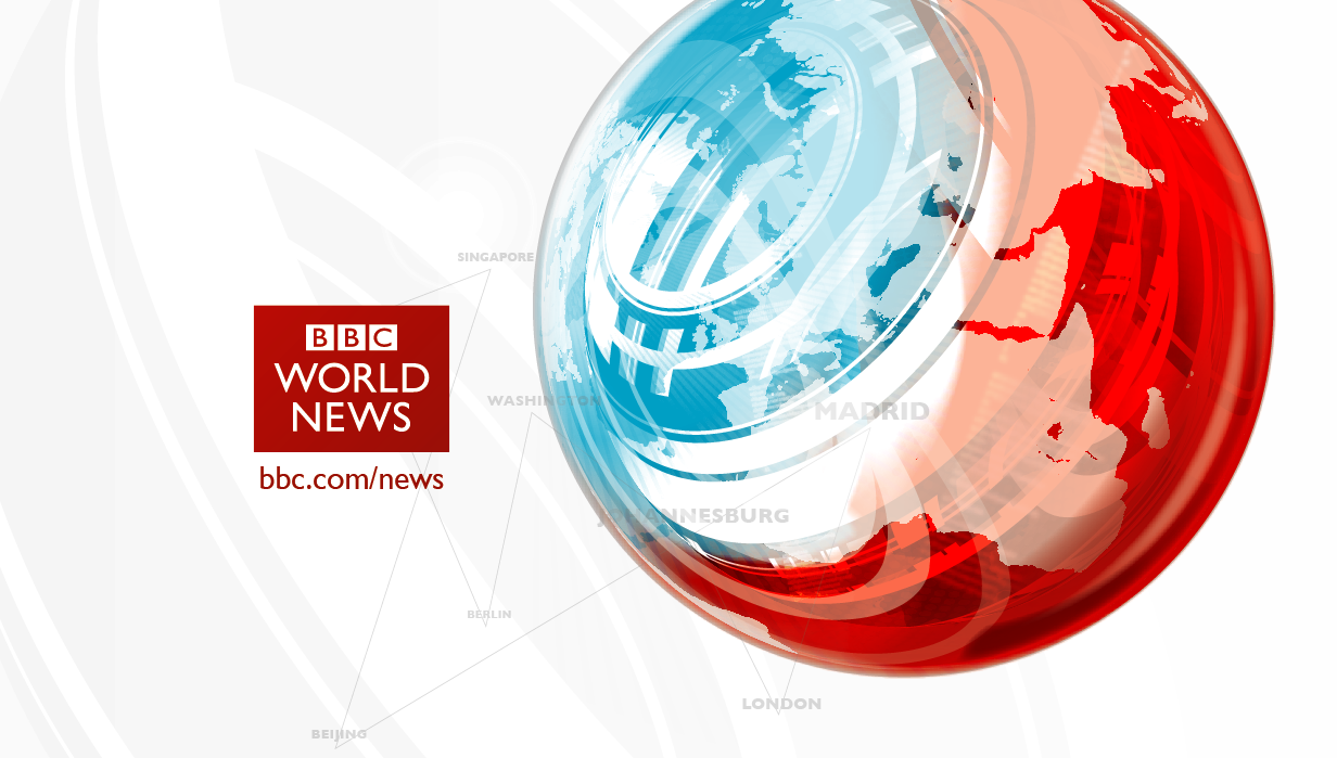
Hi, and before you jump down my throat for posting again so quickly, i've spent about 6 hours fiddling with this. Trying to make the sphere look more reflective of the white background. I've also made the saturn rings more detailed.

I've also produced a design for World News America...
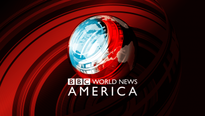
I've also produced a design for World News America...

SR
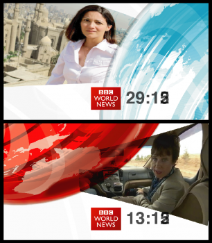
Only spent an hour on this lo-res hack-job... Its a Countdown idea, but i'm really not sure whether it will work... would really appreciate some feedback before i continue.

CH
I like the idea of having some graphics on the countdown to make it a little more interesting but I'm not sure you're quite there with this yet. I think the strangely shaped images is this issue.
Only spent an hour on this lo-res hack-job... Its a Countdown idea, but i'm really not sure whether it will work... would really appreciate some feedback before i continue.
I like the idea of having some graphics on the countdown to make it a little more interesting but I'm not sure you're quite there with this yet. I think the strangely shaped images is this issue.
SR
I like the idea of having some graphics on the countdown to make it a little more interesting but I'm not sure you're quite there with this yet. I think the strangely shaped images is this issue.
It needs a lot more time than I've given it thus far... I just didn't want to go marching off in a stupid direction, which is why I posted so soon. Totally agree with the images being odd shaped.
Only spent an hour on this lo-res hack-job... Its a Countdown idea, but i'm really not sure whether it will work... would really appreciate some feedback before i continue.
I like the idea of having some graphics on the countdown to make it a little more interesting but I'm not sure you're quite there with this yet. I think the strangely shaped images is this issue.
It needs a lot more time than I've given it thus far... I just didn't want to go marching off in a stupid direction, which is why I posted so soon. Totally agree with the images being odd shaped.
MW
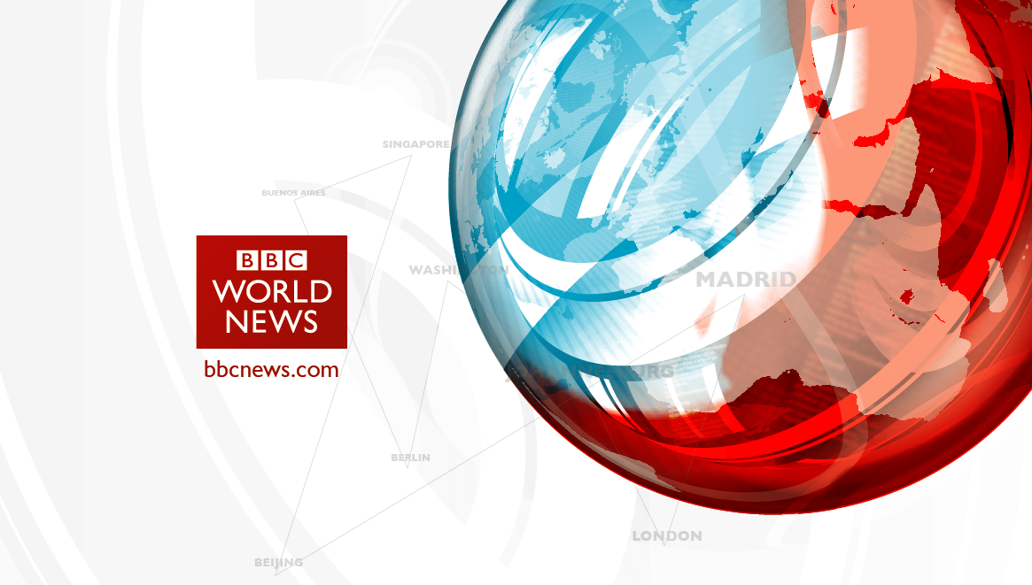
WNA Reminds me of one of my own mocks (tries to find)
This is stirling work, SRS, keep it up!
Hi, and before you jump down my throat for posting again so quickly, i've spent about 6 hours fiddling with this. Trying to make the sphere look more reflective of the white background. I've also made the saturn rings more detailed.
I've also produced a design for World News America...
I've also produced a design for World News America...
WNA Reminds me of one of my own mocks (tries to find)
This is stirling work, SRS, keep it up!
TG
The x colour/red look should definitely be preserved for regional news or business-specific news or whatever. The first thing I think when I see the blue is Reporting Scotland.

The x colour/red look should definitely be preserved for regional news or business-specific news or whatever. The first thing I think when I see the blue is Reporting Scotland.