The Gallery

ITV1

A new look ITV1 (October 2011)

This site closed in March 2021 and is now a read-only archive
CH
Channel56
Hello TV Forum, this is my first mock.
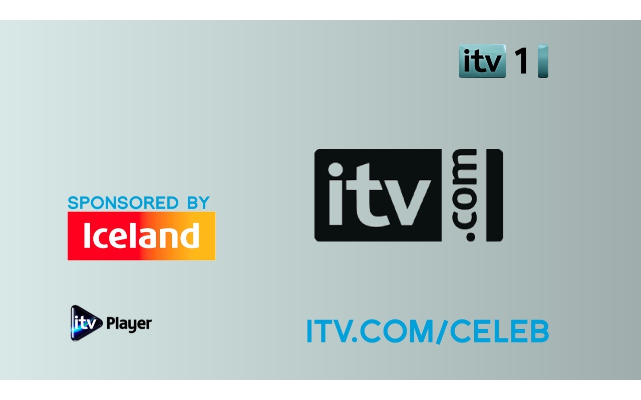
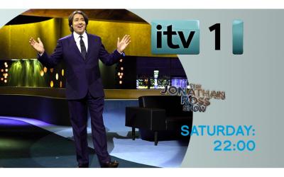
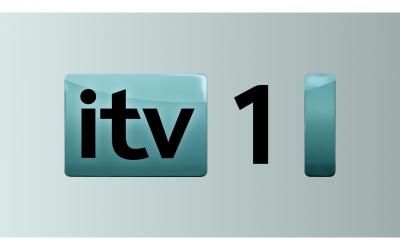
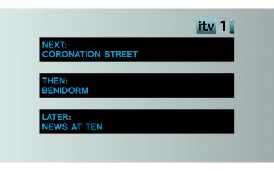
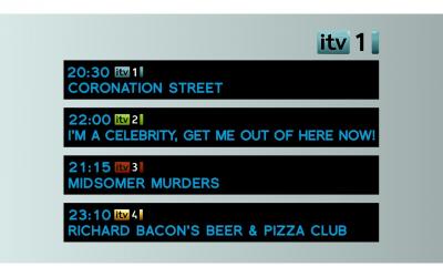
I've designed a new look for ITV1. Changing the logo from yellow to blue and the background black to white I've tried to make it look like 'The brighter side.' I hope you like it but as it is my first mock I am expecting the 'awful.' sort of comments. Please give your feedback in the hope that I can improve my mock.

*
*
*
*
*
*
DF
DrewF
A total lack of imagination - I bet this took at the very most about 30 minutes to make. The fonts are very bad, drawing black boxes on a solid background has no design element whatsoever and looks completely unprofessional - on the last two it appears you've simply plonked some logos and shapes onto it. I'd go on far more if I had the time to waste doing so.

Poor effort - sorry.
CH
Channel56
DrewF posted:
A total lack of imagination - I bet this took at the very most about 30 minutes to make. The fonts are very bad, drawing black boxes on a solid background has no design element whatsoever and looks completely unprofessional - on the last two it appears you've simply plonked some logos and shapes onto it. I'd go on far more if I had the time to waste doing so.

Poor effort - sorry.


I'm sorry to hear that you don't like it, How do you think that I could improve?
ET
ETP1 Forever
I've tried to make it look like 'The brighter side.'


More like "The Blander Side".

It's a start I suppose, although the biggest thing I could advise you to do is use a better colour scheme. And on the last one, lower the amount of branding.

Don't think this would work on TV at all.
CH
Channel56
xwing posted:
I've tried to make it look like 'The brighter side.'


More like "The Blander Side".

It's a start I suppose, although the biggest thing I could advise you to do is use a better colour scheme. And on the last one, lower the amount of branding.

Don't think this would work on TV at all.


Thank you for your comments.
AG
AxG
I'll point out that the blue is hideous, nothing wrong with yellow.

Also the 'itv.com' logo is no longer used.
JA
james
Outstanding. 5/5
CR
Critique
The re-coloured logo is very bland, and paler, and is NOT an improvement. Additionally, the font isn't working, and please, do not use the 'logo' for a programme instead of the text saying the name of the show. Showing the logo instead makes things very un-uniform, and not very nice, at all.

Overall, it's quite poor, and not an improvement on what we already have.
JO
Jonny
Well the first problem is organisation... there isn't any... at all. Logos pop up here, there and everywhere in varying sizes, most of which would look comically ginormous on screen. Similarly, trail text is not set in any given position or style and looks suspiciously MS Paintish. Indeed, the only linking factor seems to be the colour grey - hardly inspiring stuff.

The logo colour change is pointless if not utilised in some wider way. Just because you like that particular shade of blue does not a good redesign make. Switching the colours of ITV1 + 4 needlessly muddles the brand; not a great idea.

Apart from that, it isn't all that different from ITV2's current surrounding package, actually; change a few colours, round a few corners, anti-alias a few fonts. But that's not much of a compliment, unfortunately. Laughing
RO
rob Founding member
I've tried to make it look like 'The brighter side.'


Looks like the "cool, minty fresh breath" side to me.

Not too impressed by this, it's just bland. The Colour scheme is too boring.
DB
dbl
Blue = Cold
Yellow/Red/Orange = Warm

Not so much 'The Brighter Side' (even though they seem to have gone a bit quiet on that slogan) its OK for a first mock, however it could be improved a lot, its all a bit mish mash. (I think previous posters have summed up what needs to be improved)
Last edited by dbl on 16 October 2011 4:04pm
VG
Vgone
james posted:
Outstanding. 5/5


Don't be a troll Laughing

Newer posts