WA
Is that his ipad?
Yeah, but the screen-setup was weird, he had this massive great big thing sticking out as well.
Is that his ipad?
AA
I think the problem here is that Burley showed off the more impressive elements of the set on Instagram, whilst the actual set itself onscreen looks fairly bland and nondescript.
Looks far too bare during Burley’s slot, a small waist height table would help to fill the space a bit. The Westminster view, and the fact the show comes from Westminster, is not really a massive draw IMO. If the view started fairly dark, and got lighter throughout the show, that could look pretty impressive I think, or even if the Sky News logos moved slowly across the screen, it would just add something visually.
I’m struggling to believe the Breakfast slot is not going to have any kind of special branding whatsoever long term (not even a title card); as others have said, surely there’s a wider graphics refresh coming soon?
WL
Suspect Ofcom will be getting a fair few complaints about that!
he had this massive great big thing sticking out as well.
Suspect Ofcom will be getting a fair few complaints about that!
ST
I'm surprised nobody has thought of doing that. Oh, . . . wait, someone else in the same building did.
. . . or even if the Sky News logos moved slowly across the screen, it would just add something visually.
I'm surprised nobody has thought of doing that. Oh, . . . wait, someone else in the same building did.
VA
I think the screens can move in and out of the desk as required to suit presenters - Adam liking it tilted up more, seemingly.
Yeah, but the screen-setup was weird, he had this massive great big thing sticking out as well.
I think the screens can move in and out of the desk as required to suit presenters - Adam liking it tilted up more, seemingly.
DE
Wasn't that on Channel 4 last night?
Yeah, but the screen-setup was weird, he had this massive great big thing sticking out as well.
Wasn't that on Channel 4 last night?
ST
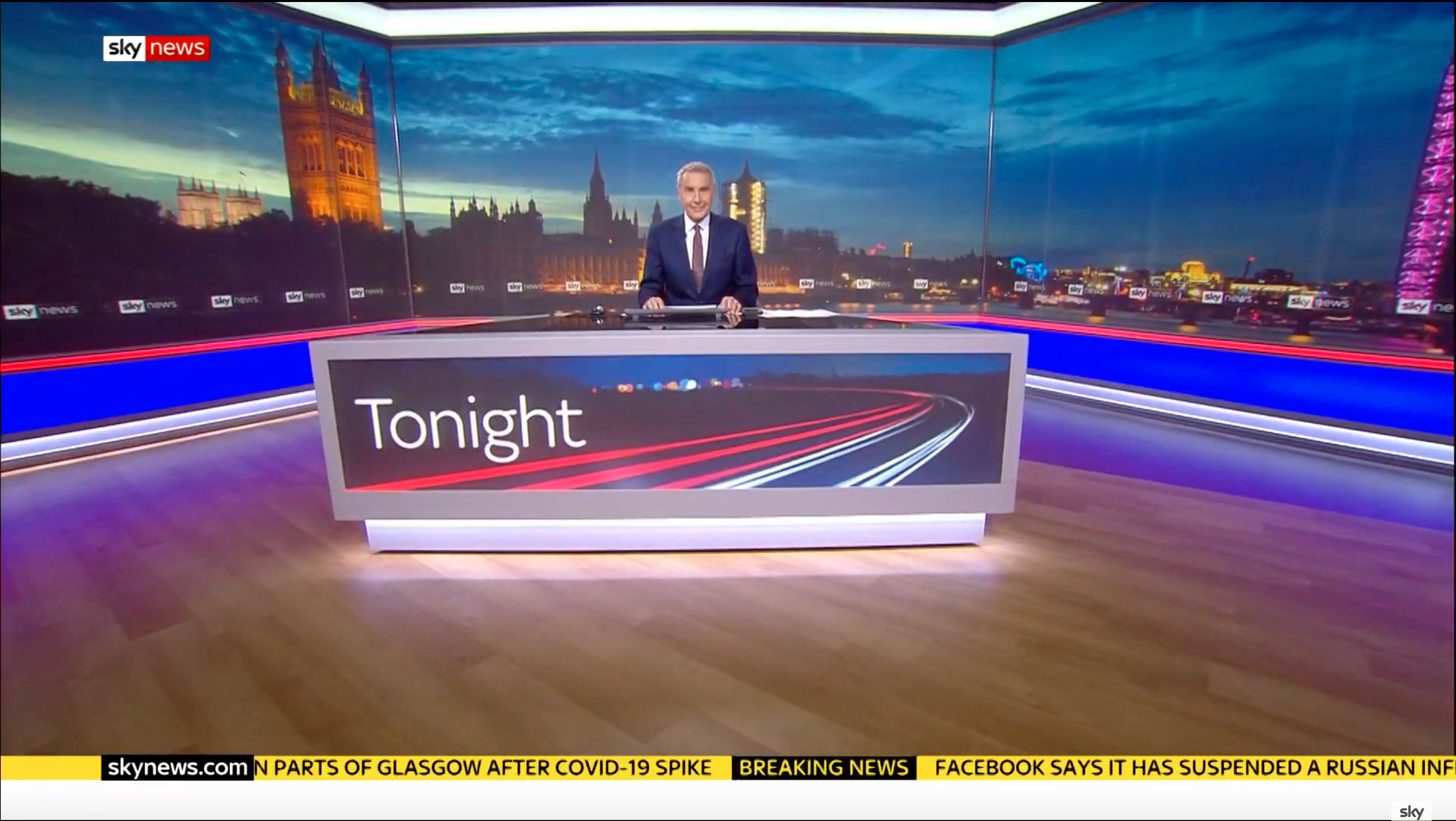
Underwhelming, overall. As well as feeling quite "washed out", some of the camera angles and framing doesn't feel quite right, either. Take the start of
Tonight
, for example; if there was a more interesting background shot, or at least a bit of depth to the backdrop, it could look fantastic. But poor old Dermot just gets lost against a massive photo (the scale of which doesn't quite work for me, either).
PA
I'm guessing the extra parts to the desk added for All Out Politics may be for making the desk larger when needed, but at the moment allows one guest to be sat at the desk while maintaining 2m, something which they didn't need to do on Tonight.
From the link to Adam's tweet posted earlier, the extra pieces add quite a bit of space, so I'd assume the reason the monitors were raised was so Adam could see them properly.
From the link to Adam's tweet posted earlier, the extra pieces add quite a bit of space, so I'd assume the reason the monitors were raised was so Adam could see them properly.
Under starter’s orders #ALLOUTPOLITICS is back @1100 @SkyNews every week day pic.twitter.com/ryC4XLXldu
— Adam Boulton (@adamboultonTABB) September 1, 2020
BR
It looks much better because Westminster looks much better at night.
The set during Sky News Tonight. Notice that Dermot hasn't got the pop out screens bit that Adam had earlier in the day
(EDIT: Oops completely missed a whole page of the thread where PATV already posted)
(EDIT: Oops completely missed a whole page of the thread where PATV already posted)
It looks much better because Westminster looks much better at night.