AM
I reakon trailers will stay in the new format. The ECP may change but I not much further than the logo. They may rid of the gradient at some point though. It is hard to see some text
I’m waiting to see whether newly-created trailers keep the new style. If a few trailers still carry the old look, I think we should assume this refresh is dead.
I reakon trailers will stay in the new format. The ECP may change but I not much further than the logo. They may rid of the gradient at some point though. It is hard to see some text
AM

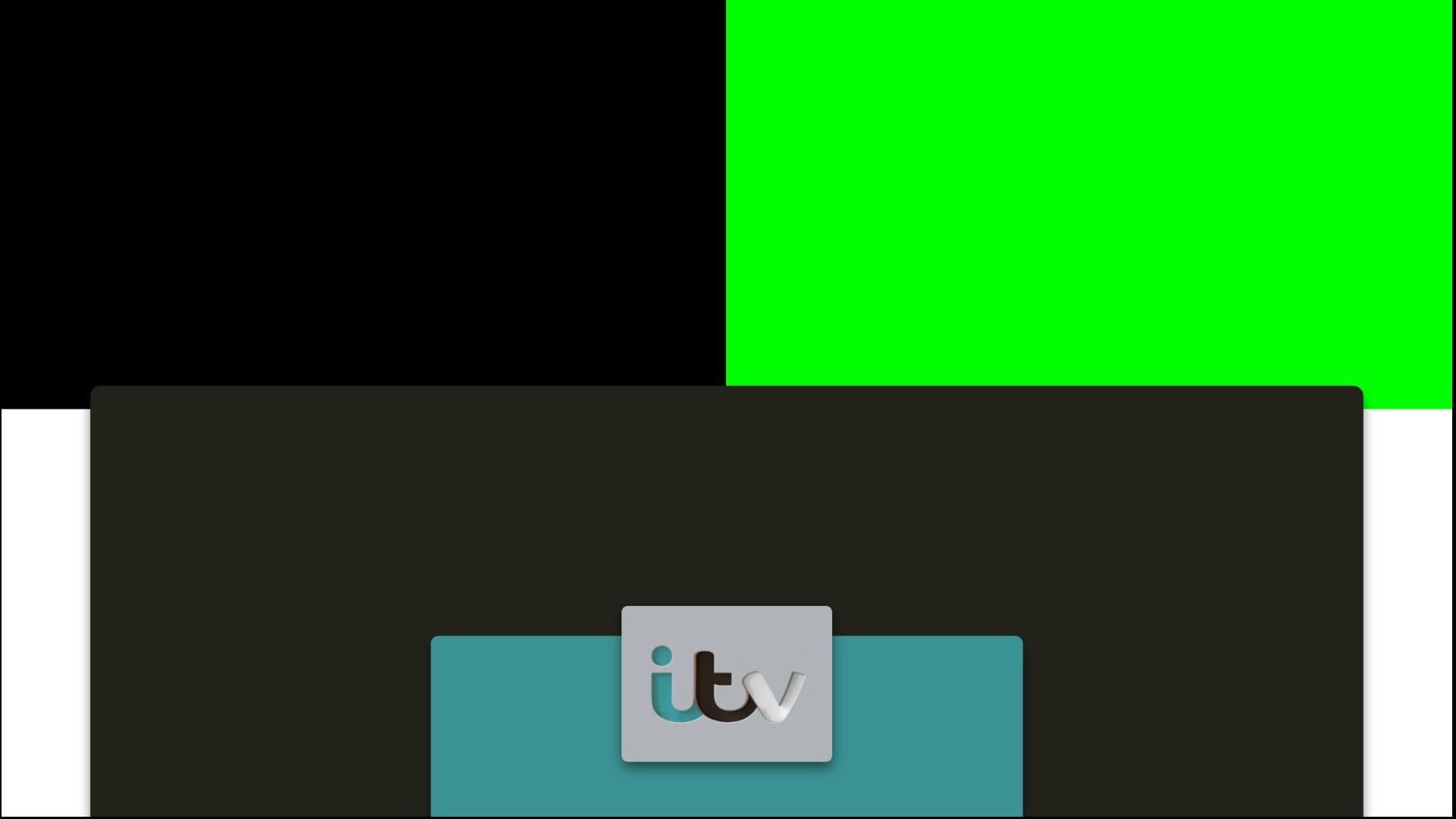
I have mocked up what they could've done with the changes. I'd put an 'also available on ITV Hub' subtitle below the channel logo (I didn't because I don't have ITV Reen installed). I'd also keep the old dropping effect and limit the number of lines of text to 3 as 4 seems cramped
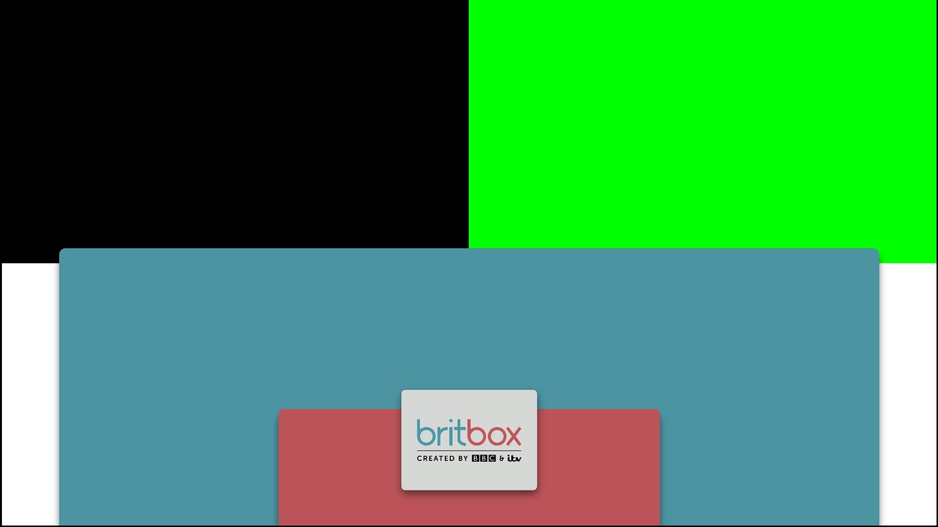
Here is a BritBox one that doesn't look cramped:

I decided to get rid of the gradient as on some displays you could see obvious rings and couldn't read the writing. Although this means that the furthest layer gets lost inside the credits
I haven't bothered texturing it like wood because I put them together in half an hour on Slides.
I think these might slide out of use by the end of their 'Hub has gone supersized' campaign. I don't see why they even needed to change it. But I think if they do revert to the old ones full time again - they should curve the corners slightly as it feels nicer and would be more inkeeping with the Hub brand

I have mocked up what they could've done with the changes. I'd put an 'also available on ITV Hub' subtitle below the channel logo (I didn't because I don't have ITV Reen installed). I'd also keep the old dropping effect and limit the number of lines of text to 3 as 4 seems cramped
Here is a BritBox one that doesn't look cramped:

I decided to get rid of the gradient as on some displays you could see obvious rings and couldn't read the writing. Although this means that the furthest layer gets lost inside the credits
I haven't bothered texturing it like wood because I put them together in half an hour on Slides.
I think these might slide out of use by the end of their 'Hub has gone supersized' campaign. I don't see why they even needed to change it. But I think if they do revert to the old ones full time again - they should curve the corners slightly as it feels nicer and would be more inkeeping with the Hub brand
Last edited by Alfie Mulcahy on 24 July 2020 10:41pm - 4 times in total
:-(
A former member
Well it isn’t inconsistent for a start. Unless you are ridiculously pedantic. Oh hang on I’ve just remembered where I am.
PI
I think that kinda shows the point though, the trails are "here's things you can watch" very much like a colour swatch, it's their offering in your home, you pick what you want. From that concept it works very well.
I think the 2013 colour picking concept did that much more effectively though. The ITV logo reflecting the 'temperature' of the programme being promoted was such an innovation, it's a real shame they didn't develop that rather than ditching it in favour of wooden stencils, which would be much more appropriate for one of the 'create and craft' channels.