BL
Disclaimer: I am not a designer. I just like design.
Since 2017, BBC One has been using the Oneness series of idents. When initially launched, and still to this day, they were criticised. At first, they started off with just two idents of people being awkward in front of a camera. Or dancing. The problem with Oneness, for me, was its execution. It took a rather tired aesthetic and paired it with a boring series of idents that don't make you think of quality British programming, award-winning news, and EastEnders.
The actual idea doesn't get enough credit. I like the idea of going up and down the country, seeing daily life, with regular people. I just think that the execution is wrong. What my mock ideas intend to achieve (and I refrain from calling them proper mocks because they are just still images) is as follows:
1. Rejig Oneness. Not outright get rid of it, but enhance the key components.
2. Look at the channel's logo, and make something new.
3. Attempt to change the channel colour, and find something else that works.
And this is what I have:
BBC One has used red in its branding for 23 years. Frankly, I don't like that red. I think it looks cheap and nasty, and a bit stale at this point. I chose this colour instead. Its a shade of orange (#FCA60C) that is warm, is fresh, and it is unique to the channel. I have also decided to replace the wordmark logo for one with a number. It is very hard to find a '1' that works as a logo. So, rather than do that, I just picked a version of the numeral that I liked.
The reason that the balloon idents worked was that the BBC didn't need a frivolous BBC One logo. It's all about the strength of the ident. If you were to plaster this on a 2017 Oneness ident, it wouldn't work. Instead, I created this still mockup image:
The central figure of these idents will be the globe, returning for the first time in almost 20 years. The globe is still the symbol that people associate with the BBC, so why not bring it back? This iteration combines elements of Oneness and the balloon idents. The concept is that the globe is travelling up and down the UK and Northern Ireland. The camera would pan away or towards a mechanical spinning globe, showing off landmarks, landscapes, and people doing things (like a dad and his kids kicking footballs into a net)
My idea would be to have a number of national idents, with a mixture of landmarks (featuring scenes around Big Ben, the London Bridge), landscapes (Ben Nevis, Snowdon, The Severn), as well as people idents (the aforementioned football one, street performers, and many more ideas that I cannot be bothered to share).
There would also be between 3-5 regional variations before news programmes on the SD feed of BBC One (why they haven't upgraded yet is beyond me)
.png)
.png)
Any thoughts/ideas/offers to make this better? Please comment!
Since 2017, BBC One has been using the Oneness series of idents. When initially launched, and still to this day, they were criticised. At first, they started off with just two idents of people being awkward in front of a camera. Or dancing. The problem with Oneness, for me, was its execution. It took a rather tired aesthetic and paired it with a boring series of idents that don't make you think of quality British programming, award-winning news, and EastEnders.
The actual idea doesn't get enough credit. I like the idea of going up and down the country, seeing daily life, with regular people. I just think that the execution is wrong. What my mock ideas intend to achieve (and I refrain from calling them proper mocks because they are just still images) is as follows:
1. Rejig Oneness. Not outright get rid of it, but enhance the key components.
2. Look at the channel's logo, and make something new.
3. Attempt to change the channel colour, and find something else that works.
And this is what I have:
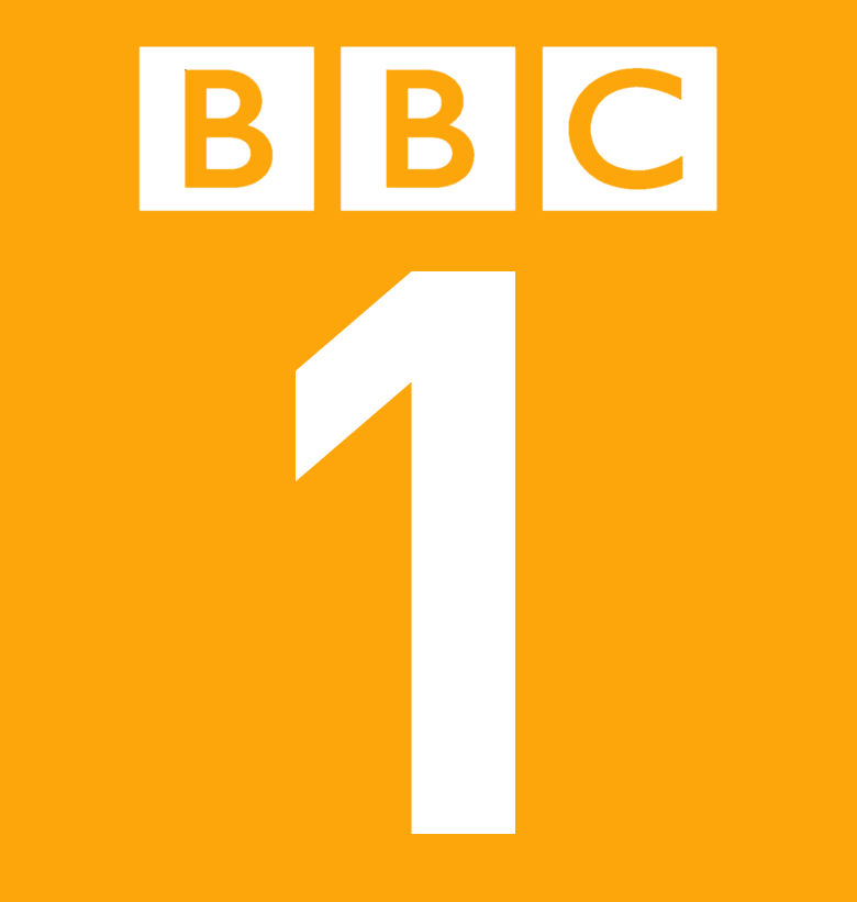
BBC One has used red in its branding for 23 years. Frankly, I don't like that red. I think it looks cheap and nasty, and a bit stale at this point. I chose this colour instead. Its a shade of orange (#FCA60C) that is warm, is fresh, and it is unique to the channel. I have also decided to replace the wordmark logo for one with a number. It is very hard to find a '1' that works as a logo. So, rather than do that, I just picked a version of the numeral that I liked.
The reason that the balloon idents worked was that the BBC didn't need a frivolous BBC One logo. It's all about the strength of the ident. If you were to plaster this on a 2017 Oneness ident, it wouldn't work. Instead, I created this still mockup image:

The central figure of these idents will be the globe, returning for the first time in almost 20 years. The globe is still the symbol that people associate with the BBC, so why not bring it back? This iteration combines elements of Oneness and the balloon idents. The concept is that the globe is travelling up and down the UK and Northern Ireland. The camera would pan away or towards a mechanical spinning globe, showing off landmarks, landscapes, and people doing things (like a dad and his kids kicking footballs into a net)
My idea would be to have a number of national idents, with a mixture of landmarks (featuring scenes around Big Ben, the London Bridge), landscapes (Ben Nevis, Snowdon, The Severn), as well as people idents (the aforementioned football one, street performers, and many more ideas that I cannot be bothered to share).
There would also be between 3-5 regional variations before news programmes on the SD feed of BBC One (why they haven't upgraded yet is beyond me)
Any thoughts/ideas/offers to make this better? Please comment!