PA
Hi everyone!
Hope everyone is doing okay in this mental year we're living through.
I was thinking the other day about how ITV's family logos could be updated to be more unique and colourful, while continuing the 'overlapping colour' essence of the 2013 company rebrand, and started coming up with a few ideas.
Here's where I ended up:
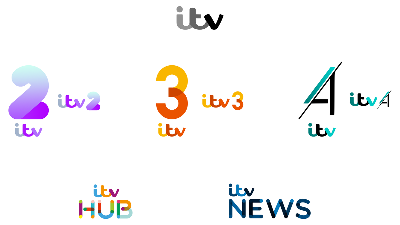
My thinking was that the main ITV corporate logo would be monochrome, but adopt the colour-matching system it had from 2013 for all on-air promo stuff on the actual ITV/ITV1 channel. So it would rarely seen in monochrome on screen but in the chameleon form it took on from 2013 until the recent change. I loved that look and would like to see it return, with updated graphics alongside it.
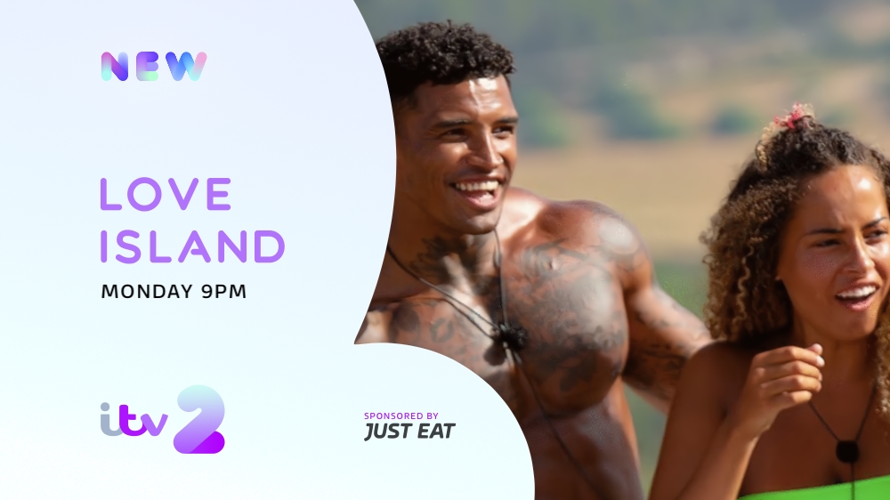
The channel logos for 2, 3 and 4 would all move to the 3-piece ITV logo introduced more recently to the main channel/corporate logo, with unique numerals which attempt to capture more of the 'identity' of each channel: a bulbous, youthful thick-set 2 for the youth-oriented channel, a more sophisticated overlapping style for 3, and a sharp style for the male/sports-oriented 4 (which is also inspired by the 2005 logo).
I've been yearning for ITV News to adopt a (predominantly navy) blue colour scheme for ages rather than the teal it has used for so long, so that's what I opted for, and the ITV Hub name is one I think was well-known and effective, so I brought it back with a muticoloured theme to encompass all the brands.
Would be interested to hear people's feedback and could keep developing them, perhaps even trying some designs for the channel/news graphics.
pad
Further work from future posts in this thread
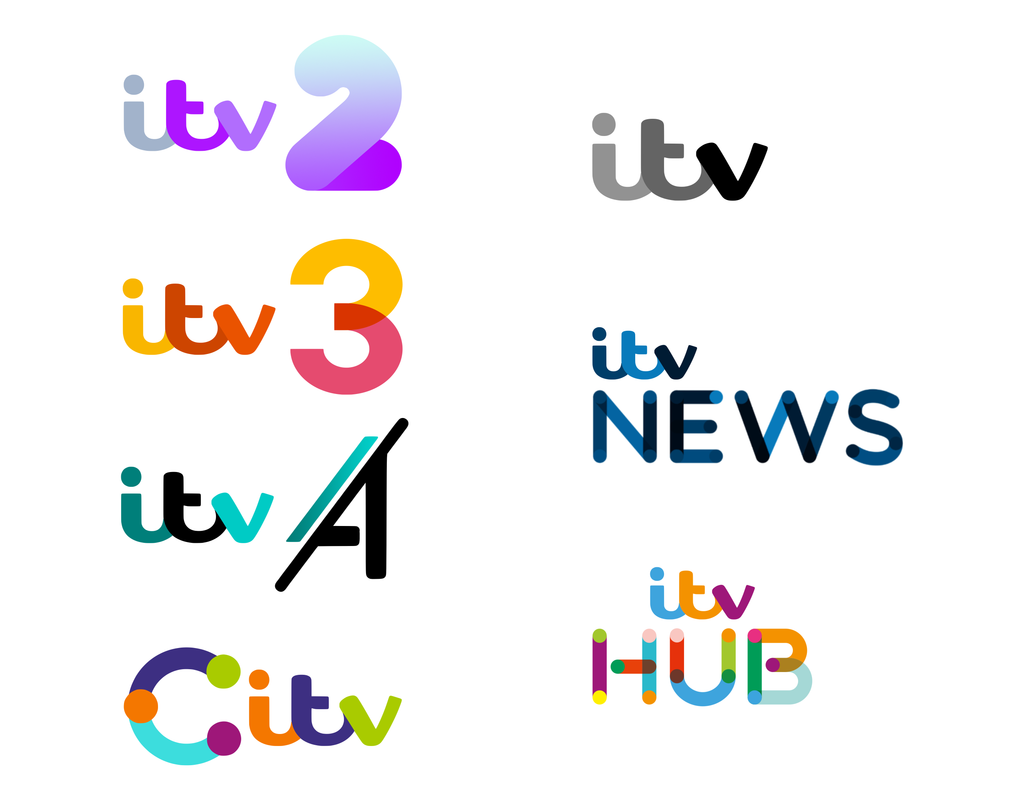
Revision 1
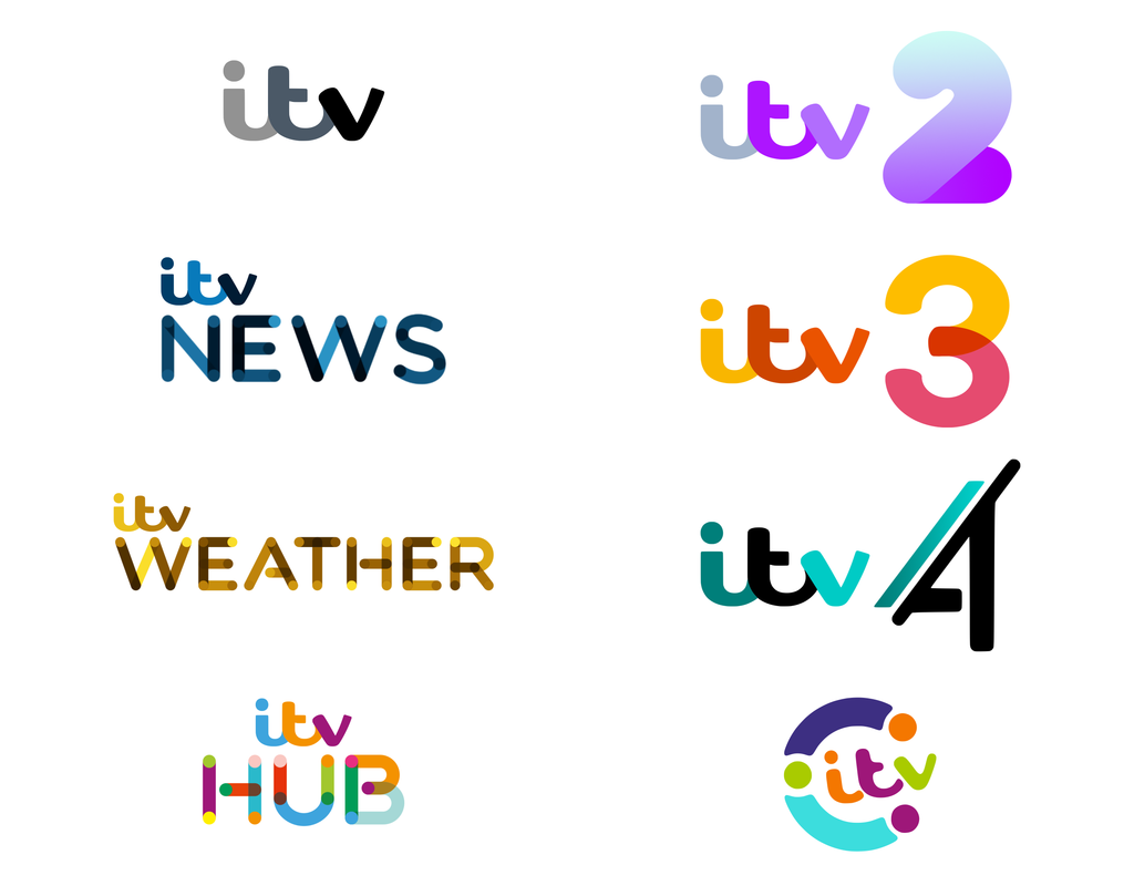
Revision 2
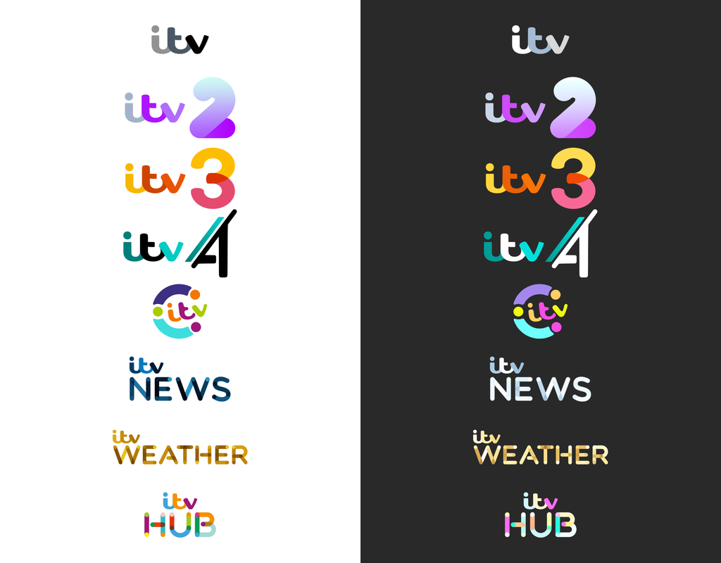
Logos on light and dark backgrounds
Trailer 1:
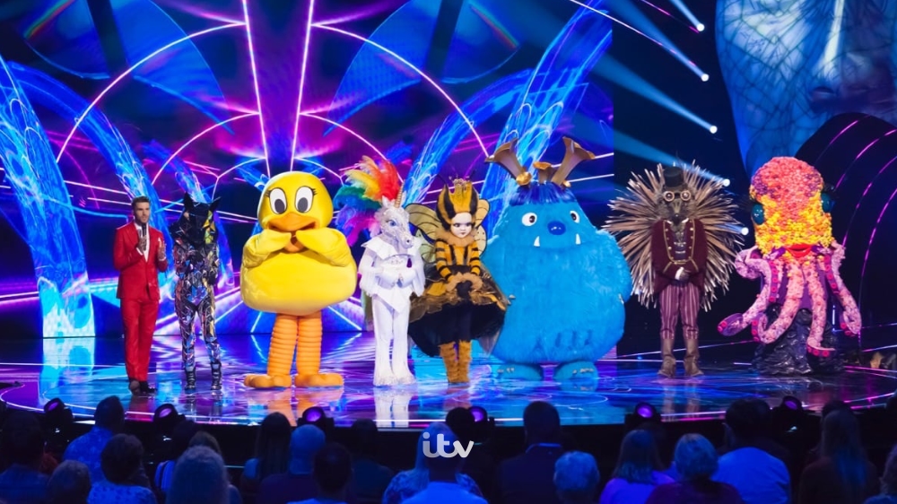
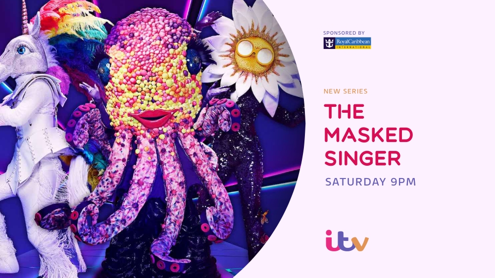
Trailer 2:
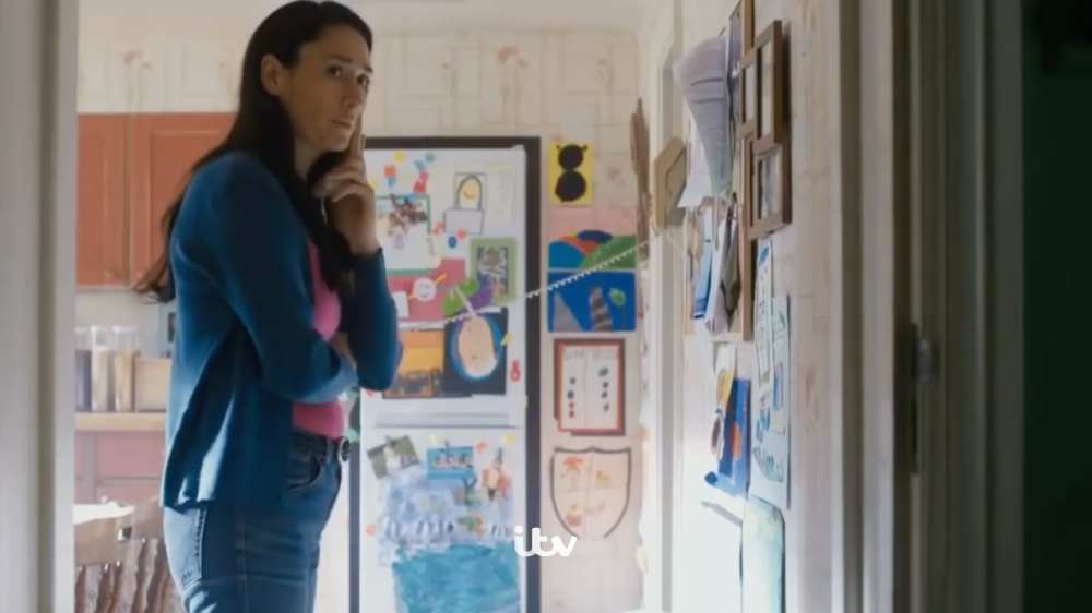
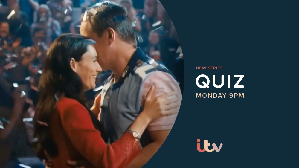
Trailer 3:
All ITV trailers and logos
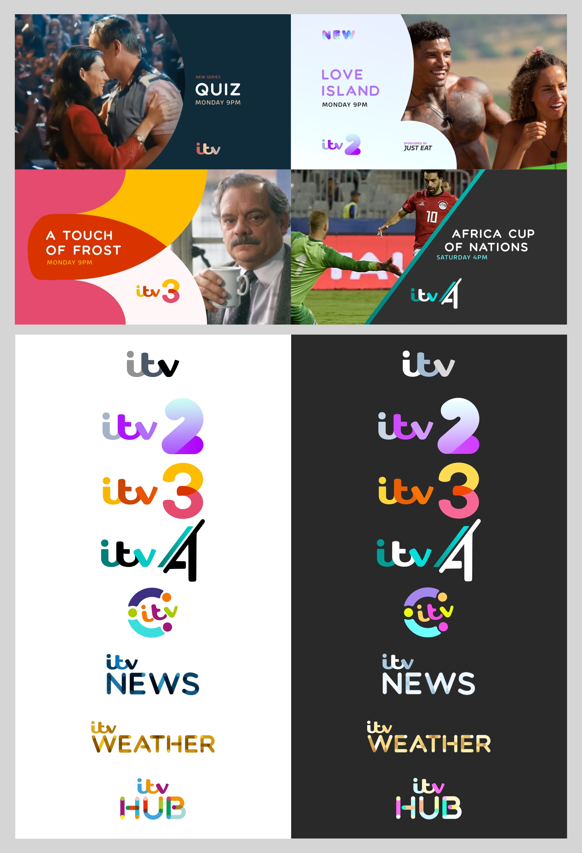
ITV2
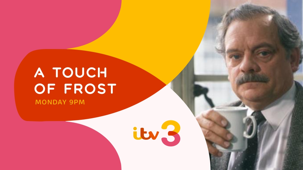
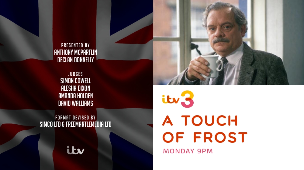
ITV3
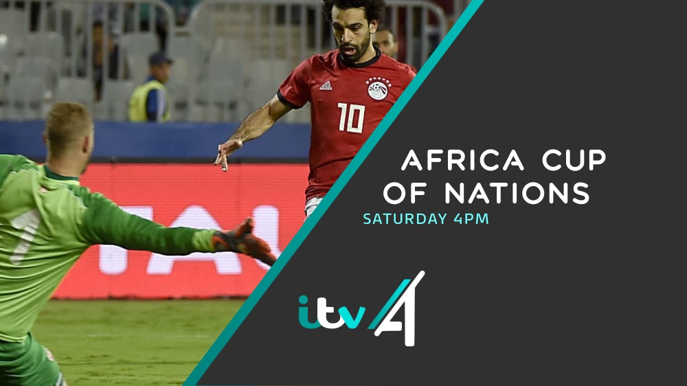
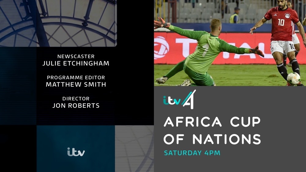
ITV4
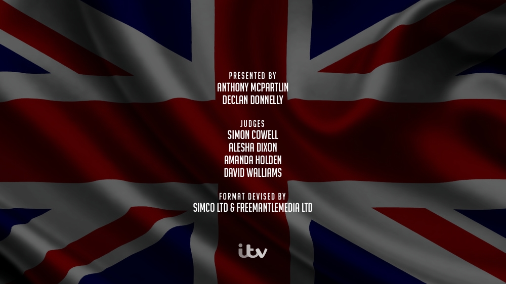
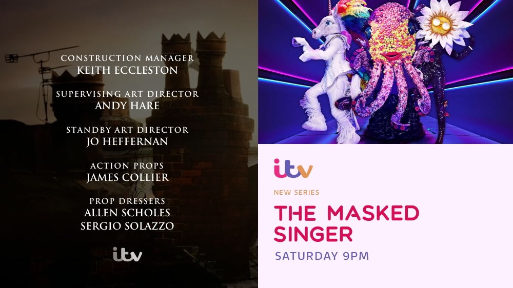
Britain's Got Talent credits
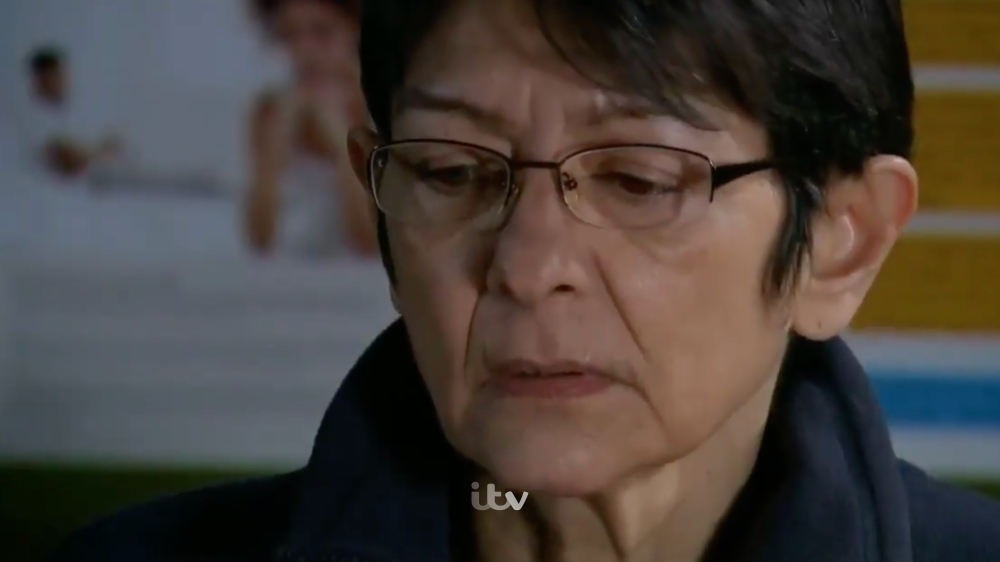
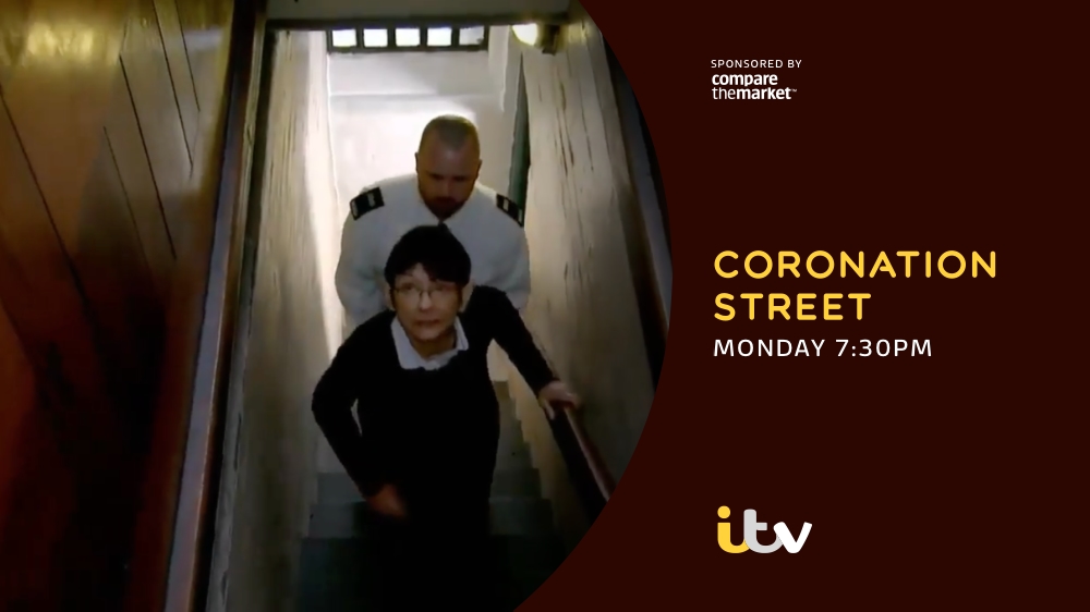
Coronation Street credits
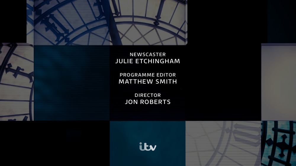
ITV News credits
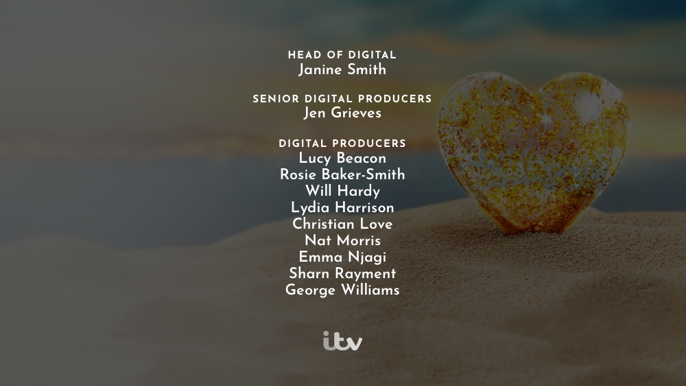
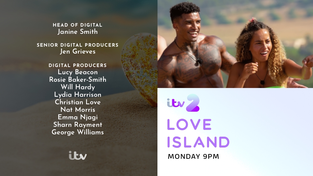
Love Island credits
ITV ECP
ITV2 ECP
ITV3 ECP
ITV4 ECP
Hope everyone is doing okay in this mental year we're living through.
I was thinking the other day about how ITV's family logos could be updated to be more unique and colourful, while continuing the 'overlapping colour' essence of the 2013 company rebrand, and started coming up with a few ideas.
Here's where I ended up:
My thinking was that the main ITV corporate logo would be monochrome, but adopt the colour-matching system it had from 2013 for all on-air promo stuff on the actual ITV/ITV1 channel. So it would rarely seen in monochrome on screen but in the chameleon form it took on from 2013 until the recent change. I loved that look and would like to see it return, with updated graphics alongside it.
The channel logos for 2, 3 and 4 would all move to the 3-piece ITV logo introduced more recently to the main channel/corporate logo, with unique numerals which attempt to capture more of the 'identity' of each channel: a bulbous, youthful thick-set 2 for the youth-oriented channel, a more sophisticated overlapping style for 3, and a sharp style for the male/sports-oriented 4 (which is also inspired by the 2005 logo).
I've been yearning for ITV News to adopt a (predominantly navy) blue colour scheme for ages rather than the teal it has used for so long, so that's what I opted for, and the ITV Hub name is one I think was well-known and effective, so I brought it back with a muticoloured theme to encompass all the brands.
Would be interested to hear people's feedback and could keep developing them, perhaps even trying some designs for the channel/news graphics.
pad
Further work from future posts in this thread
Revision 1
Revision 2
Logos on light and dark backgrounds
Trailer 1:
Trailer 2:
Trailer 3:
All ITV trailers and logos
ITV2
ITV3
ITV4
Britain's Got Talent credits
Coronation Street credits
ITV News credits
Love Island credits
ITV ECP
ITV2 ECP
ITV3 ECP
ITV4 ECP
Last edited by pad on 16 June 2020 2:28pm - 24 times in total


