EY
It looks very mocked like someone’s recreated it, especially that glassy headline transition
Really not liking the glass rendition of the logo for regular TOTHs. It looks cheap and there's something about the way that the old sequence animates that feels more coherent in a way.
It looks very mocked like someone’s recreated it, especially that glassy headline transition

CH
Watching a little more and it's growing on me. If AJE didn't exist until now and this is what they launched with in 2020, I'm sure we'd all be much warmer with it. It's just so hard to look past the excellent 2006 look that held up so well.
All the promos and idents now appear to begin and end with the same logo animation, so they all seamlessly blend into one another.
Please try not to quote reply to this post in full so this thread doesn't get clogged up with these screencaps over and over.


There's some slight movement of the lighting on the panels between the two video monitors that mimicks the graphics. The lights gradually fade between gold and blue.

Newshour open. Notice how there's a twinkle above Washington, London, and Doha. I guess they finally got around to removing Kuala Lumpur.

Newscast open


I'm glad the desk is similar.


Please try not to quote reply to this post in full so this thread doesn't get clogged up with these screencaps over and over.
All the promos and idents now appear to begin and end with the same logo animation, so they all seamlessly blend into one another.
Please try not to quote reply to this post in full so this thread doesn't get clogged up with these screencaps over and over.
There's some slight movement of the lighting on the panels between the two video monitors that mimicks the graphics. The lights gradually fade between gold and blue.
Newshour open. Notice how there's a twinkle above Washington, London, and Doha. I guess they finally got around to removing Kuala Lumpur.
Newscast open
I'm glad the desk is similar.
Please try not to quote reply to this post in full so this thread doesn't get clogged up with these screencaps over and over.
Last edited by Charles on 2 January 2020 3:08am
JW
Some photos of the @AJEnglish on-screen refresh and new studio. @peterdobbie1 pic.twitter.com/c1SJ79oAsw
— Gabriel Elizondo (@elizondogabriel) January 1, 2020
JW
Thanks for posting those, Charles. I like it a lot. Small touches here and there show that a lot of thought has gone into it, without overdoing it. The shape and beveled edging of the podium is nice. The overall palette is smooth and fresh, yet brings distinction without being overpowering.
I like the music and the end boards all very distinctly AJ.
My only uncertainty so far (as far as the visual look goes): I’m not sure about the clear shroud at the front of the desk. Other than to carry the logo, does it serve any other technical purpose, or is only there for the aesthetic?
All in all, this is a very good makeover! I like. Really like. Not overpowering at all.
ST
Indeed, why didn't they go for LED screens? There is enough space between the desk or standing position to ensure that it wouldn't appear pixelated on screen.
Or even the back projection screens similar to Tegesschau:

Those barcos though 🤢
Indeed, why didn't they go for LED screens? There is enough space between the desk or standing position to ensure that it wouldn't appear pixelated on screen.
Or even the back projection screens similar to Tegesschau:
MO
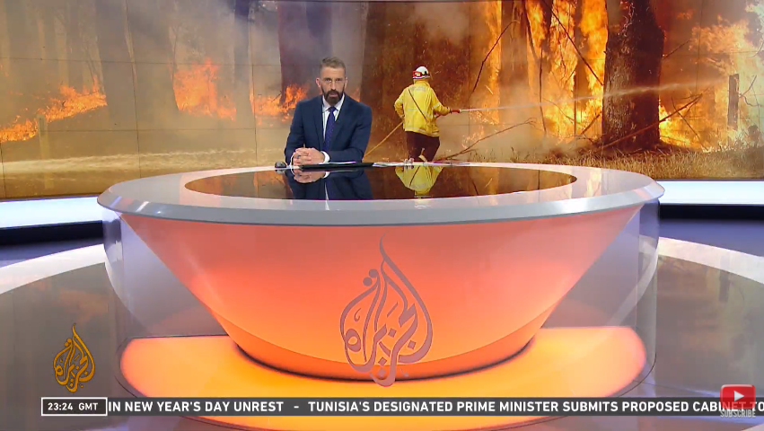
Looks like he's sat in a giant cup of tea.
AND WHAT'S WITH THE CAPITALS! STOP SHOUTING!!! Hundreds of studies show that sentence case is easier to read, all capitals should be a thing of the past in every context.
Clean shot of the new desk. Surprised they've stuck with a circular one considering the style of the ones in London and DC.
Looks like he's sat in a giant cup of tea.
AND WHAT'S WITH THE CAPITALS! STOP SHOUTING!!! Hundreds of studies show that sentence case is easier to read, all capitals should be a thing of the past in every context.
CR
When BBC World News relaunched in 2013, didn't they use sentence case on their ticker at first? However, it was worse for readability and looked a bit naff too so it was swapped out for all caps after a few days?
AND WHAT'S WITH THE CAPITALS! STOP SHOUTING!!! Hundreds of studies show that sentence case is easier to read, all capitals should be a thing of the past in every context.
When BBC World News relaunched in 2013, didn't they use sentence case on their ticker at first? However, it was worse for readability and looked a bit naff too so it was swapped out for all caps after a few days?
MO
When BBC World News relaunched in 2013, didn't they use sentence case on their ticker at first? However, it was worse for readability and looked a bit naff too so it was swapped out for all caps after a few days?
Well they’re using sentence case now...!
If all capitals was better for readability, WHY DON’T WE ALL USE IT ALL THE TIME?
AND WHAT'S WITH THE CAPITALS! STOP SHOUTING!!! Hundreds of studies show that sentence case is easier to read, all capitals should be a thing of the past in every context.
When BBC World News relaunched in 2013, didn't they use sentence case on their ticker at first? However, it was worse for readability and looked a bit naff too so it was swapped out for all caps after a few days?
Well they’re using sentence case now...!
If all capitals was better for readability, WHY DON’T WE ALL USE IT ALL THE TIME?
WO
When BBC World News relaunched in 2013, didn't they use sentence case on their ticker at first? However, it was worse for readability and looked a bit naff too so it was swapped out for all caps after a few days?
Well they’re using sentence case now...!
If all capitals was better for readability, WHY DON’T WE ALL USE IT ALL THE TIME?
Well it's a flipper now rather than a scrolling ticker, so it doesn't suffer from the kerning/readability problems it did when they first put the graphics to air.
I take it you're not a fan of Sky News' lower thirds either then?
AND WHAT'S WITH THE CAPITALS! STOP SHOUTING!!! Hundreds of studies show that sentence case is easier to read, all capitals should be a thing of the past in every context.
When BBC World News relaunched in 2013, didn't they use sentence case on their ticker at first? However, it was worse for readability and looked a bit naff too so it was swapped out for all caps after a few days?
Well they’re using sentence case now...!
If all capitals was better for readability, WHY DON’T WE ALL USE IT ALL THE TIME?
Well it's a flipper now rather than a scrolling ticker, so it doesn't suffer from the kerning/readability problems it did when they first put the graphics to air.
I take it you're not a fan of Sky News' lower thirds either then?