MA
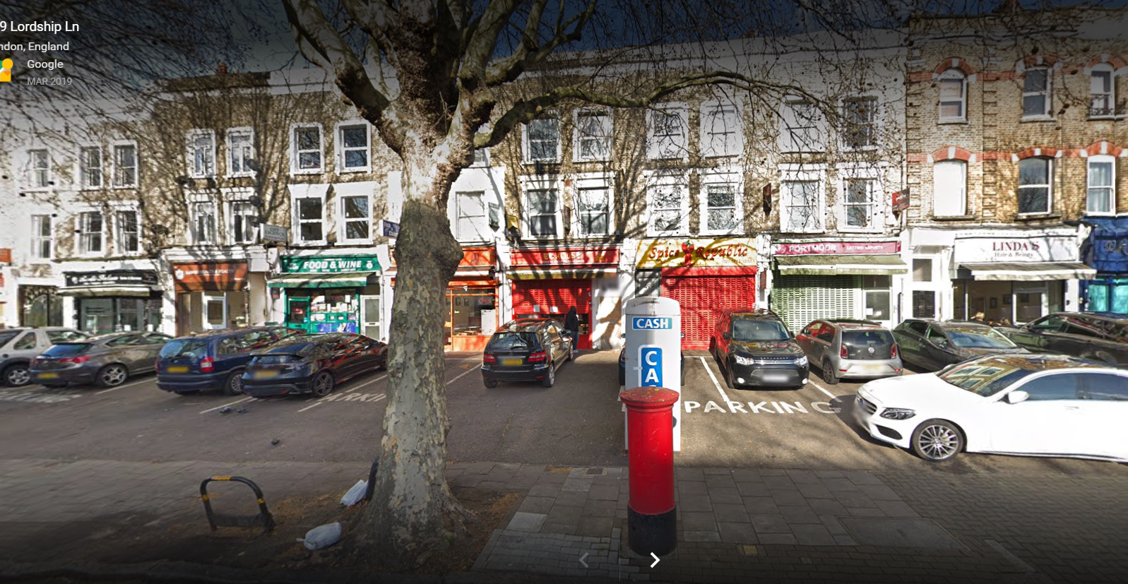
One of the two local phone boxes here was converted into an ATM with the payphone (the early 90s style with a coin slot) one the side of it.
The only 'modern' adaptation was the mag stripe reader added in the noughties.
The last remaining bank in a large village near me closed, taking with it the only ATM. So the zero revenue earning phone box was converted into an ATM. It didn’t take long ( three weeks) for it to be totally flatened in a ram raid. That was two years ago. It was never reinstated. A great shame, but phone boxes given their position next to roads are easy targets. I think it was/is a BT run initiative?
I'm sure most phone boxes by me don't have any branding now, plain windows with one or two sides covered in adverts, often they don't even seem to have a door on anymore.
One of the two local phone boxes here was converted into an ATM with the payphone (the early 90s style with a coin slot) one the side of it.
The only 'modern' adaptation was the mag stripe reader added in the noughties.
The last remaining bank in a large village near me closed, taking with it the only ATM. So the zero revenue earning phone box was converted into an ATM. It didn’t take long ( three weeks) for it to be totally flatened in a ram raid. That was two years ago. It was never reinstated. A great shame, but phone boxes given their position next to roads are easy targets. I think it was/is a BT run initiative?