The Newsroom

The new NEW Central West and BBC Midlands thread

(January 2013)

This site closed in March 2021 and is now a read-only archive
MW
Mike W
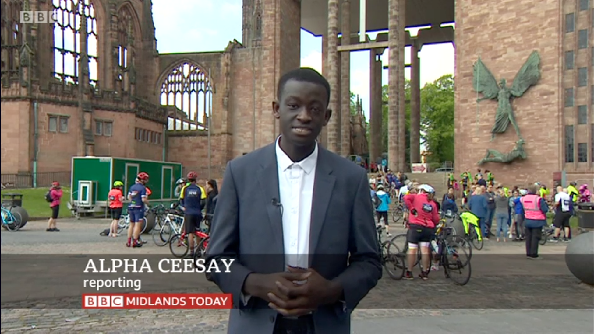
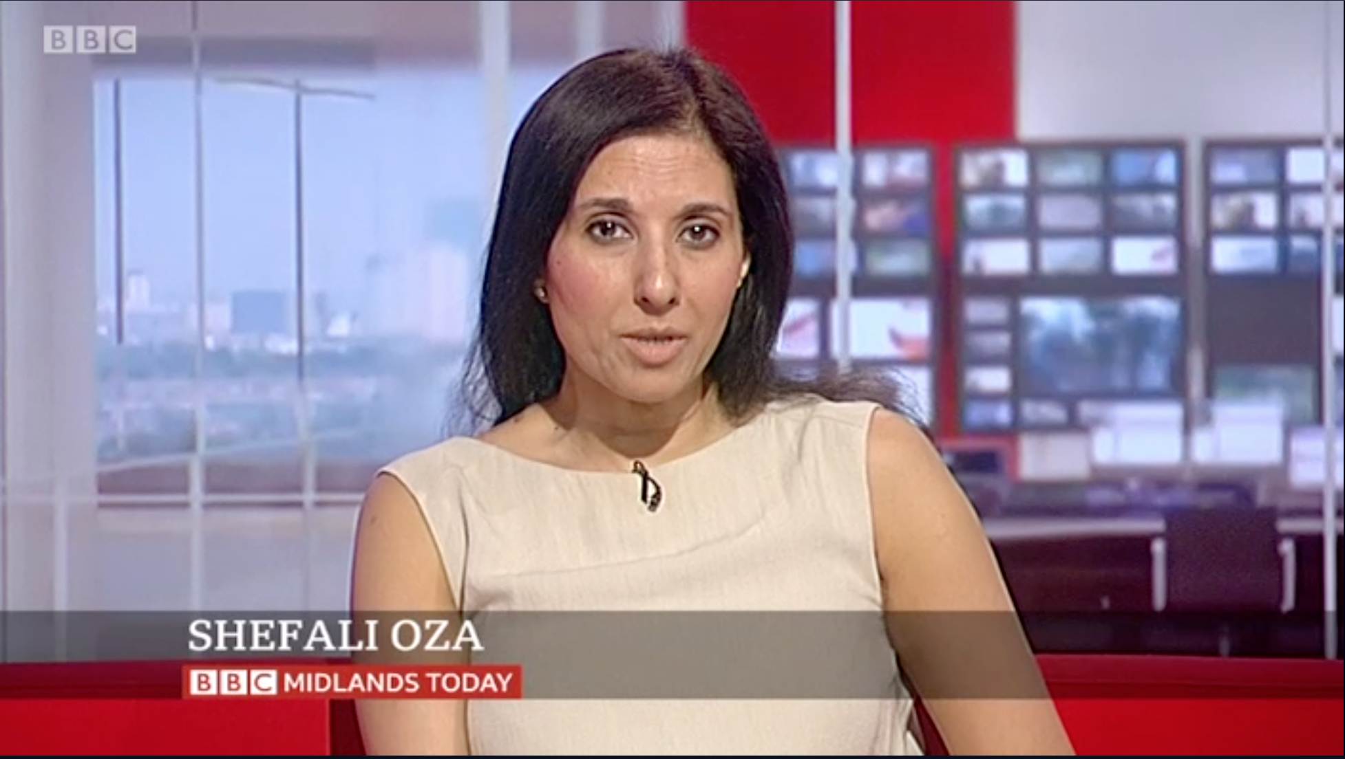
The animation is very nice. I think the name should be in title case rather than upper case.

Looks like the BBC still can’t do anything more creative than blocks of plain colour however - both for the straps and the logo.

Reminds me a little of the straps from ITV News’ black and yellow look.

Agreed on the last part,definite hints of the black and yellow peril. I don't like the Reith text next to the BBC logo, I assume that either titles are going to change (albeit ever so slightly) across the corporation's news output to match the logo. I wonder if we could see a variation on the clamshell look coming back?
HA
harshy Founding member
Are they the new bbc news lower thirds that is disappointing if it is.
JA
Jamesypoo
You've all got this wrong. It's in Reith so ergo it must look good. Isn't that how it works?
OR
orange
RDJ posted:
*
*

Interesting....

I can only assume that the whole look will need changing if they're going to go for these graphics. The black astons don't suit when the titles and the look are all white.

The way it pops up is quite nice. But the Midlands Today logo is horrific. Reith just does not look good like that for a main logo at all.

Yikes! Quite honestly thought this was a mock...
BBI45, chris and W1LL gave kudos
WO
Worzel
_Tom_ posted:
RDJ posted:
*
*

Interesting....

I can only assume that the whole look will need changing if they're going to go for these graphics. The black astons don't suit when the titles and the look are all white.

The way it pops up is quite nice. But the Midlands Today logo is horrific. Reith just does not look good like that for a main logo at all.

Yikes! Quite honestly thought this was a mock...


When are they going to finally drop the 4:3 safe areas, the year 2050?
BR
Brekkie
_Tom_ posted:
RDJ posted:
*
*

Interesting....

I can only assume that the whole look will need changing if they're going to go for these graphics. The black astons don't suit when the titles and the look are all white.

The way it pops up is quite nice. But the Midlands Today logo is horrific. Reith just does not look good like that for a main logo at all.

Yikes! Quite honestly thought this was a mock...


When are they going to finally drop the 4:3 safe areas, the year 2050?

About 35 years after they axe the black and white licence fee.

To be honest we should probably just be grateful they're not making them Instagram safe.
DE
deejay
Well. Very interesting. And not at all what everyone else is working with! Is this on screen all the time now or just certain bulletins?
harshy and bilky asko gave kudos
WL
W1LL
They’re hideous. The only redeeming feature about them is the animation which, as I gather, the majority of the regions don’t have the kit to do - so we’ll just end up with that mess fading in and out. I really hope that was just a trial.
DV
dvboy
It was that bulletin only.
harshy and bilky asko gave kudos
AJ
AJ
The animation is nice, but 4:3 safe still? It'd be interesting to know how many people actually watch on 4:3 TVs and aren't unintentionally watching in shatliffed mode on a wide-screen TV.
MW
Mike W
Is that because Birmingham’s current Aston’s are 4:3 safe? Note the formatting is incorrect as apparently the names will be title case, might be someone pressed the wrong template in casparCG
SP
Steve in Pudsey
That does seem a possibility, particularly with Deejay's comment upthread. Perhaps doing some testing of the new look and didn't switch everything back to normal, so that's a hybrid of the new and old, which is why it looks crap?

Newer posts