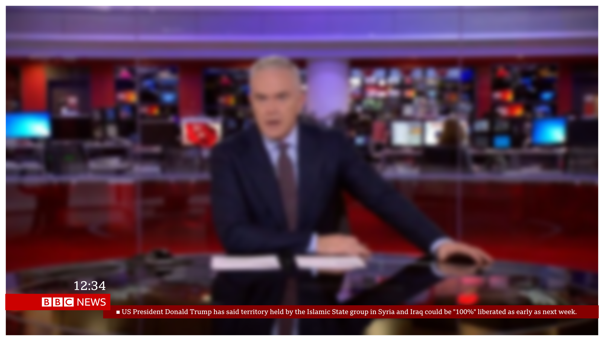
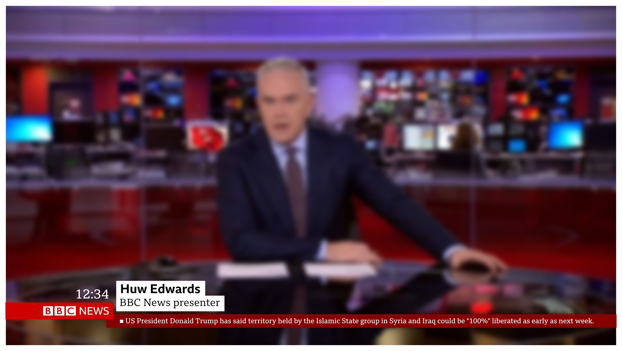
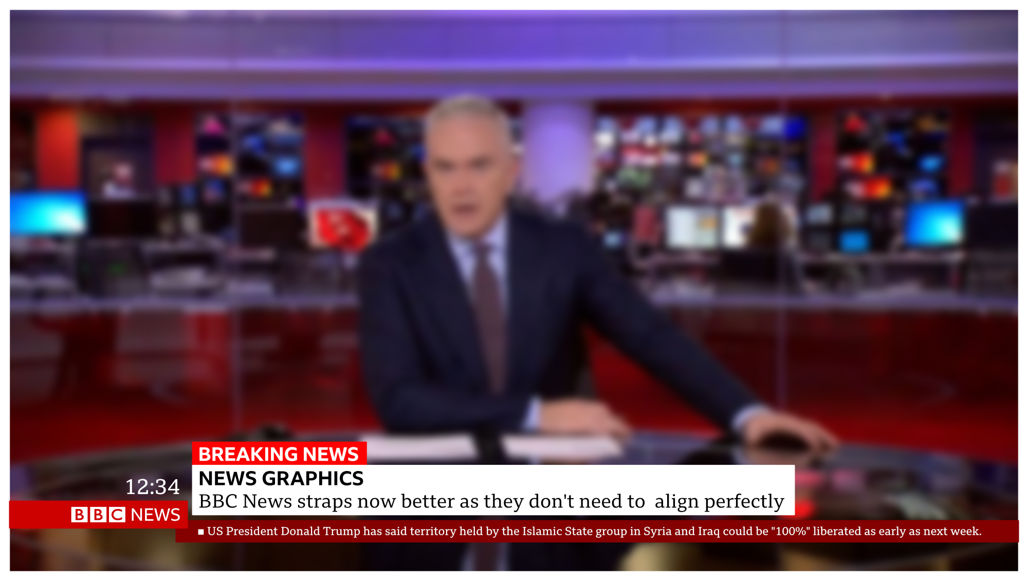
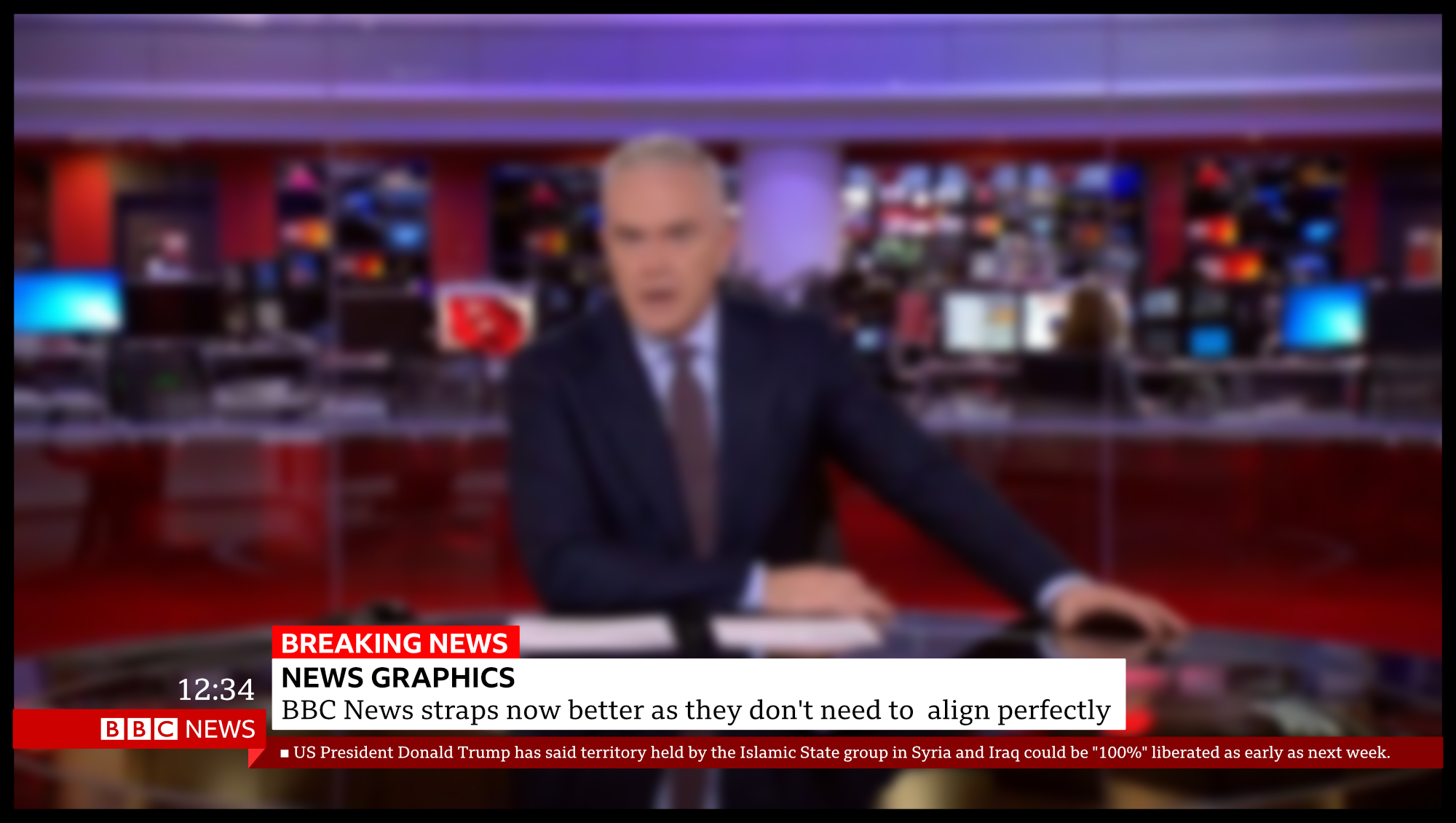
My first every post on the Gallery. Linked to the upcoming revamp of BBC News graphics, and a discussion about how the various technologies, buildings, kit and software used but BBC News will always lead to alignment issues. So I thought about designing a set where the elements didn't align, so a pixel or two out when layering different elements wouldn't be noticed.
Be kind to me!
I've not animated them as I've no idea how, and also safe areas are so 2001!
Oh, and its a flipper at the bottom, not a ticker. Think they're much better!
I actually like this, just a few niggles from me, I find the size of the font on the 'flipper' a tad small; also Are you using three shades of red? I find the Breaking News red background a bit too bright.
:-(
A former member
Big fan of graphics that are only as big as they need to be, like these. I really hope this is the direction they’re going in.
Off on a tangent too but I think they should be bold and drop the ticker completely.
I really quite like this - could be a bold new direction for the Beeb to go in. Reminds me a little of the graphics used by VTM in Belgium until last year:
Interesting idea. Certainly different to what they have now.
A few things I would tweak for my personal tastes:
- I'd make the headline text bigger and/or the main information text smaller in the white box. Currently, the headline appears smaller than the secondary information which seems wrong to me.
- Try and make the flipper text a bit bigger. A lower case serif font in a size like that is not at all easy to read.
- Think about the clock; it would be invisible on a light background. Perhaps consider using Reith (bold) (with a shadow perhaps?) so it stands out a bit more, or, probably best, put it in a box with an opaque (or at least translucent) fill colour.
Aside from my nit-picky comments, I think this is a wonderful idea, and I'd love to see wider areas of presentation, e.g. split screens.
The logo/ticker reminds me of the ribbon style stripped used for BBC1 on YouTube- looks great.
I thought the same, and when I look at the mocks I can't help but feel there is something missing between the BBC News logo and the flipper, to give a full ribbon effect: