
CO
Conor98
Hmm, I can't be the only one who thinks that looks like a mock? New logo looks cheaper if that's the right word.
It was designed by the same guys behind Channel 4's current OSP
PA
The Voice promo first up. Layers with the programme name/time ‘fold in’ from the right at the end near the bottom, with the title at the top. Imagine pieces of paper of different sizes on top of eachother.
‘The Voice’ name was huge and still in Reem.
Ident was the 3D logo set on black background with a caption bottom left crediting the designer. Music seems quite sombre/understated.
Couldn’t capture.
‘The Voice’ name was huge and still in Reem.
Ident was the 3D logo set on black background with a caption bottom left crediting the designer. Music seems quite sombre/understated.
Couldn’t capture.
CO
Conor98
The DOG doesn't seem to animate no more as well
It just fades in now
It just fades in now
SE
Square Eyes
Founding member
Promo endboards are colour matching now then, which in turn make up the colours in the itv logo cutout.
WH
Not quite. It was a red bumper out of break and the endboard for the Cleaning Up trailer was green.
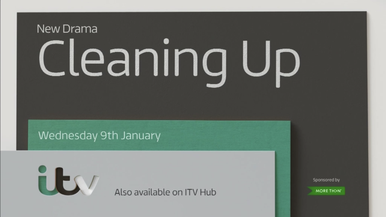
Break bumper appears to match the promo it’s paired with, colour-matching wise.
Not quite. It was a red bumper out of break and the endboard for the Cleaning Up trailer was green.