The Gallery

ALEX EDOH Presentation (2016/17-Present)

An Original Concept of mine (September 2017)

This site closed in March 2021 and is now a read-only archive
AE
AlexEdohHD13
Hello Everyone, I have decided to make an original concept. This is my concept of presentation (My branding).

This concept is based on my logo. (I created it myself, The ALEX EDOH logo is based on the 1999 Carlton logo).

Ident:

I made the music myself.

Breakbumper


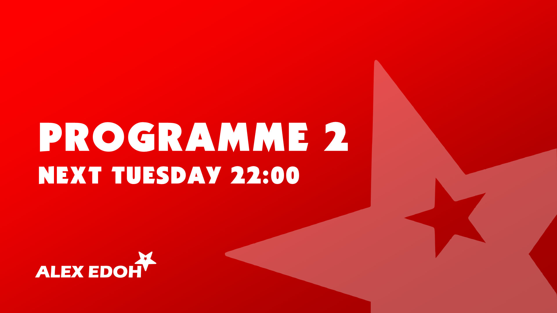
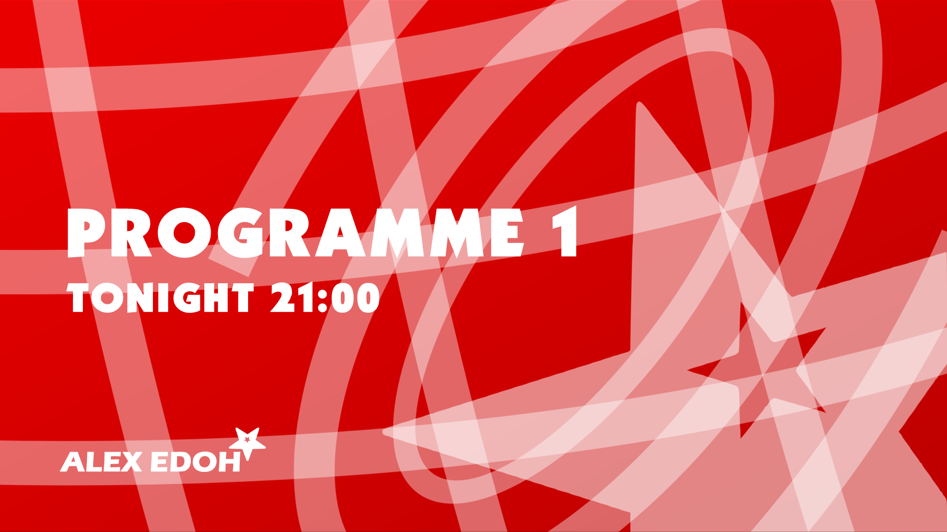
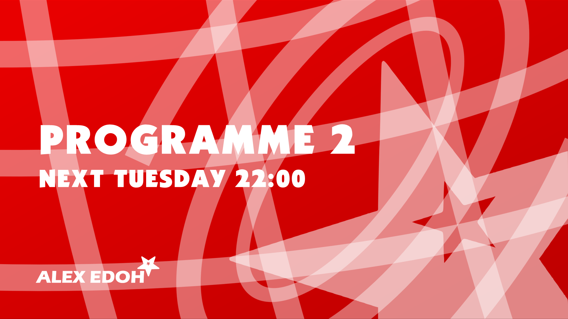
Promo Styles (Templates)
*
*

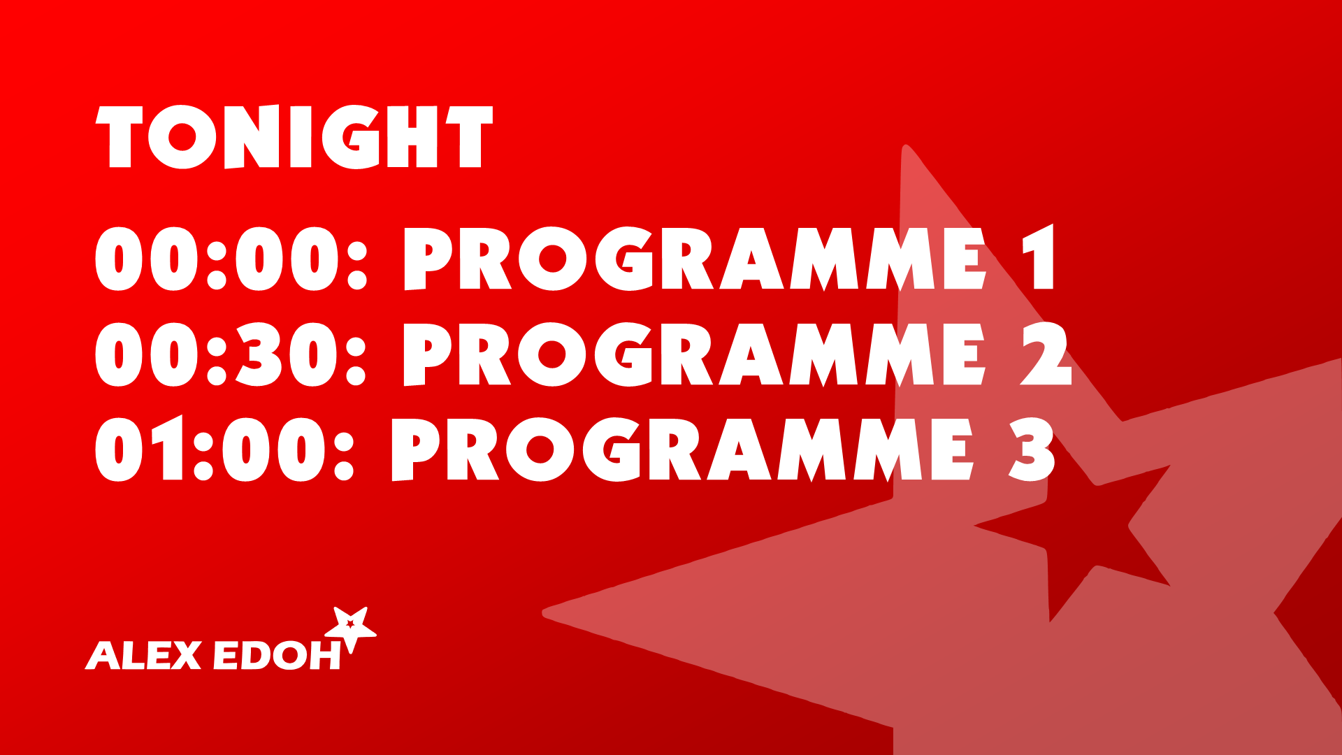
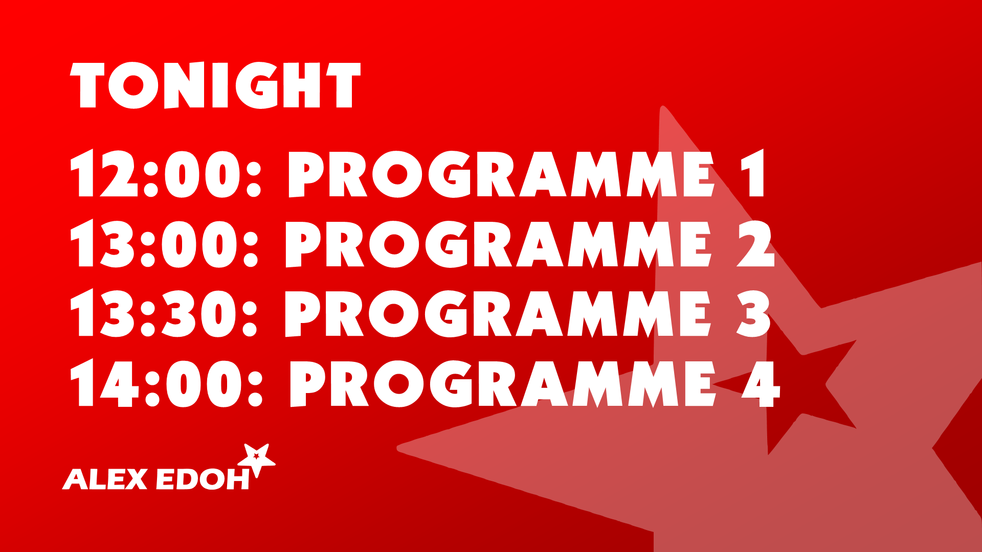
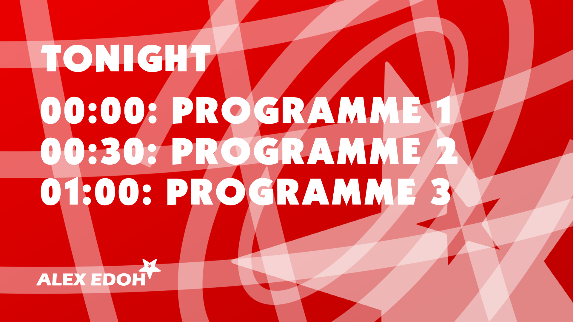
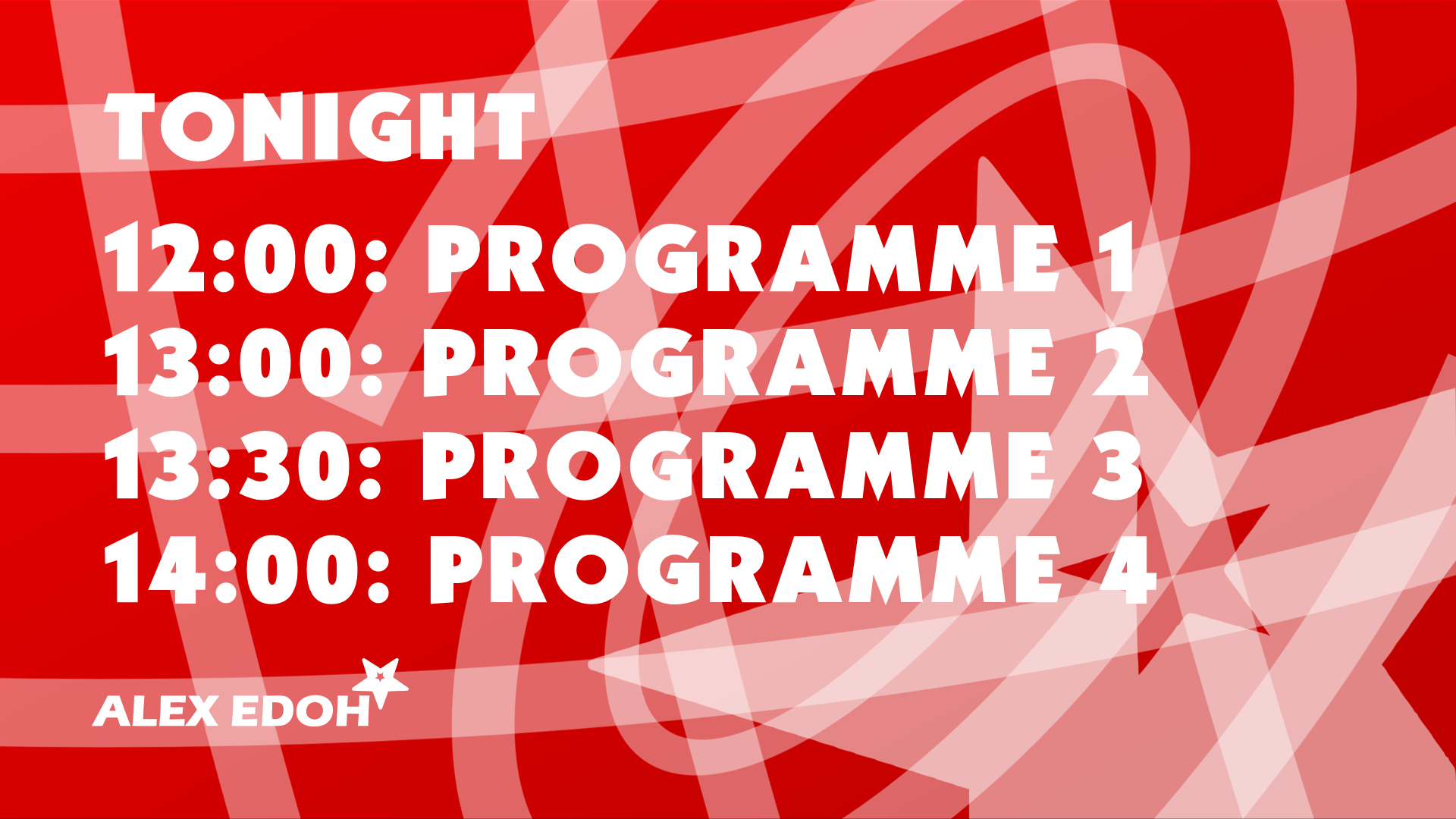
Lineup Styles (Templates)
*
*

I made the font based on the (freely available) 'Kabel Ultra' font. I tweaked some bits.
Last edited by AlexEdohHD13 on 2 September 2017 5:45pm
AG
AxG
There's far too much clutter in the background.
AE
AlexEdohHD13
AxG posted:
There's far too much clutter in the background.

I made that background myself with the design. So how is there too much clutter?
AG
AxG
AxG posted:
There's far too much clutter in the background.

I made that background myself with the design. So how is there too much clutter?

Having four programme slots along with the background with criss-cross lines, rings, and star. Too much going on when a simple blurring would make sure that the programme names are the clearest thing.
AE
AlexEdohHD13
AxG posted:
AxG posted:
There's far too much clutter in the background.

I made that background myself with the design. So how is there too much clutter?

Having four programme slots along with the background with criss-cross lines, rings, and star. Too much going on when a simple blurring would make sure that the programme names are the clearest thing.

Okay
WL
W1LL
I'm sorry but what is this mock trying to be?
AE
AlexEdohHD13
I'm sorry but what is this mock trying to be?

My own concept
NJ
Neil Jones Founding member
Background of the slides, as stated is far too busy and far too prominent. Either make it lighter, fade/blur it out or remove it. Otherwise you'd distract from the key information.
AE
AlexEdohHD13
Background of the slides, as stated is far too busy and far too prominent. Either make it lighter, fade/blur it out or remove it. Otherwise you'd distract from the key information.

Okay.
DW
DavidWhitfield
You need to think about the logistics of what you're doing. Take the upcoming programmes graphic - you've got four single line pieces of information but the lines of text are only big enough to display 'programme [number]' - What if you were to air Ant & Dec's Saturday Night Takeaway or I'm A Celebrity, Get Me Out Of Here? You need to be prepared for any eventuality when you make templates like these.

Also, others are right - the background is far too busy and distracting.
AE
AlexEdohHD13
You need to think about the logistics of what you're doing. Take the upcoming programmes graphic - you've got four single line pieces of information but the lines of text are only big enough to display 'programme [number]' - What if you were to air Ant & Dec's Saturday Night Takeaway or I'm A Celebrity, Get Me Out Of Here? You need to be prepared for any eventuality when you make templates like these.

Also, others are right - the background is far too busy and distracting.

I will accommodate the menu for long name titles.
AE
AlexEdohHD13
Okay, I have read your comments on the background and have changed it slightly so it's less busy.
Promo Styles:
*
*

Lineup Styles
*
*

Newer posts