I noticed that on
The Last Leg
last night, when talking about the pay revelations, Josh Widdicombe used the Hippos as an allegory, not the bog snorkellers. The joke would have still worked if the Hippos had only been around for six months; can't say that about "Oneness."
The only thing I admire here is the sheer brass neck of the "creatives" that keeping churning out this bilge. They are doing absolutely nothing to improve this format/concept.
And FFS, why are they persisting with that dreadful glow effect on the 'Oneness' logo?
Someone mentioned PromaxBDA awards earlier. I shouldn't worry about any of this tripe been shortlisted there. But if the creative/marketing industry had an equivalent of the Razzie Awards...
The glow effect does nothing to alleviate the problems with these idents - even if the best intention was to add a bit more oomph. They’ll still use it for the rest of the set.
The idents would have been a bit better if the footage from the stings were included, but still they would be dire.
BBC Creative have lumped themselves in a project that has little scope for improvement. They’re only continuing to churn these idents out, as they had planned to do it throughout the course of the year.
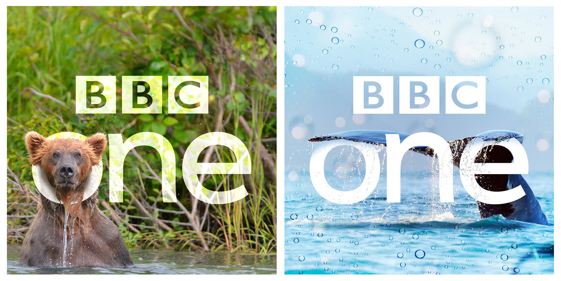
DP
D.Page
Couple of
Wild Alaska Live
photos from BBC1's twitter feed.
Presumably like everything with social media, it's been created to maximise the size of the logo within a square photo. Those stills look a lot better than any of the recent BBC One presentation IMO.
What is going on with the logo in that ident, I noticed it on TV as well, it seemed very low quality and flickering a little.
It looks badly keyed - a few of the variants used in the Midlands have the Midlands legend in normal quality and the BBC One logo form up blurry. It's a mess.