How about some description of what you're trying to achieve here? Because based on the pictures alone, it's taken no more than 7 minutes, it's inconsistent, doesn't conform to any standards, and is painful on the eyes.
I'd be interested to know what Sky Sports News HQ you've been watching. This sort of looks like Sky News's "curvy" aston era style from 2001 with the current logo and ticker.
Nope. It looks like you've taken 2 minutes to create I'm afraid. This isn't 'online TV' mode, you've not even taken account for how it would look on TV.
Ok some pointers then
1) I hate to be the person to say it but they're not 16:9 safe and for SkyNews they need to be.
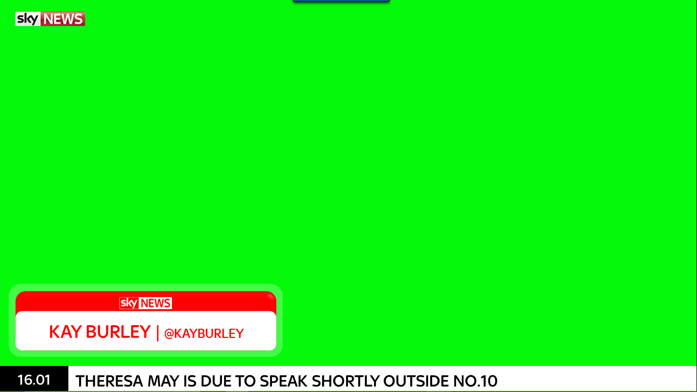
2) What will the bar at the bottom be for? Is it a ticker? A flicker? Part of the straps?
3) Why are the aston only about 1/2 of the screen wide? This means for a lot of dead space or will there be something to the right?
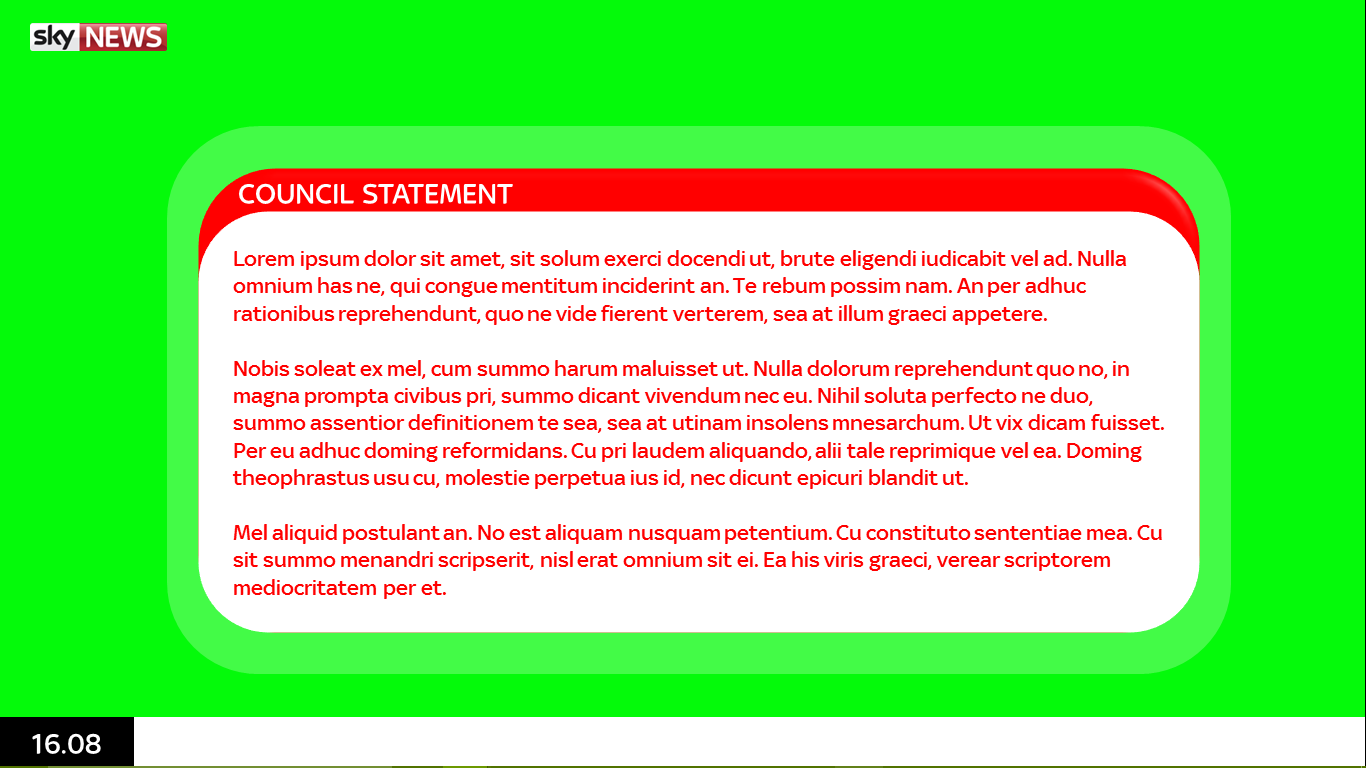
4) Your council statement graphic has a different radius on the rounded edges which looks inconsistent. Also this can't be on screen with the straps which could be problematic.
5) This seems very incomplete. We've only seen 2 different graphics as the astons just have different text in. What will the fullscreen background be like? The two box? Live bug? Stock markets? Etc. I'm sure you get my point.
It's an average start but it looks like it took 10 minutes. Please try to complete the mock before posting it. You're more likely to get a good rating for a completed mock rather than adding things as people won't change their ratings later on. Would also be nice to see some animations.
Nope. It looks like you've taken 2 minutes to create I'm afraid. This isn't 'online TV' mode, you've not even taken account for how it would look on TV.
I thought it looked like the 2000 graphics with the modern font.