TV Home Forum

New BBC corporate font: BBC Reith

To replace Gill Sans in print and on screen (May 2017)

This site closed in March 2021 and is now a read-only archive
NG
noggin Founding member
BBC Lifestyle and BBC Knowledge also have their own fonts for on-screen presentation. Bringing all channels into line with a single font for the whole corporation could save a lot of money, it is also a good excuse to refresh the presentation on all channels. BBC News could look better ditching Swiss for instance.


I agree that there are potential economies - and other benefits - to a corporate typeface, I'm not sure all channels should have to adopt it. Typefaces have character, just like other design elements, so having bespoke typefaces for each channel still makes sense (though using bespoke make be more cost-effective than off-the-shelf)
MD
mdtauk
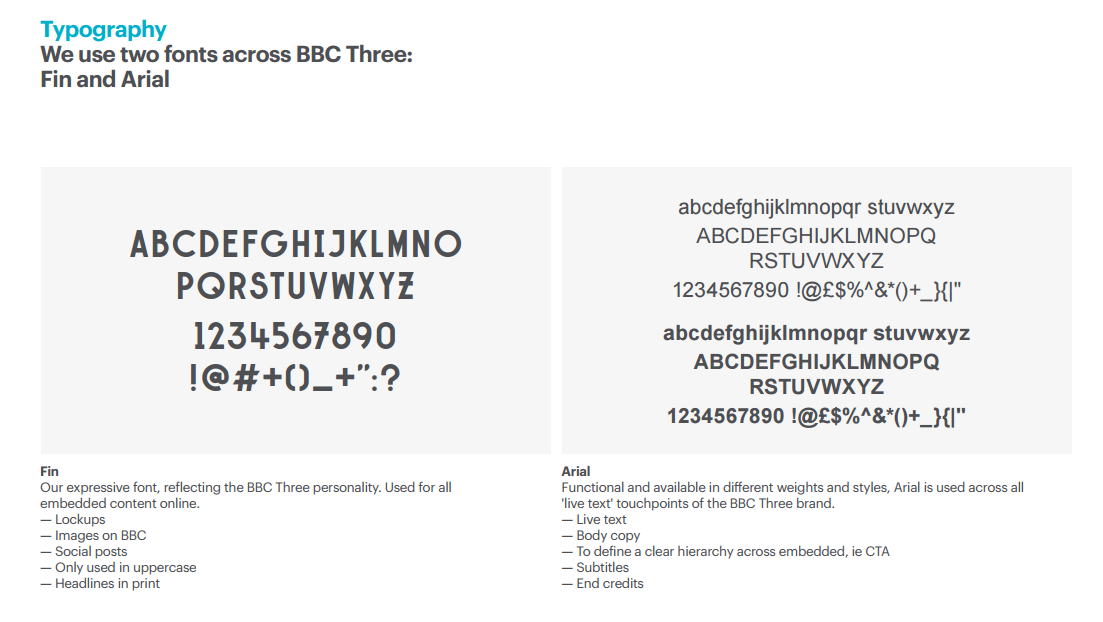
There is space for Headline fonts, as well as the general purpose fonts. Look at BBC Three's font guide.
*

The Arial part would be replaced by BBC Reith. It could also be used for the Website with the serif font being used for reading modes and more traditional typographic uses.

Also these fonts would need licenses for multiple uses. Web, Print, TV, Apps, etc Each of these would need licenses, and as timeless as Gill Sans is, it is not designed for all these uses, and is available in many different (cuts) which alter the quality of the message the text is delivering, and is not consistent across all it's weights.
EL
elmarko
Thanks guys, I've never done broadcast work, only some internal print stuff and some external stuff we did where.... nobody ever said it was an issue. Heh.
TM
tmorgan96
I like it, but I'll wait to see what else they accompany with it. The BBC as a whole needs a complete clean-out and reboot of its on-air appearance, minus the BBC blocks.

Looking at the ECP commonly aired across the BBC's TV channels, it's quite an ugly thing, especially with the Gill Sans. Certainly a new font will help, although a more robust and dynamic cross-promotional strategy would definitely be a good move. Looking forward to what I see next.
WO
Worzel
BBC Lifestyle and BBC Knowledge also have their own fonts for on-screen presentation. Bringing all channels into line with a single font for the whole corporation could save a lot of money, it is also a good excuse to refresh the presentation on all channels. BBC News could look better ditching Swiss for instance.


I agree that there are potential economies - and other benefits - to a corporate typeface, I'm not sure all channels should have to adopt it. Typefaces have character, just like other design elements, so having bespoke typefaces for each channel still makes sense (though using bespoke make be more cost-effective than off-the-shelf)

It's all been done before, but a long long time ago...

VM
VMPhil
Incidentally, this year is the ten year anniversary of the current BBC Radio logos, so I wonder if they're due for an update.
WO
Worzel
Incidentally, this year is the ten year anniversary of the current BBC Radio logos, so I wonder if they're due for an update.


Judging how BBC Two's presentation has been left to rot, I doubt it.
RE
Rex
Having seen these fonts (and posted them here in the midst of the Twitter user protecting his account) - I'm heartily pleased. While Gill served the BBC well - it was understandably left behind in the wayside by the use of other fonts for BBC services (Avenir for TWO and Helvetica for FOUR, for instance), and subsequently paving the way for inconsistency.

These fonts bring the BBC into line with other broadcasters having their own specific fonts, and are designed for a modern media landscape. The sans version of Reith looks particularly great to the eye.

Also, it's worth noting that using Reith as a typeface to save money from using font licences would be instrumental in bringing most services into line - given that most of the BBC's presentation needs a cleanup.

I like the font - and it will grow on me for certain - what will be more interesting is how it will be implemented as a replacement for Gill Sans.
OR
orange
I like the look of this, it's a breath of fresh air and it's modern.

56 days later

AG
AxG
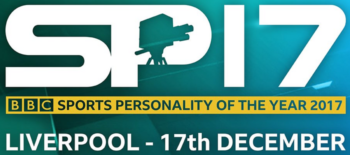
Now I may be wrong here, but the BBC Sport have tweeted the BBC SPOTY details, and I believe that this is BBC Reith.
*
Warbler, benjy and DE88 gave kudos
JV
James Vertigan Founding member
Joe posted:
Serifs? In 2017?! May God have mercy on us all.

Extremely odd comment.


Exactly. Support your local Serif! Laughing
VM
VMPhil
Serifs went completely out of style in the early-mid 00s but I think it's no longer a sin to use them. They can be used with great effect even when paired with a sans serif logo. My favourite example of this kind of thing is Craig Ward's gorgeous and sadly short-lived Drama Lives on ITV logo:

http://tonystoyshop.com/wp-content/uploads/2012/08/ITV_Drama_board_cropped-785x435.jpeg

EDIT: spelling mistake
Last edited by VMPhil on 17 July 2017 3:05pm
Telly Media, DavidWhitfield and DE88 gave kudos

Newer posts