TV Home Forum

BBC Two Christmas Idents 2016

Speculation and News (October 2016)

This site closed in March 2021 and is now a read-only archive
VM
VMPhil
BBC Two's presentation is such a mess at the moment. No wonder the production teams don't know which is the right logo to use when trailing programmes on screen.

For "at the moment", replace with "for the last seven years"
Jeffmister, Brekkie and Lou Scannon gave kudos
DP
D.Page
Kunst posted:
BBC Two's presentation is such a mess at the moment. No wonder the production teams don't know which is the right logo to use when trailing programmes on screen.

And Christmas definitely is the worst part, with the mixture of too different styles and those new soundtracks


If you're referring to the logos, I think you're being a little harsh. The retro logos are only used with programmes of an archival nature. I can't see a problem with that. It's rather endearing.
LS
Lou Scannon
If you're referring to the logos, I think you're being a little harsh. The retro logos are only used with programmes of an archival nature. I can't see a problem with that. It's rather endearing.


Absolutely all* idents used by BBC Two nowadays are "retro", to a greater or lesser extent!

(*with the possible exception of any "window on the world"-era ones (for they were the last true "new look") that may still survive in the current hotch-potch mix?)
JO
Jonny
So it looks like BBC2 believe they've found the spiritual successor to Sprout Boy...

*
:-(
A former member
The BBC2 1998 Christmas ident was shown on Network and Scotland today, before Just Good Friends.

BBC2 Scotland seemed to air a Network copy.


There have NOW just broadcast the Scottish version Wink just a few days later Very Happy
FA
fanoftv
Jonny posted:
So it looks like BBC2 believe they've found the spiritual successor to Sprout Boy...

*


A shame that they couldn't have bulked that into a presentation package. A very creative idea with Vince Pie
BR
Brekkie
Not so sure, it's a bloody annoying ad.

Talking of bulking into a presentation package I wonder if there could have been any mileage in taking the Christmas set from recent years and fleshing them out into a year round package with various "World of 2" idents, either based around genres or around the seasons.
DP
D.Page
Shown a couple of times on NI, this evening. Nice job.

*
:-(
A former member
It only ever seens to be BBC two NI who do Slides. Remember BBC 2 Alba is on tonight at 11.30
RE
Rex
If you're referring to the logos, I think you're being a little harsh. The retro logos are only used with programmes of an archival nature. I can't see a problem with that. It's rather endearing.


Absolutely all* idents used by BBC Two nowadays are "retro", to a greater or lesser extent!

(*with the possible exception of any "window on the world"-era ones (for they were the last true "new look") that may still survive in the current hotch-potch mix?)

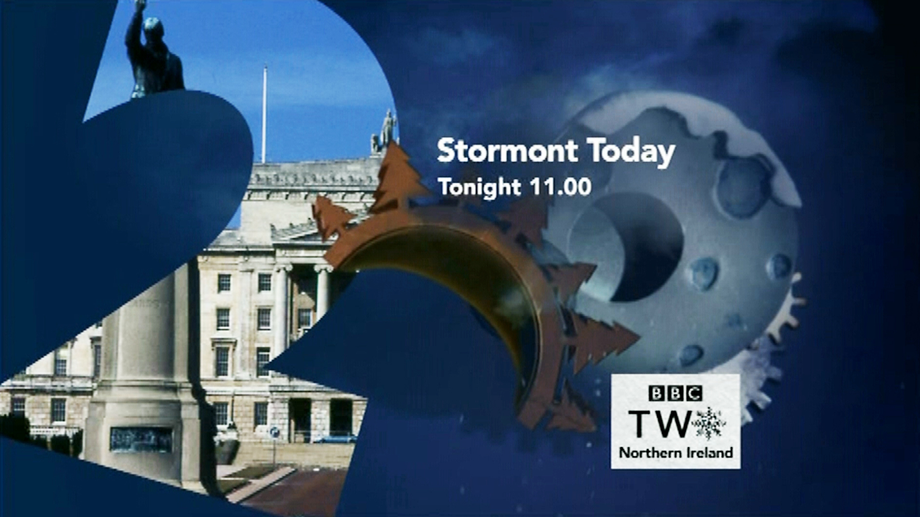
Window on the World was scrapped by the end of 2014 - but the car crash of BBC TWO presentation it's left behind (the ugly endboards, inconsistency) is still lying around on the road, waiting to be taken to the crusher.

The last remnant of any Window on the World ident was the Christmas 2011 pres but that's been butchered with terrible singing.

Looking back on Window on the World - it wasn't bad. I particularly liked some of the idents and the soundtracks, especially Seascape and Mirror.

What ruined the set was an ugly endboard with garish and bright colours, and the idents were out of place with what was a more lighthearted but crap piece of presentation. Alt J's music made the idents a tad worse.

What also didn't help it was that it was lacked wit. Just as much as the Personality '2's were way too lighthearted and not serious enough, Window on the World was too much of seriousness in the way. Both have a sodomising problem of having too much of one aspect of TWO but completely missing the other. The damage control made by Keating over how the new pres package for TWO would 'embody its playful and fun personality' makes for amusing and ironic reading.

The 2007 '2' reeked of ugliness as well compared to the '2' that was unleashed with the excellent 90s idents - the differences are stark.

I'm sure that the 90s idents were dug out not only as a stopgap before the next refresh (DQF and Charter Renewal might be a cause) but one of an act of desperation - Window on the World was hacked off to bits throughout its lifespan.

Should the BBC really decide to rebrand TWO - I'd just hope that they'd try to emulate the 90s idents - and embody a BBC TWO for the modern age, with a balance of wit and seriousness, rather than having too much of one which hampered both the Personality '2's and the Window on the World pres packages' appeal. You only need to look as far as the excellent Artsnight ident to see how well it can be done.
denton, Larry the Loafer and Brekkie gave kudos
DP
D.Page
If you're referring to the logos, I think you're being a little harsh. The retro logos are only used with programmes of an archival nature. I can't see a problem with that. It's rather endearing.


Absolutely all* idents used by BBC Two nowadays are "retro", to a greater or lesser extent!

(*with the possible exception of any "window on the world"-era ones (for they were the last true "new look") that may still survive in the current hotch-potch mix?)

...Should the BBC really decide to rebrand TWO - I'd just hope that they'd try to emulate the 90s idents - and embody a BBC TWO for the modern age, with a balance of wit and seriousness, rather than having too much of one which hampered both the Personality '2's and the Window on the World pres packages' appeal. You only need to look as far as the excellent Artsnight ident to see how well it can be done.


You certainly have more faith than I. Just look at the on-screen mess that BBC2 Network currently airs: the superb ‘90s idents, but now with an oversized, hideous 'in-your-face' corner-located boxed logo superimposed over a set of idents that had clearly been designed for a centralized logo placement.

If they can get a pretty basic thing like that wrong - and still to this day not see any problem with how it looks, then what hope is there with the look of any new set? Bring in the NI team to oversee things and I would feel a whole lot more optimistic.
RE
Rex

Absolutely all* idents used by BBC Two nowadays are "retro", to a greater or lesser extent!

(*with the possible exception of any "window on the world"-era ones (for they were the last true "new look") that may still survive in the current hotch-potch mix?)

...Should the BBC really decide to rebrand TWO - I'd just hope that they'd try to emulate the 90s idents - and embody a BBC TWO for the modern age, with a balance of wit and seriousness, rather than having too much of one which hampered both the Personality '2's and the Window on the World pres packages' appeal. You only need to look as far as the excellent Artsnight ident to see how well it can be done.


You certainly have more faith than I. Just look at the on-screen mess that BBC2 Network currently airs: the superb ‘90s idents, but now with an oversized, hideous 'in-your-face' corner-located boxed logo superimposed over a set of idents that had clearly been designed for a centralized logo placement.

If they can get a pretty basic thing like that wrong - and still to this day not see any problem with how it looks, then what hope is there with the look of any new set? Bring in the NI team to oversee things and I would feel a whole lot more optimistic.

I would prefer to see all of the nations working and cooperating together for presentation - Network going it alone has disastrous results.

Newer posts