AA
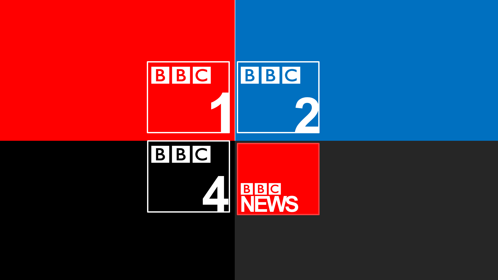
Just think about what you're actually making. Are they logos? How would they work on endboards? Why is BBC News totally different?
PT
Popler121 TV
Well its
Okay
CO
No, it isn't.
It uses Arial, a font that everyone has and can use. There's no excuse; either find a site that gets you commercial fonts for free, or go to Dafont and find a good free font to use.
If this is an attempt to make a square look, like everyone and their mother has been trying to do, like me: http://orig10.deviantart.net/e47c/f/2016/100/7/d/bbc3_by_jok3rb0ytothereturn-d9ygrvd.png, then it fails there; the boxes aren't even square.
And finally; it's a step backwards from your previous mocks (and that is saying something). There is not an attempt; it's just a word in Arial set in the bottom right of the rectangle, and the BBC blocks not even squared up with the rectangle.
Long story short: work on this some more. When you feel as though your design could gain at least 3 stars, then you can come back.
Well its
Okay
No, it isn't.
It uses Arial, a font that everyone has and can use. There's no excuse; either find a site that gets you commercial fonts for free, or go to Dafont and find a good free font to use.
If this is an attempt to make a square look, like everyone and their mother has been trying to do, like me: http://orig10.deviantart.net/e47c/f/2016/100/7/d/bbc3_by_jok3rb0ytothereturn-d9ygrvd.png, then it fails there; the boxes aren't even square.
And finally; it's a step backwards from your previous mocks (and that is saying something). There is not an attempt; it's just a word in Arial set in the bottom right of the rectangle, and the BBC blocks not even squared up with the rectangle.
Long story short: work on this some more. When you feel as though your design could gain at least 3 stars, then you can come back.
BK
I do understand that you are a new member; but I'm sorry to say that these designs are awful.
One thing I can say about the number '1' in the right hand side of the BBC 1 box located in the top left hand corner is not readable. Viewers would not be able to read it if that design was on the channel itself. They could be asking where is the 1 gone from it's logo. BBC One is the main channel of the BBC and therefore it is meant to draw in viewers to it by being visually attractive to them.
Try a new approach to designing your logos that attracts attention and interest to viewers but try to apply it with the distinctiveness of the BBC.