TM
Remember when in the last days of the 2001-07 look, BBC2 had special idents that dropped the yellow void aspect?
http://hub.tv-ark.org.uk/images/bbctwo/images_idents/2001/bbc2pedigree2005large.jpg
http://hub.tv-ark.org.uk/images/bbctwo/images_idents/2001/bbc2thearmstrongs2006large.jpg
http://hub.tv-ark.org.uk/images/bbctwo/images_idents/2001/bbc2home2006a_large.jpg
http://hub.tv-ark.org.uk/images/bbctwo/images_idents/2001/bbc2home2006b_large.jpg
http://hub.tv-ark.org.uk/images/bbctwo/images_idents/2001/bbc2_xmasident_2006a.jpg
Do you think these should have been the new look for 2007, rather than the Window on the World idents? I never minded the latter too much, (expect for the proportions of the bladed "2" being changed), though I feel like these could've been Mark II of the 1991-2001 era, if BBC Two were to have a new look soon, Red Bee should take inspiration from these. Also, the "2"s used in the Pedigree Comedy & Home idents were brought back for the 50 years bumpers & idents, if I'm correct?
Also, what is it everyone hates about the Window on the World idents? I thought the concepts of them were nice & the original soundtracks by Beetroot Music were beautiful & soothing to listen to.
Last edited by ToasterMan on 29 April 2016 4:08pm
:-(
A former member
The footage in the actual idents aren't too bad - it's everything else that surrounds it that is absolutely dire.
TM
What about the original soundtracks?
The footage in the actual idents aren't too bad - it's everything else that surrounds it that is absolutely dire.
What about the original soundtracks?
SN
You've picked a good example of them though. Mirror v1 was arguably the nicest of that set of idents - suitable for a good chunk of the more serious output. Many of the others didn't stand up to repeated listening and were downright annoying by the end - especially once they dropped half the set and thus used the remaning ones twice as often (the fact they eventually replaced them with Alt-J and co says it all).
What about the original soundtracks?
You've picked a good example of them though. Mirror v1 was arguably the nicest of that set of idents - suitable for a good chunk of the more serious output. Many of the others didn't stand up to repeated listening and were downright annoying by the end - especially once they dropped half the set and thus used the remaning ones twice as often (the fact they eventually replaced them with Alt-J and co says it all).
DP
D.Page
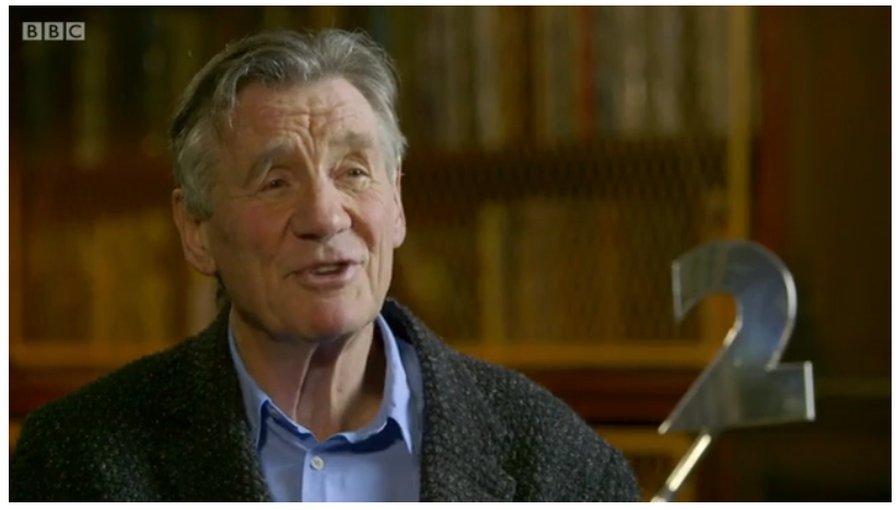
Looking at that video of Mirror Version 1 reminds me about the slight modification to the shape of the 2. It's predictably shaped, to the point of being a little boring, if you know what I mean. I much prefer the shape first used in 1991. It's a slightly odder, quirkier shape which works better IMO. They should never have changed the shape, so I'm glad it's being used once again, albeit with the idents and sign zone graphics only.
TM
I remember I was watching BBC Two NI, the other day, when I saw that they aired the Snooker ident with the teal box, I thought they never aired the special idents on Network & thought they only used the 1991-2001 idents with the centered logo, but even NI's guilty of inconsistency, too. 
JO
It was (as seen in 50 Years of BBC2):
And agreed, the modification was needless and stunk of an agency wanting to leave its mark.
Does anyone know if Mirror was an actual model? Because if not, I wouldn't mind seeing the '2' reedited and mixed in with the 1991 idents.
It was (as seen in 50 Years of BBC2):
And agreed, the modification was needless and stunk of an agency wanting to leave its mark.
DP
D.Page
Whilst the modification annoys many pres geeks like us, and maybe a few others who pay close attention to detail, I would guess the majority of BBC2 viewers don’t realise the shape of the 2 underwent a slight change, and therefore is the reason the BBC allow both shapes to be used on air simultaneously (i.e. the idents currently being used having the former shape, and the endboard graphics etc having the latter shape). It's a little like, for example, Capes having a fault which seemingly allows a few of the cyclists to travel 'underneath' a puddle on the roundabout. Matt Losasso, Capes' directors', response to me basically saying it's too minor an overlooked detail to attempt to fix.
I don’t personally think Mirror, or any others outside of the 1991-2001 era, would suitably work, but leaving that aside, had Mirror been created in CGI, I’m sure, as a consequence of these cash-strapped times, they wouldn’t bother tinkering with the shape of the 2 in Mirror, if they wanted to use it alongside the current retro set.
I don’t personally think Mirror, or any others outside of the 1991-2001 era, would suitably work, but leaving that aside, had Mirror been created in CGI, I’m sure, as a consequence of these cash-strapped times, they wouldn’t bother tinkering with the shape of the 2 in Mirror, if they wanted to use it alongside the current retro set.
Last edited by D.Page on 2 May 2016 8:32am - 3 times in total
JO
Well, yes, it's extremely similar just more evenly proportioned, with a fatter base and rather ugly, elongated sharp "beak". The model used in this ident highlighted the ugliness extremely well.
Very few outside of these walls will notice (although Tent was re-edited to feature the classic numeral for the All About Two title sequence, so they do know there is a difference).
I guess the modifications were made to make it a more suitable framing device for the Windows theme. The problem is that idea was flawed as any kind of "2" numeral shape wouldn't really work in this capacity (see the trail endboards) and especially not this one, which was specifically designed to have things done to not be looked through/past.
And it was also far too staid and predictable for a BBC2 campaign. Some of the idents were executed expertly (Mirror, Zoetrope) but others were hampered by this conceptual bankruptcy.
The set should have been expanded upon and developed into something better but a massive crisis in confidence, identity and general common sense decision making, alongside tightening resources, meant it was dead in the water after only 18 months on air, yet incredibly hung around in a zombie-like state for 6 more years.
And the surrounding debris still remains with us today.
Last edited by Jonny on 2 May 2016 10:35am