The Gallery

BBC Box Ideas

What would more adstract logos look like? (March 2016)

This site closed in March 2021 and is now a read-only archive
BA
TheBATs
*

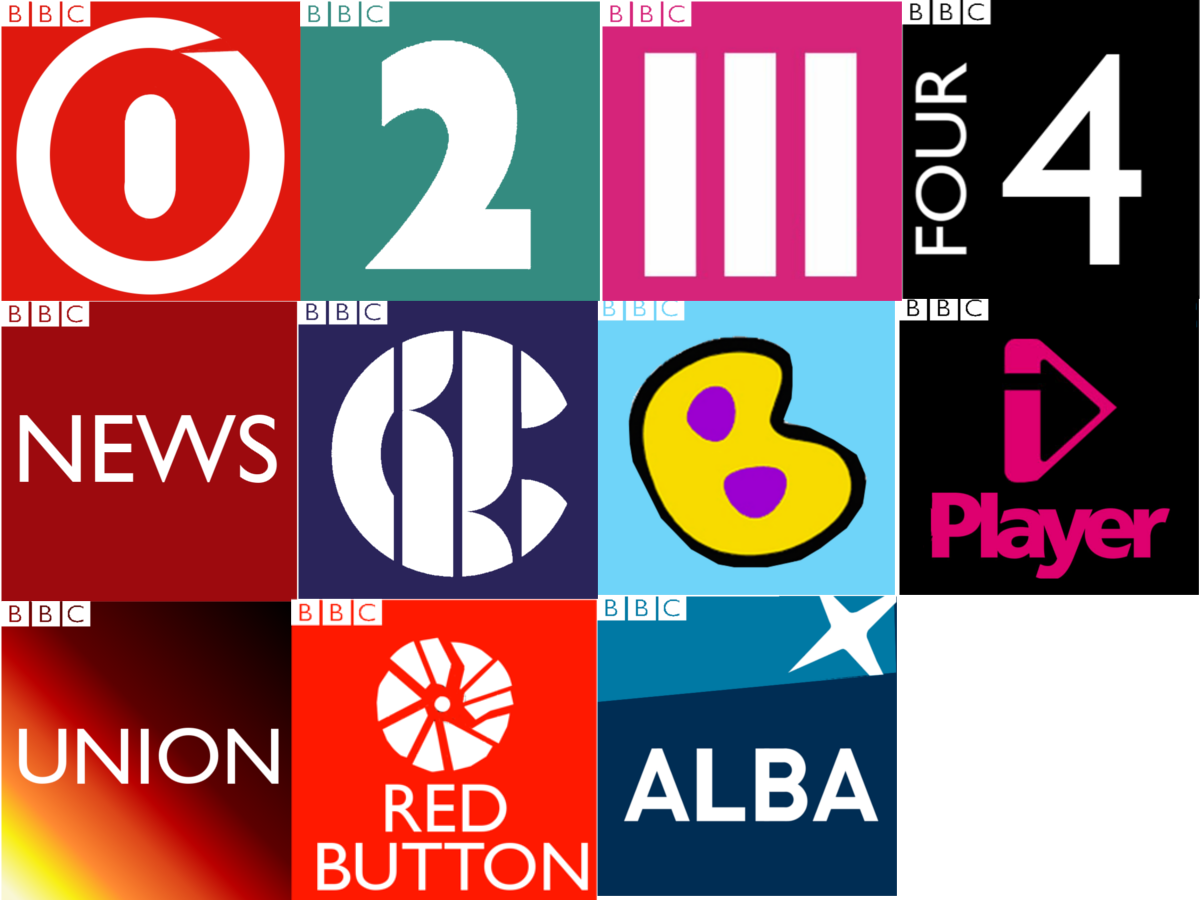
The BBC 1 logo is based on channel 5 original logo with a bit of the modern one in there.
The BBC 2 logo is simply BBC 2.
The BBC 2! logo has been fixed to say BBC 3
The BBC 4 logo is reminiscent of the early 90's CITV logo.
NEWS has been centred.
CBBC has been made larger
Cbeebies is reduced to b however will expand to the full logo
Iplayer is squished
BBC Parliament is changed to BBC Union
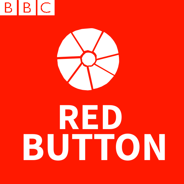
BBC Red Button, well you get the idea, I guess I need someone to neaten it up. It's hard to do complex shapes in GIMP
BBC Alba is mostly the same.
Hope you like em'! Laughing
JB
JasonB
Shouldn't this be in the gallery?
BA
TheBATs
oh yeah, thanks
TVF
TV Forum Team
This topic has been moved from TV Home Forum .
BA
TheBATs
Okay so now this ones on the gallery, I will carry on here. I think the first thing I need to work on is proportion and fixing the red button logo. I should probably make a world news logo as well. I'm not at all experienced using GIMP so the designs won't be great.
LL
Larry the Loafer
Just for future reference, don't post something and then say "This is what I need to work on".

Work on what you need to work on before you post, and then let other people tell you what improvements you need to make. If you post stuff that you know is inadequate, it's a waste of everybody's time.
BA
TheBATs
*
The Red Button Logo is now fixed, being neater and with a new font
JK
JK08
I think you need to spend some time working on your mocking skills away from the Forum, before updating this further.
AA
Aaron_2015
BBC One looks like it's turning on, BBC Two is actually quite nice, BBC Three isn't your logo (obviously), BBC Four shows BBC 4 4, BBC News is fine, CBBC isn't your creation, CBeebies reads 'BBC B', iPlayer is fine, the Red Button icon looks like shattered glass, BBC Alba is fine.

Additionally, all the boxes are different sizes and the BBC logo is even cut off in some places.
MF
MatthewFirth
I have actually been exploring the idea of BBC boxes myself. Comparing yours to mine, I can tell that you did these on Paint, whereas mine is on PowerPoint (as much as it simple and not really ideal for mocks, I still found some good ideas there).

Unless you move onto other software, don't bother carry on with these.
BA
TheBATs
I have actually been exploring the idea of BBC boxes myself. Comparing yours to mine, I can tell that you did these on Paint, whereas mine is on PowerPoint (as much as it simple and not really ideal for mocks, I still found some good ideas there).

Unless you move onto other software, don't bother carry on with these.

Actually I made them on GIMP.
BA
TheBATs
BBC One looks like it's turning on, BBC Two is actually quite nice, BBC Three isn't your logo (obviously), BBC Four shows BBC 4 4, BBC News is fine, CBBC isn't your creation, CBeebies reads 'BBC B', iPlayer is fine, the Red Button icon looks like shattered glass, BBC Alba is fine.

Additionally, all the boxes are different sizes and the BBC logo is even cut off in some places.


Thanks for the feedback but my idea was to expand upon the idea of BBC's abstract box logos, however you have a fair point.

Newer posts