


JA
james
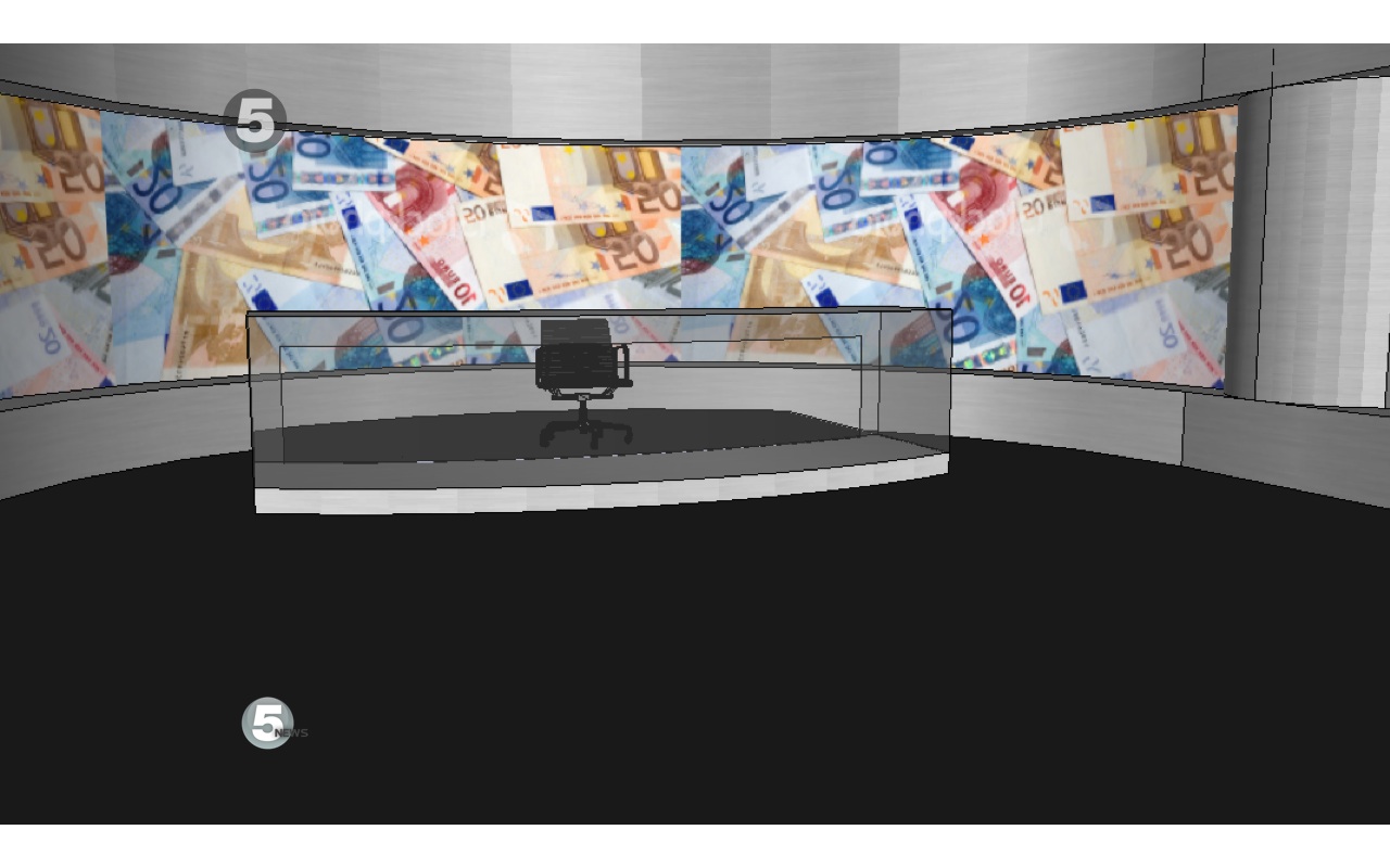
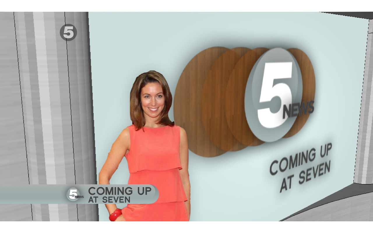
Your mocks are starting to get better and more time is being spent planning and preparing them. I think this is your best mock to date. There are a few things that could be tweaked though, for example the text on the aston could be moved further away from the logo and a bit more colour would be nice. Other than that, you are starting to get the hang of how to do mocks.
SR
Would echo everthing that has already been said, you're showing improvement... me likes this.
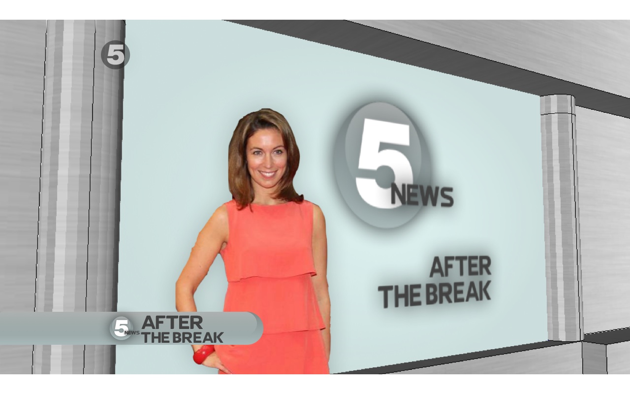
A bit of colour would be great, but use it sparingly. We dont want to see the swap shop again.
...shows promise, I'd like to see more of this mock... no rush.
A bit of colour would be great, but use it sparingly. We dont want to see the swap shop again.
...shows promise, I'd like to see more of this mock... no rush.


JA
james
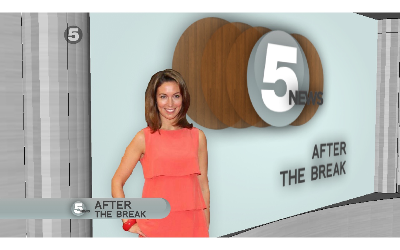
No wood in the titles. Add more colour to the other presentation elements, also your aston is identical to the first post so maybe you have uploaded the wrong image?
JK
Yes I have, sorry.. I'll fix it!
No wood in the titles. Add more colour to the other presentation elements, also your aston is identical to the first post so maybe you have uploaded the wrong image?
Yes I have, sorry.. I'll fix it!