I'm quite liking the DOG. It is slightly larger than needed, but also quite translucent. On some backgrounds you can hardly see it.
Unfortunately, a quite scan through programming for the rest of today doesn't reveal anything worth watching, which is perhaps why it was necessary to change the name of the channel.
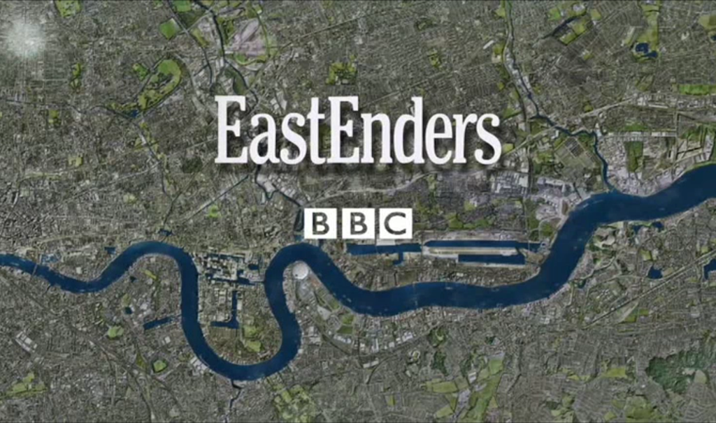
Here's the slide that W are using for EastEnders going into and out of breaks. (The burst of light in the top left is the start of the UKTV logo animation). The EastEnders/BBC logo is a bit strange - smaller than the title sequence and the BBC logo doesn't have the OTT drop shadow.
They're broadcasting in surround sound - does it usually go out in surround sound on BBC One?
TVF
TV Forum Team
Posts from
UKTV - new channel W
have been merged into this topic.
I haven't been able to see much on air, but this video showing the highlights of the package looks stunning.
Everything about the identity seems to have been thought out and designed incredibly well. What I presume are the idents that fly forward take a brilliant idea and have been created with a Channel 4 (2005-2015) feel to them.
Though I'm still not sure about the name. I can't imagine saying "Did you see that programme on W", that's partly because I don't watch the channel and haven't been drawn to it for anything recently.
LS
Lou Scannon
The new name may be shorter in terms of number of letters, but it's obviously longer in terms of syllables ("watch" = 1 syllable, but "double-u" = 3 syllables).
I found the snappiness of saying the previous name was preferable to the longer-sounding "W" name.
I haven't been able to see much on air, but this video showing the highlights of the package looks stunning.
https://vimeo.com/154852930
Everything about the identity seems to have been thought out and designed incredibly well. What I presume are the idents that fly forward take a brilliant idea and have been created with a Channel 4 (2005-2015) feel to them.
Though I'm still not sure about the name. I can't imagine saying "Did you see that programme on W", that's partly because I don't watch the channel and haven't been drawn to it for anything recently.
Really nice branding - stylish but ultimately quite simply.
As for the name I suspect many will continue to identify it as Watch and just take the W to be the logo, like Y is for Yesterday and D for Drama.
So, if I can be extra picky, and I guess this is TV Forum after all…
Does it disappoint anyone else that a lot of TV channels, including UKTV's, don't yet broadcast much other than the programmes in HD. I'm talking about the surrounding presentation, idents, trailers, bumpers, that kind of thing. The videos uploaded for this rebrand, and indeed virtually all recent channel rebrands, are in HD. I know some people say they can't tell the difference but for me it makes all the difference, especially when it comes to those slickly produced idents.
I believe this may have something to do with existing contracts for the playout of the channel, as I recall reading a post on here that BBC One trails were only broadcast in SD because of the then-current deal with Red Bee. I notice that since Christmas, trails are now going out in HD on BBC One. It's not a huge deal all things concerned - obviously I'd rather have the programmes in HD than the idents - but still, it just seems disappointing as a presentation fan to have this mix of SD and HD, especially when it's all been made in HD in the first place.
The other problem is the coming up menu, which I think is generated live as it's using what looks to me like Helvetica rather than the custom font as seen in the above video. More4 has this same problem too - using a generic sans serif instead of the custom one used in trailers. Is there some kind of technical limitation that prevents this?