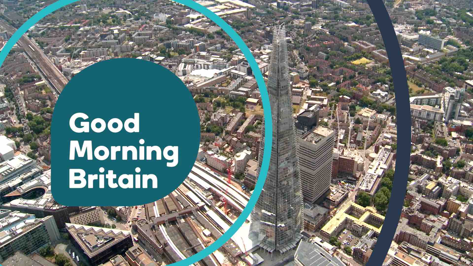
I based all of the graphics on ITV's Good Morning Britain, used ITV News London's theme music and ITV News' colours with some aerial shots of the Docklands and the Shard.
First mock here, feedback welcome.
Last edited by htchngs on 2 May 2015 3:52pm - 2 times in total
Good idea. I still think it should contain the current colours of GMB though, give it a breakfast feel. Also, it should say ITV News instead of the usual ITV logo.
It looks good although perhaps repicking the colours for the date as it doesn't stand out that much, and as MatthewFirth has said, it would be the ITV News logo instead of the ITV one. Rather than timing the words 'Good Morning Britain' with the music, perhaps timing a couple of pulses from the logo with the music.
It looks good although perhaps repicking the colours for the date as it doesn't stand out that much, and as MatthewFirth has said, it would be the ITV News logo instead of the ITV one. Rather than timing the words 'Good Morning Britain' with the music, perhaps timing a couple of pulses from the logo with the music.
Other than that, a fab mock up.
Any suggestions on colours for the date? I'm struggling to find something that fits.
Thanks for the link! Very interesting. I unfortunately lost the motion project after it crashed so I can't change the date, but fortunately I exported the pulses, so that is below. Learned a lesson about saving.
Unfortunate about the loss. The pulses are great, well timed. I'd love to see this expanded to the regions and nations if you choose to redo the project, it would give you a lot of freedom creatively, especially with STV and UTV.
BB
BruceBBC
When I read the title I was very sceptical but I couldn't have been more wrong! This is very very good. I do feel the logo is the wrong shade of blue. Maybe a lighter colour? Or maybe the red(ish) colour you've used. Apart from that this is an excellent mock. Perfectly timed. Well done.