Yes. I've just come back from Belgium. I'm yet to decide wether to change the font or not as I really like the current one. I started making tweaks yesterday but I will try to get more done soon. Sorry to keep you waiting!
Is it perhaps too nice. I've a feeling clean and stylish isn't the route they'll be going.
I agree, it seems far to similar to their previous graphics for the original launch. Amazing mock compared to previous PowerPoint ones I've seen in the past but maybe not in the direction Daybreak (or what ever) ought to be going in.
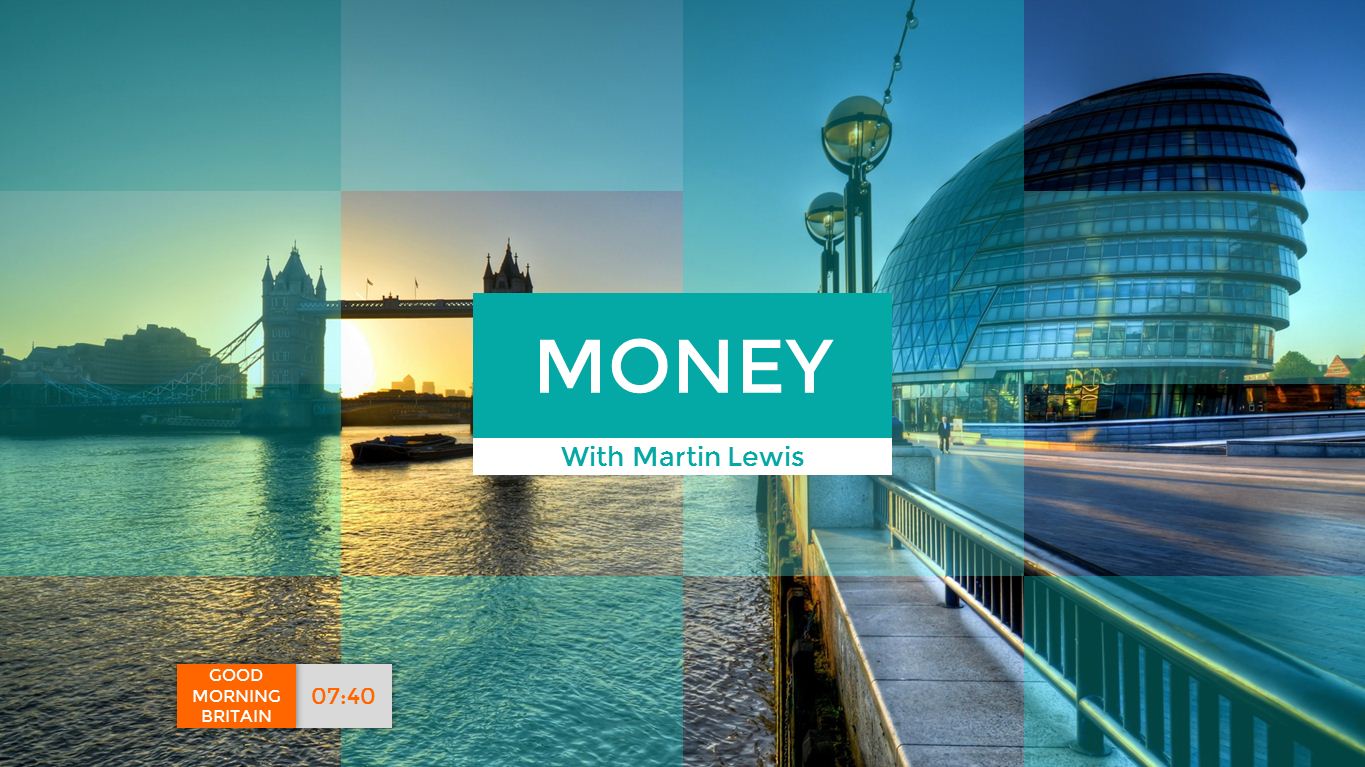
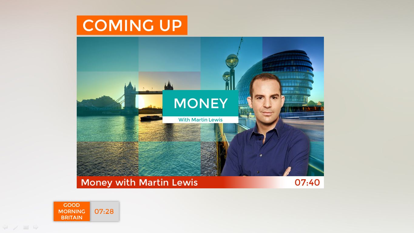
I sort of understand where your coming from especially the Titles Slide it's a bit Daybreak 2010 with the logo coming up on an image but I kind of like it! Studio 7 Needs to be brought Back!
Clean and stylish is the route I think that they
should
be going. I didn't want this to be a prediction of what the show would be like, this is my idea of what I would want to see, with regards to presentation and branding.
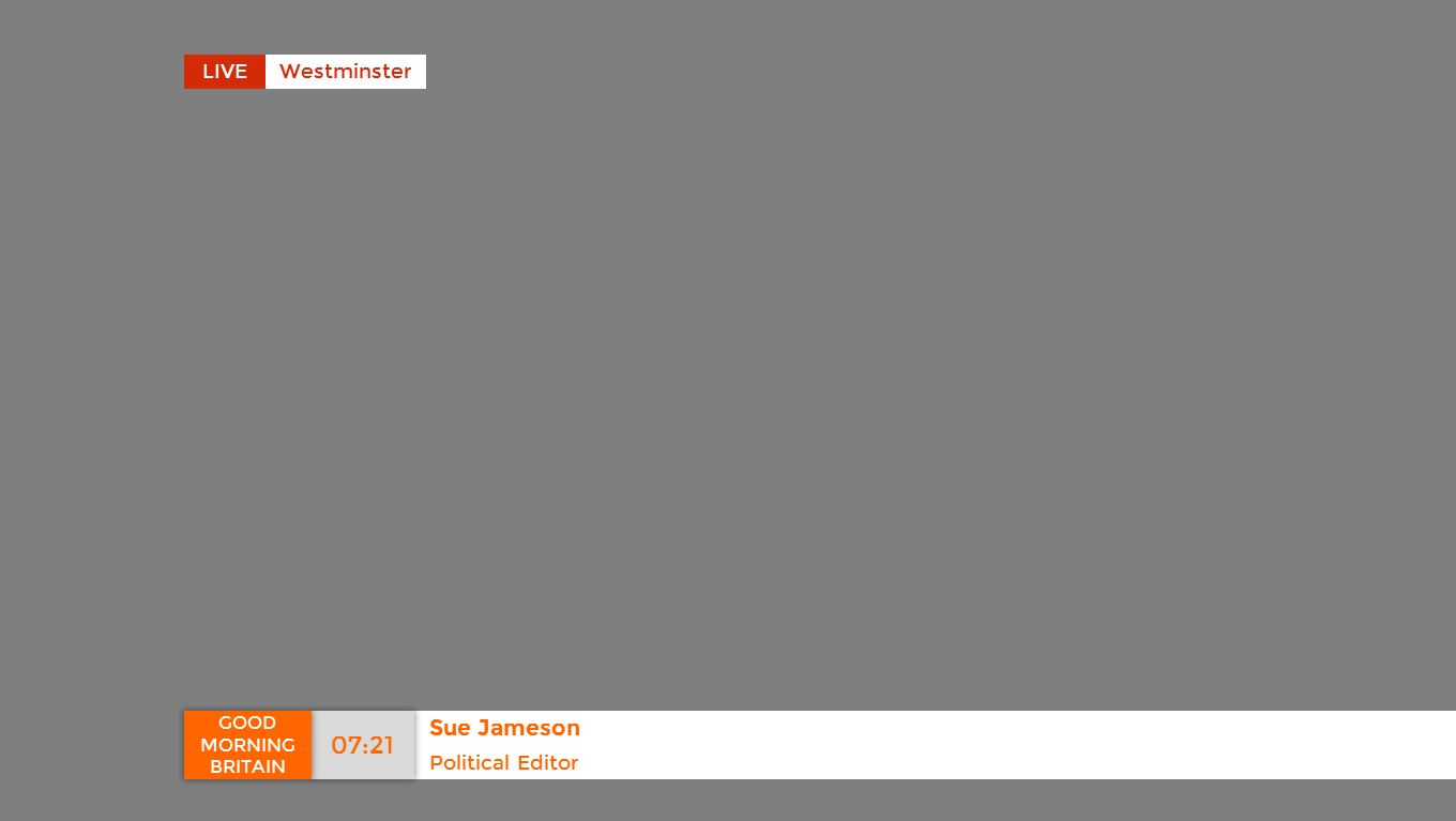
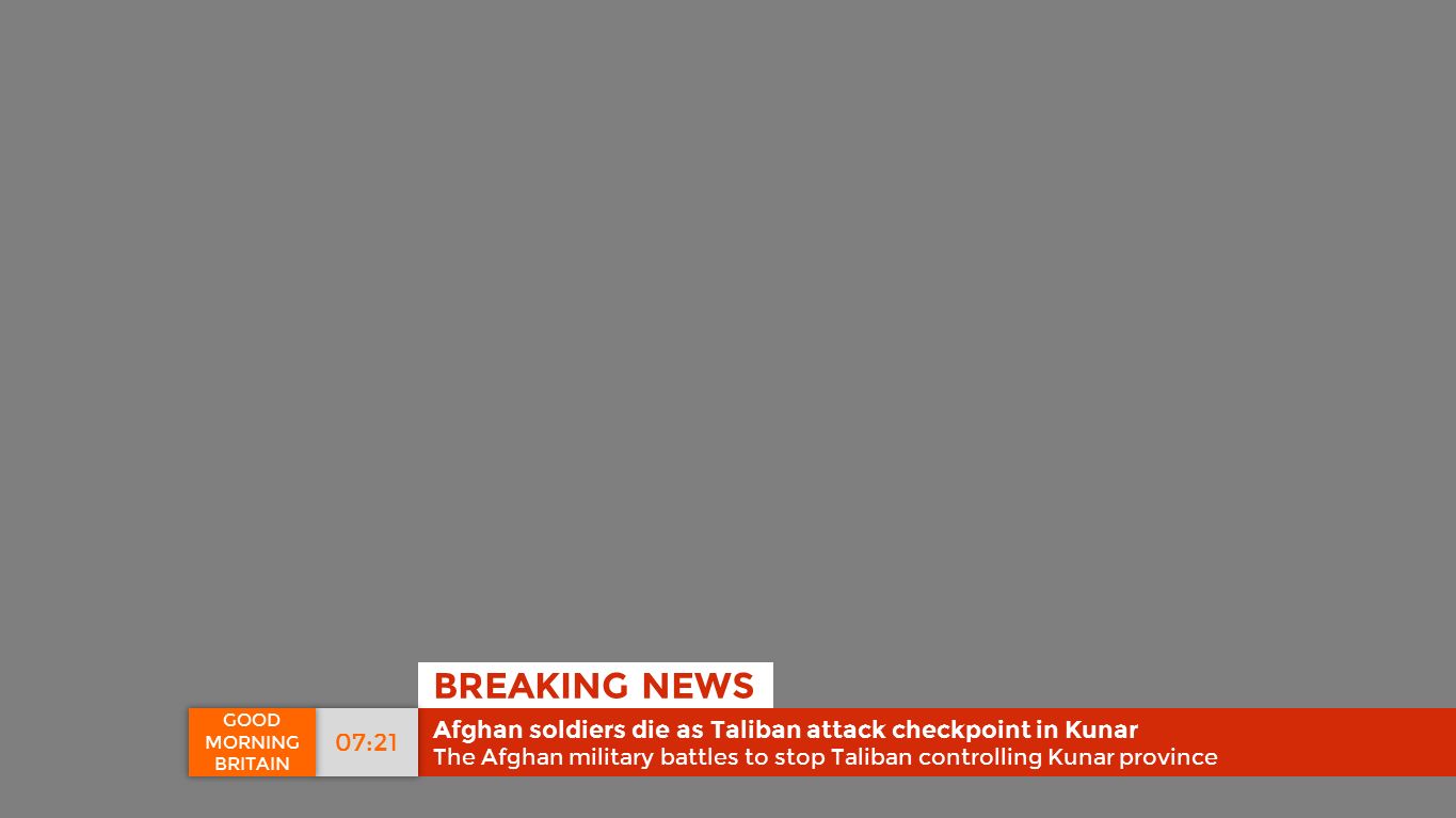
On another note: Please all - remember that this isn't Daybreak, this is Good Morning Britain.
Clean and stylish is the route I think that they
should
be going. I didn't want this to be a prediction of what the show would be like, this is my idea of what I would want to see, with regards to presentation and branding.
On another note: Please all - remember that this isn't Daybreak, this is Good Morning Britain.