Before I fall asleep at my desk, I am posting this video of a sample Junction from a new look BBC One.
Included are:
A VT Clock (just for fun...)
Sample programme credits with an End Credit promotion;
Quick orange BBC One sting;
BBC Three trailer (with new series logo delighter);
Doctor Who BBC One trailer;
Quick white BBC One sting;
BBC iPlayer promotion;
This has been several days work, and longer if you include the tests I did while designing the logos. I found examples of BBC Trailers online, and re-edited the footage for the BBC Three and Doctor Who trailers to have it in HD and without the original logos on. I then had to edit the BBC iPlayer trailer to include my new logo, mock site design, and a couple of quick logo flashes.
I hope this gives a good idea how these graphics would fit as a visual language that is consistent with each other, but has room for some channel personalisation. Fun BBC Three, with serious BBC One for example.
I didn't like the look of this mock at all until you showed the video and it does kind of work. Maybe the BBC's horrid ECP design used now has made me like it more though!
Things which I think have already been picked up on which I am not keen on though:
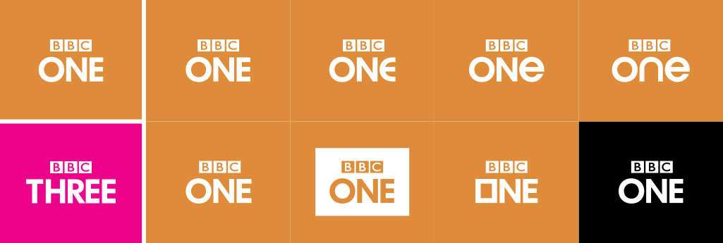
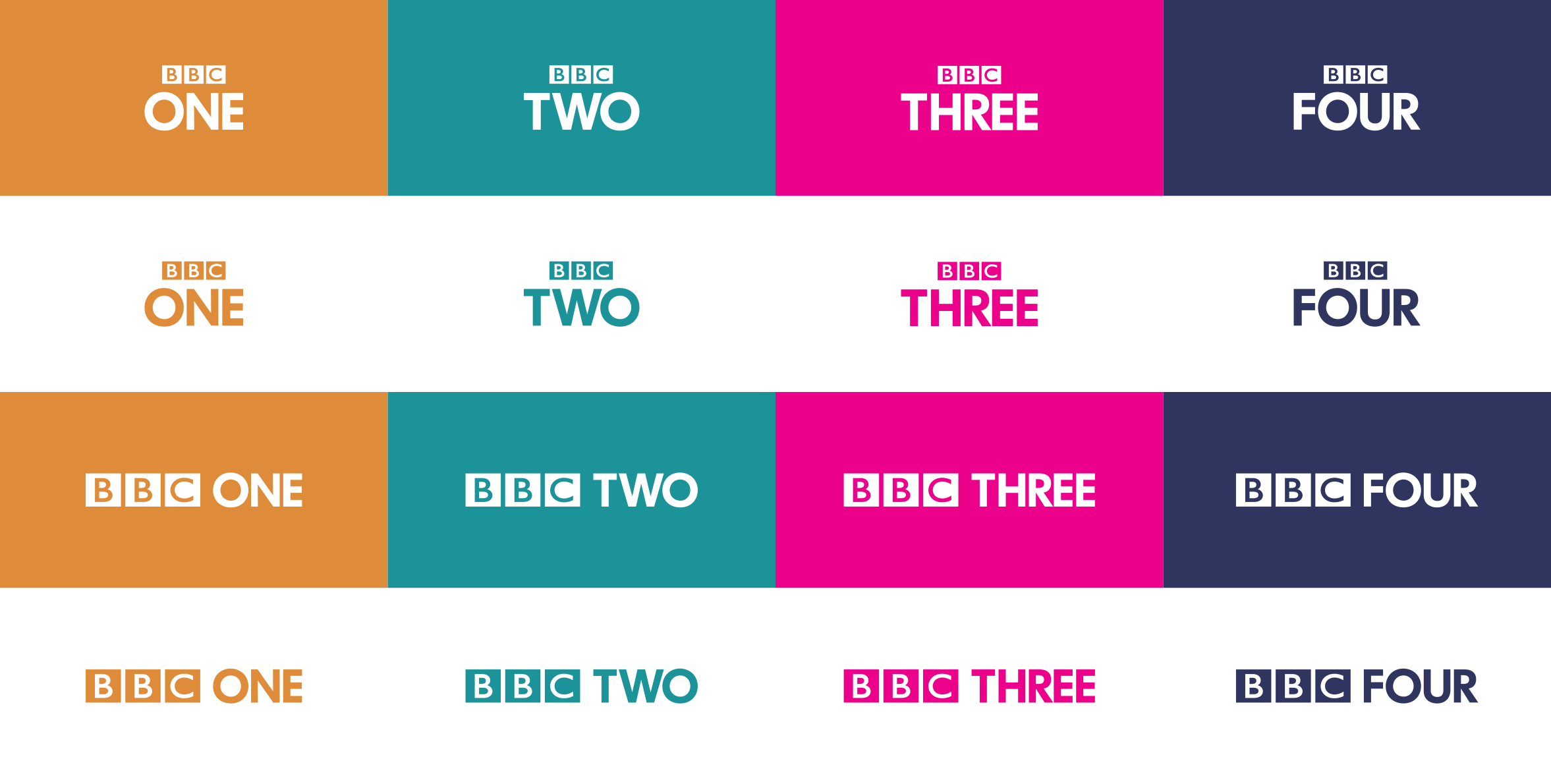
- BBC One's text just doesn't look right. It's worse than it looked in 2002 and it's all due to the size of the 'O' compared to the N and E. Could we perhaps
just
use the stripped logos?
- It's odd that BBC One uses white text (rather than orange) for the promos and Three uses the pink.
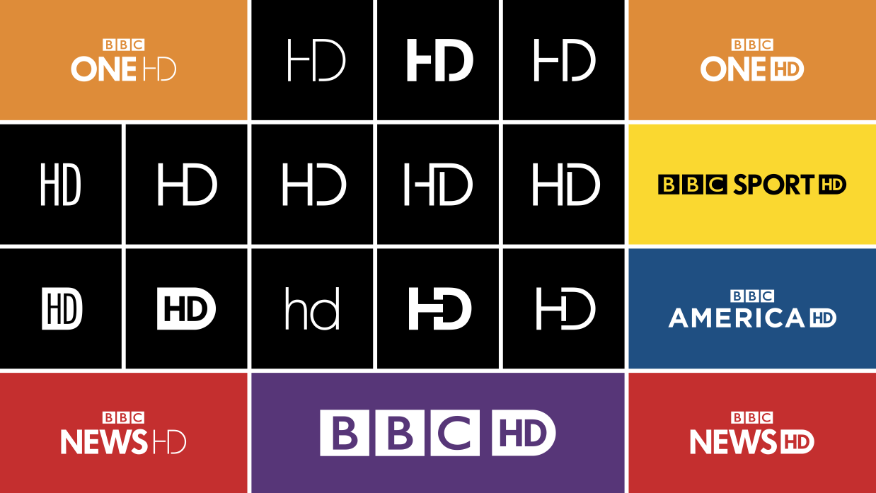
- Really not keen on the HD logos.
On another note, the positioning of the Radio logos is much better than present!
I didn't like the look of this mock at all until you showed the video and it does kind of work. Maybe the BBC's horrid ECP design used now has made me like it more though!
Thank you. Whilst it doesn't show strongly a channel's branding, it is intended to show
consistency
with
personality
.
Things which I think have already been picked up on which I am not keen on though:
- BBC One's text just doesn't look right. It's worse than it looked in 2002 and it's all due to the size of the 'O' compared to the N and E. Could we perhaps
just
use the stripped logos?
I only intend to use the stripped logos for the smaller sizes, because it ensures the BBC logo is not impossible to see.
- It's odd that BBC One uses white text (rather than orange) for the promos and Three uses the pink.
At first I did have the BBC Three logo entirely in white (as it is when the endboard forms) but felt the pink would add some personality to the channel, whilst not braking the conformity of the formating and design.
I think this video really shows the ideas off in a much better way - I like this a lot more now you've created the video, which as you say, shows some of the channel personalisation, but keeps everything uniform. The animations are all very nice and work well.
As I and others have said before, and as you've said too, I think the HD logos need some looking at, and also I'd agree with the point made about BBC One's logo not appearing in orange when the BBC Three logo is.
This looks really promising!
The way I was thinking about it was, BBC Three would be the only channel to use Pink/Colour in its logo, so it stands out more than the other channels. Also with BBC Three making use of trailer logo captions/animations. For those to be in colour, and the logo not, felt weird, so I made the THREE pink.
I am sort of tempted to make BBC Two stand out a little more also, as it was always meant to be an alternative take on the BBC output (maybe I am stuck in the 90's vision of the channel). Maybe have its trailer logo animate on screen through the 2 numeral?
I am not trying to focus on the individual brands, because apart from font and trailer endboards, each channel would go its own way for the most part. We don't need the absolute conformity of 1997 again, but just reigning it all in a bit more.
So a mental checklist so far...
- The BBC One logo is not to everyone's tastes / or feels off balance somehow;
- The HD symbol is "wrong" and something needs to be done with it; (not sure what however)
- BBC Three's use of colour for its trailer logo should be considered again?!?;
- The colour choices don't appeal to some;
- James thinks its all ****;
Very nice, my main issue is the orange for BBC One (and Radio 1 which looks even more out of place).
The presentation looks fresh, but the logo transitions are a bit naff.
What is it about Orange for BBC One do you not like, other than the fact that the colour Red has been used since 1997?
The fact that it has been red for so long is probably a factor, but the orange seems drab. Maybe it's just the particular shade, but it reminds me of wallpaper from the 70s.
Right, I'll have another go at an image-by-image critique. I am comparing this to version one.
It's good to see that technical standards are being upheld, but I don't think that was ever in doubt.
It is interesting how much difference a change in font weight makes. I think the weight seems appropriate for the main channels now, although I'm still not a fan of the font.
The removal of the gradients from the logos is a good improvement, and I think that the colours, in general, fit. BBC One being orange is not my favourite choice, but it doesn't seem inappropriate. I think the versions with the coloured backgrounds work better out of the two versions; however, seeing as the coloured-background versions seem to be the main ones, this doesn't really matter. I agree with others that the ONE suffers with the perception of not being centred.
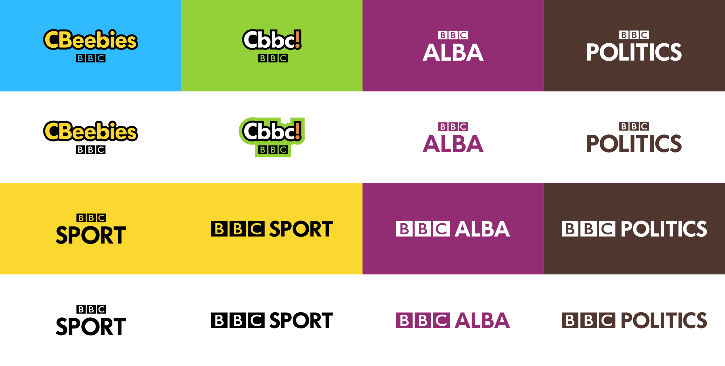
The CBBC and CBeebies logos are still too much of a mish-mash - the "Cbbc!" smacks of trying too hard to be cool. I think they really need to be considered separately. They both seem like a big step back from the current logos.
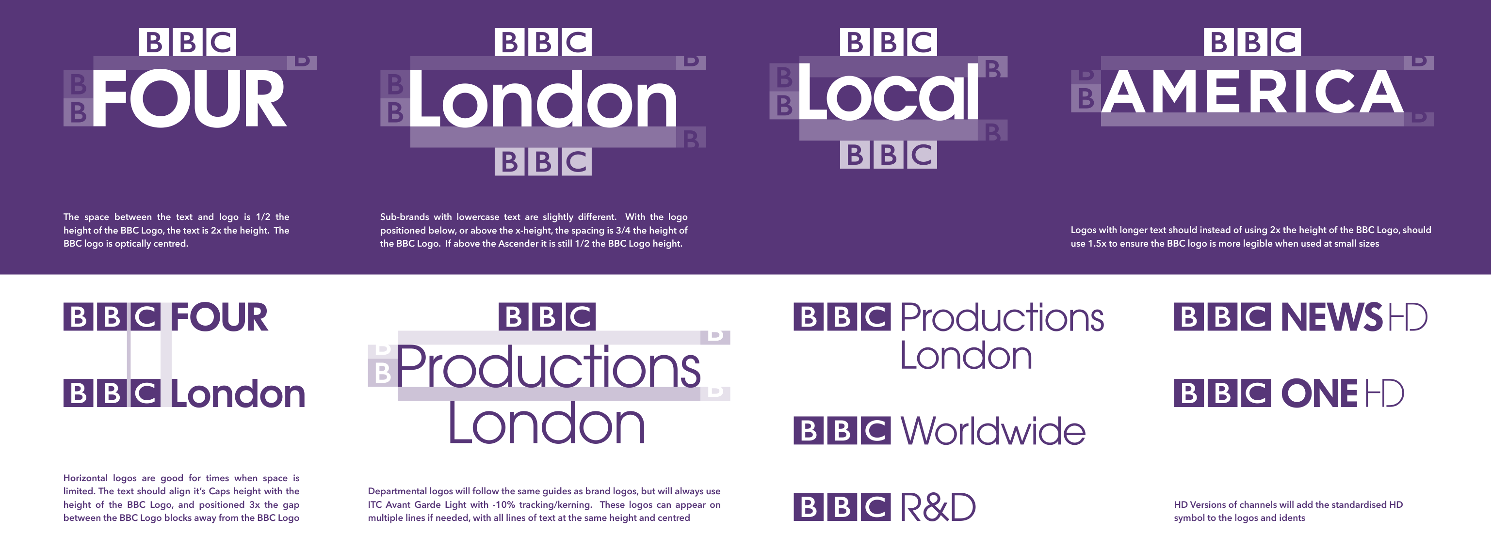
I think BBC Politics would benefit from being the same colour as BBC News, seeing as the two are quite closely connected.
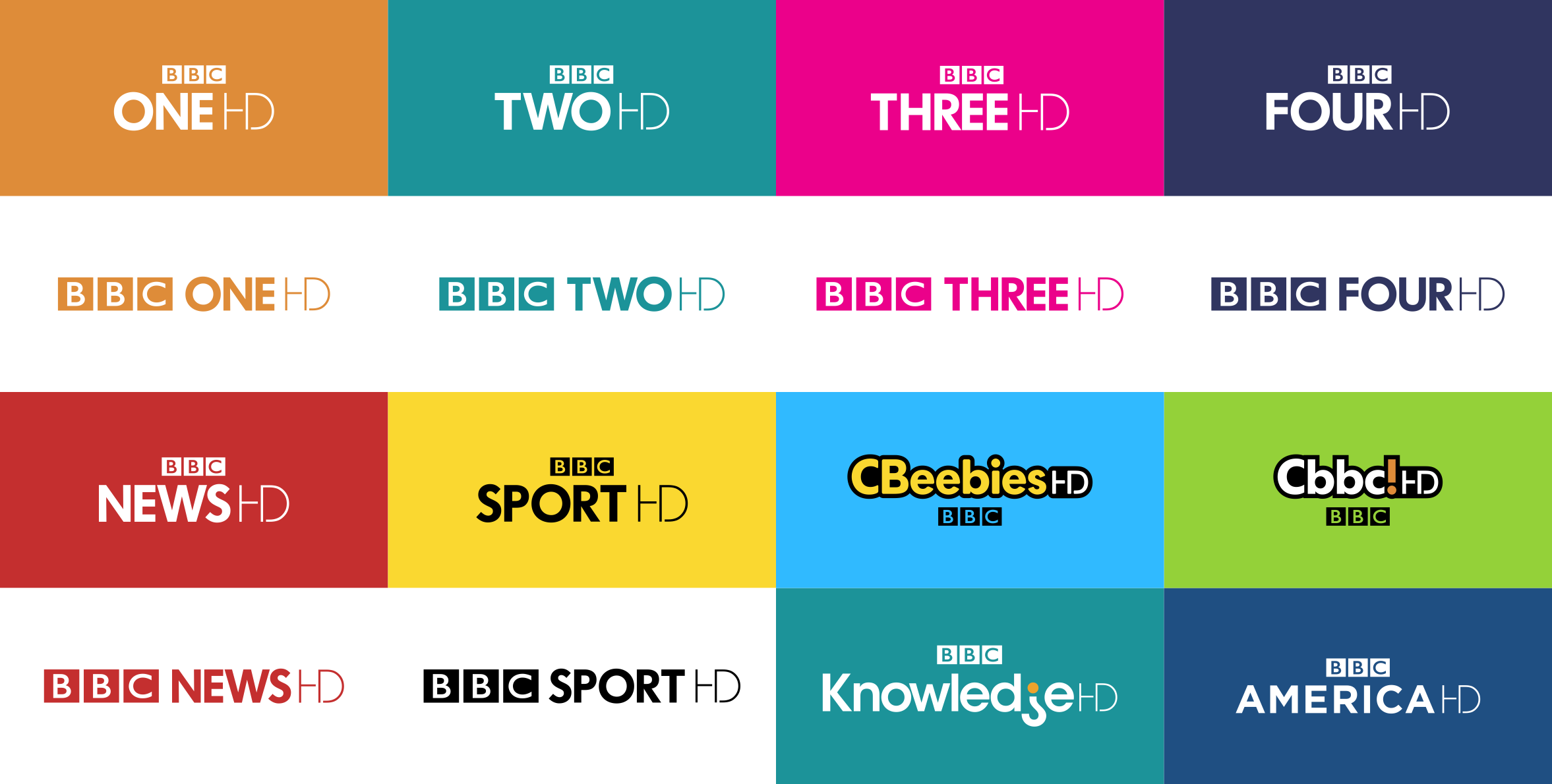
The HD symbol on these logos is far too thin. The HD logos still have to work in SD, and they still have to look balanced. The actual HD symbol's layout is also a bit tight.
The HD versions of the CBBC and CBeebies logos are a bit of a mess. Having the HD as quasi-small caps on the mixed-case logos is jarring to the eye, and this stands out particularly on those two logos.
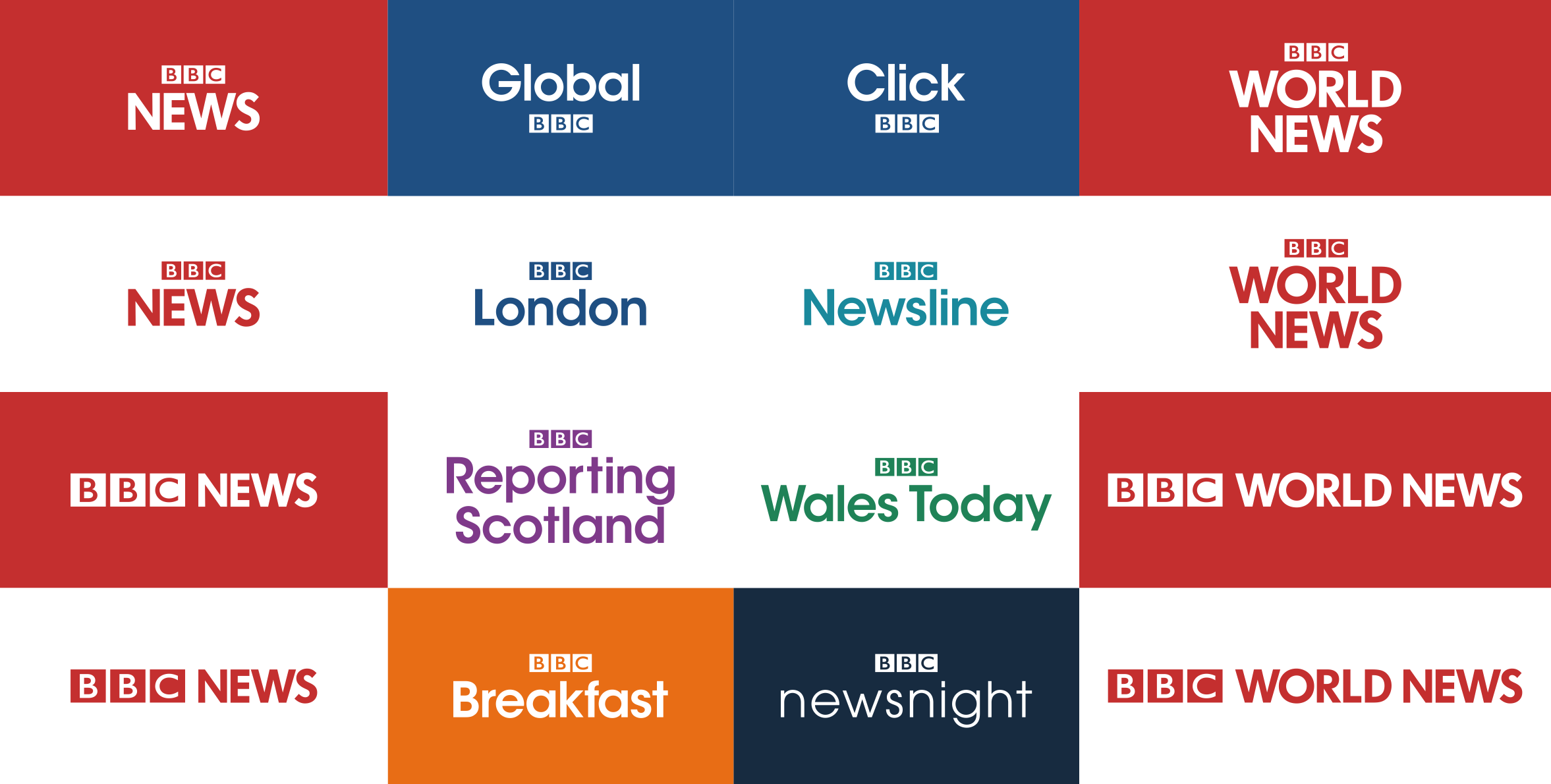
Keeping the current BBC News colours is a good choice; the Newsnight colour change also works well, not being too much of a departure. I don't think extending it to shows like Click is a good idea, however, and having the BBC logo underneath it is problematic due to the social media references to it as BBC Click.
The regional logos are an improvement overall to the first version, and is where consistency with the BBC News brand is important.
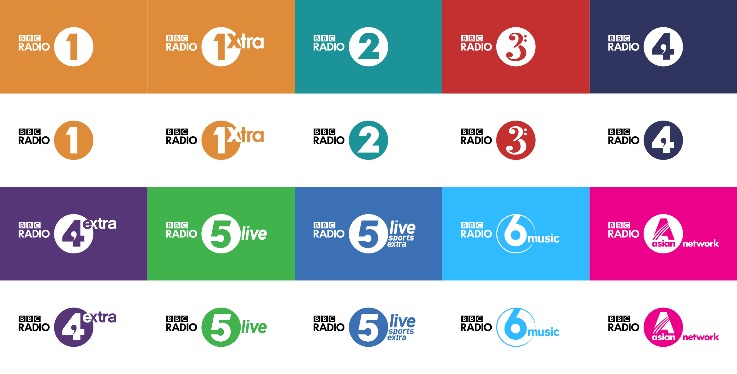
The radio logos are, again, not much of a departure. I think the altered alignment of BBC Radio works, but so did the previous one.
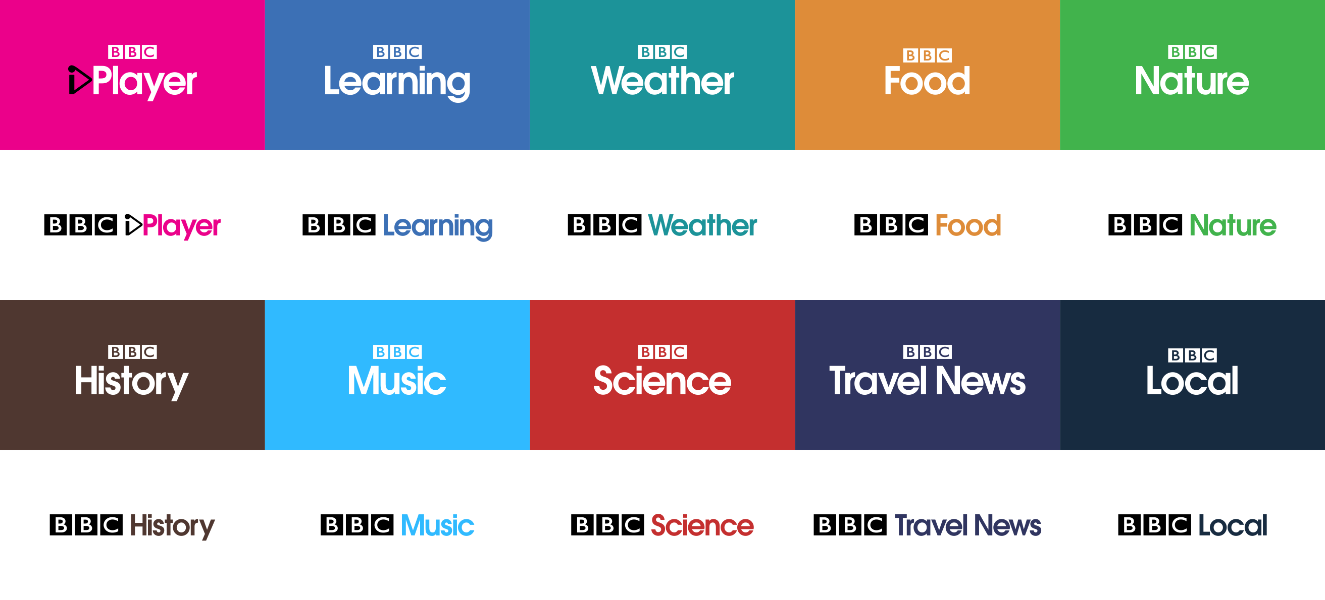
The standardised BBC logo position definitely improves these logos, and makes them viable as standard website logos. The adaptation of the iPlayer symbol works quite well, but is rather limited by the geometry of the font.
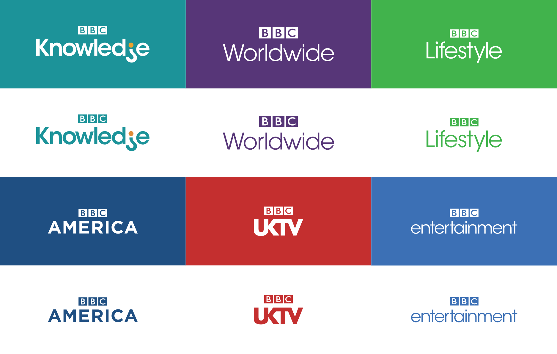
The only thing I can comment on here is the BBC UKTV logo looking cramped rather than flowing. I think connecting letters in that way only works with certain fonts, and this is one font it doesn't work with.
Moving on to the video:
The credits squeeze works quite well, but the purple text on the dark background is a bit of a clash (possibly worsened by the compression in the video). It's certainly an improvement over the current version,
The BBC One sting just looks a bit cheesy. The transition seems a bit over the top; a bit too complex. The combination of the glow, shadow, and super-slick transition makes it feel gaudy to me. The transition throughout the video is one I don't like.
The endboard of the trailers are certainly distinctive in design. The video showing through is distracting on the Doctor Who trailer, as there is a lot of motion and contrast. I think it could do with slow motion, or a still, to ease the issue. I think plain background endboards tend to work better.
The Original British Drama logo looks a bit strange with the rather dated and very annoying alternate As.
Edits:
The realignment seems to work rather well - a rounded E isn't really required to fix the issue, I'd say.
The HD symbol you've chosen as a replacement is good - a move away from the clich�d joined HD or the HD with gap in the D is a good move.
Overall, I'd say that this is an improvement. I still think that there are fundamental issues with the mock. I think that the font is still, overall, a poor choice. In addition, the one use only colours are far too limiting. The over-application of house style can diminish the most important brands. I think the video provides some useful context, but still shows up the same issues that exist in the images.
I'd now give this a 2.5/5, partly because I can't see this being implemented, and partly because of the aforementioned issues. The quality of your technical skill isn't in question, however, I think this shows how hard designing a branding solution for a good portion of the BBC is.
Last edited by bilky asko on 23 August 2013 1:43am
Overall, I'd say that this is an improvement. I still think that there are fundamental issues with the mock. I think that the font is still, overall, a poor choice. In addition, the one use only colours are far too limiting. The over-application of house style can diminish the most important brands. I think the video provides some useful context, but still shows up the same issues that exist in the images.
I'd now give this a 2.5/5, partly because I can't see this being implemented, and partly because of the aforementioned issues. The quality of your technical skill isn't in question, however, I think this shows how hard designing a branding solution for a good portion of the BBC is.
I am interesting in hearing more about where you feel these fall short. One thing I think I have picked up from your comments, is the fact you feel each channel should be addressed in its own way? The stings were placeholders to show I would like channel/themed stings reintroduced to channel junctions. I was intentionally not attempting to tackle individual channel brands with these mocks, only the logos and primary colour.
As for the colour usage. They are not single use colours, but more a group of colours which work well together. I chose to assign a colour to each channel, which makes sense for the cross promotional systems and graphics. BBC Three for instance used a blue colour alongside the pink for the little "New Series" animation, and endboard. And other channels could have other secondary colours.
One thing I would like to address. The technical proficiency is not something I was trying to show off. I set up grids, guides, and basic rules for myself when designing to ensure I remain consistent with my own stuff. It is also something as a designer, I have to keep in mind. I design these animations to technical standards as if I were designing for real. Not just for this mock, but for all my design work these days.